Question

Text box height is larger than the text inside and unevenly. How to solve the padding issue?


Shneor

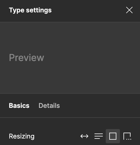
It’s known the text line hight it’s a nightmare. However, I’m struggling with the text box hight even more with Figma Auto Layout.


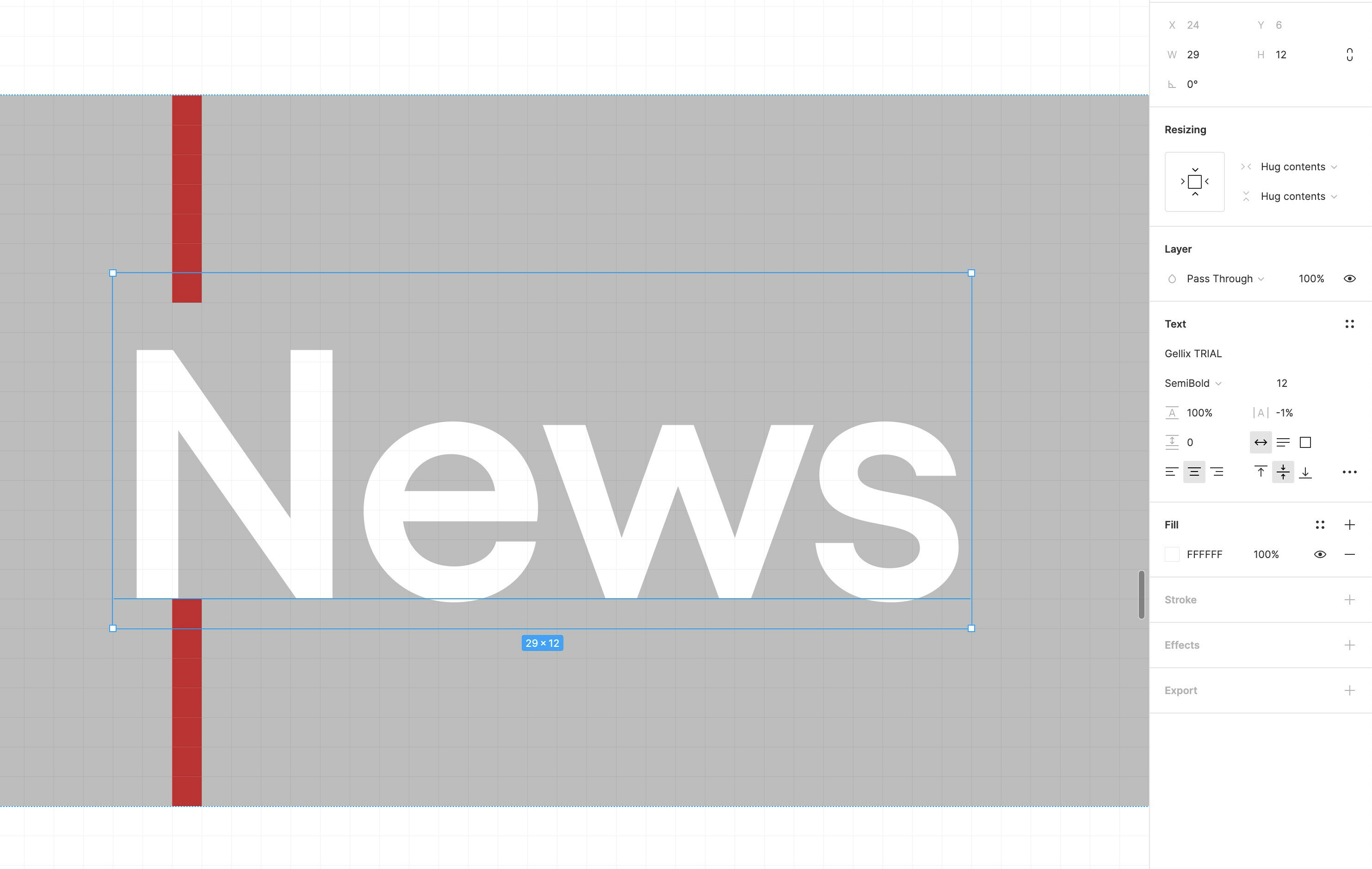
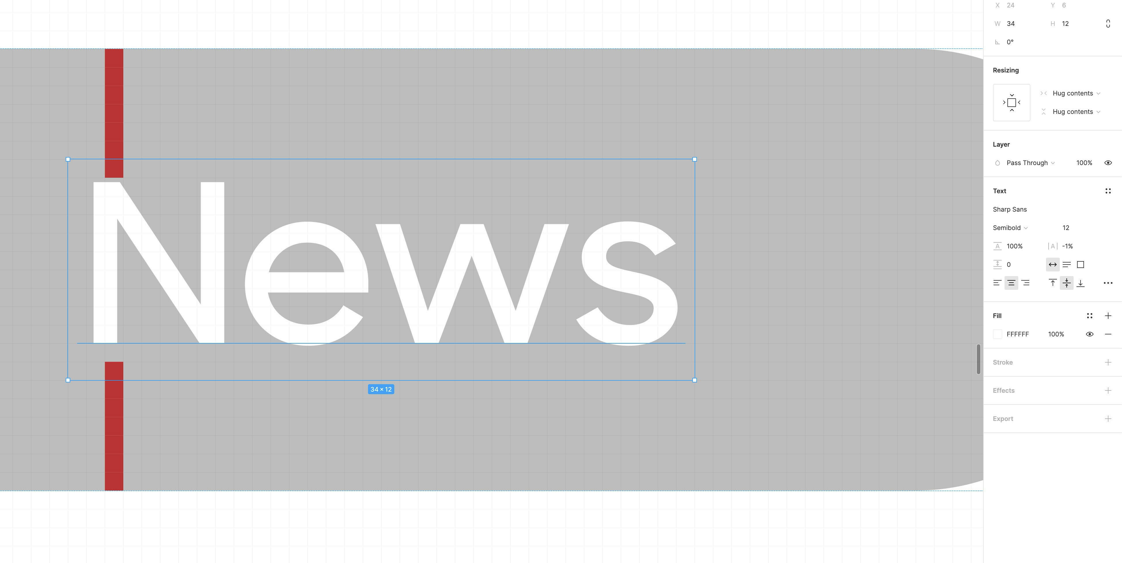
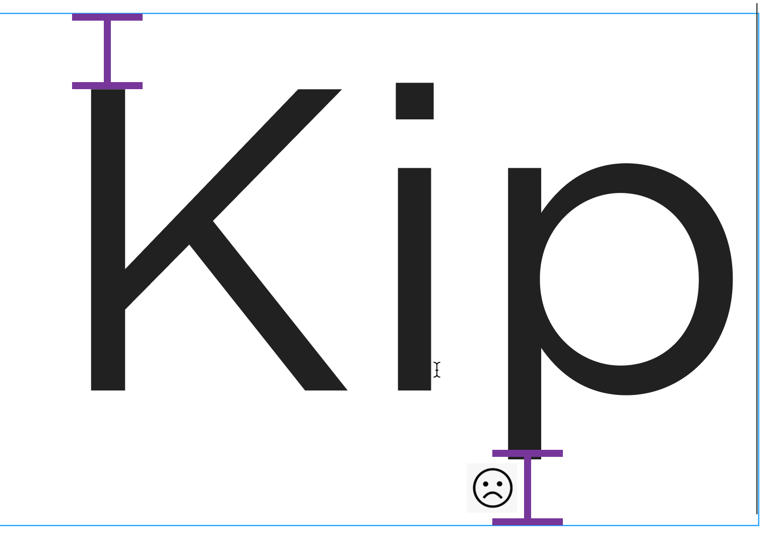
When giving “padding” on Figma auto-layout to a button, the text position (inside the box, not the box) is not in the centre height. In the following example, you can see that in one font type there is 2 px space at the bottom and 1 at the top and in the other one, 2px at the top and 1 at the bottom.

That’s led to; 1, the text is not in the centre height, 2, the padding is getting extra which then lead to the wrong implementation.

Later on CSS, the text div won’t behave like that and will wrap right around the text.

The ideal is that the space (padding) above and below the text is even and exactly as set in the padding.

Is anyone have a solution for this challenge?

11 replies

Gleb
  • Power Member
  • 4706 replies
  • February 11, 2021

This is how fonts work, you can’t do much here. And “later on CSS” you will have exactly the same issue, although it might be less visible since you won’t be able to zoom in that much.


Reinold
  • 1 reply
  • November 9, 2022

I have been trying to figure out a solution for the same problem. So far the text height options have been a sort-of solution, being Auto Height the one that I use the most. Truncate I guess can also work. Let me know if this was of any help!

Screenshot 2022-11-09 at 12.45.08 AM


SohrabNiroo
  • New Participant
  • 188 replies
  • November 9, 2022

@Shneor
I’m not sure if that helps you but at least on visual side works, you can put a the text inside a container frame and adjust it to desired center of the frame and then put that frame in your auto layout (if Applicable).


  • 1 reply
  • February 15, 2023

Hello all! It seems that there is still no satisfactory solution to this problem? 😦

For me setting the auto-height does not solve the problem…


bombadillo

I am having the exact same issue (to the point that I thought I wrote this post 😃) We are trying to define fonts, text box behavior, and auto-layout for a design system, so this is a serious problem.

There is more space above the ascender than there is below the descender. Ideally it should be equal!


dvaliao
Figmate
  • Community Support
  • 4592 replies
  • May 19, 2023

You can now use vertical trim to remove the extra space above and below text:

twitter.com

bombadillo

Wow cool! Thank you!


Hi! Would it be useful to create some kind of utility to resolve this issue? If so, I could do that and let you know!


James_W
  • 1 reply
  • May 25, 2023

Is there any way to make this the default behavior for text project wide? Short of using components I mean.


Thank you! This is the solution!


ACtually this just works for vertical trim, not horizontal trim…


Reply


Cookie policy

We use cookies to enhance and personalize your experience. If you accept you agree to our full cookie policy. Learn more about our cookies.

 
Cookie settings