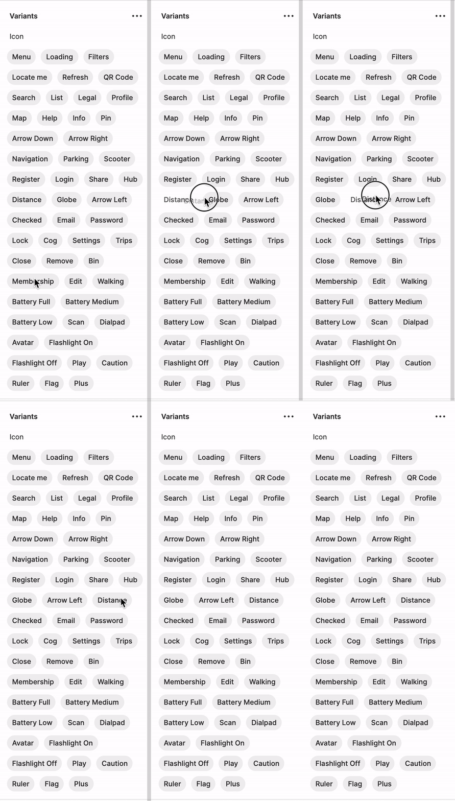
Is there any option to automatically sort the items/components in the variants menu? Seems like I can drag them and drop but while having lots of elements it’s quite hard to keep things in the correct order.
I know there are plugins to sort items in the layers menu (like SortIt) but would be great if there is an option to make the same (A->Z, Z->A) for the variants.
@rzmota
i’m also seriously in need of this feature at the moment. have a ton of variants in several components and would like to keep them organised and listed alphabetically for easier selection when designing the screens. come on, Figma team! you can do it.
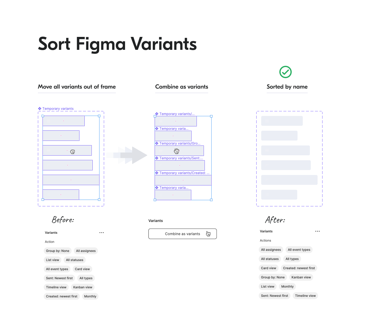
It seems that Figma does not have any intuitive (and more importantly native) function to sort components by title, ascending or descending. The only option I foresee is ordering the components before they are combined as variants as @sebastien.giroux eluded to.
Same case, 2 hundred icons. Sorting before merging won’t work since the component is already a part of the team library and has tons of references across the projects. + The set is not static, people add new items and remove outdated ones.
It would be nice to have a choice of a key property synced with the order of the variant layers. There are plenty of ways to sort layers (manually & via plugins), so it might be rather flexible.
Same here. A lot of Icons and we add new ones every now and then. It takes ages to find them as they are not sorted alphabetically. When you try to filter them by start typing the name of the variants it stops after entering “_”
@rzmota am I wrong or you can solve this problem by dragging the variant name tags in the order you want/need?
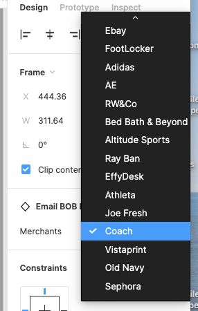
This will have an effect on the dropdown list as well.
Please note the scrollbar) I use dragging to keep it sorted, true. However, it takes some time to establish the order in an old lib. And this way is not quite reliable, since every contributor has to put any new icon into its place manually on any update, which is annoying and thus ignored in daily routine practice. Autosorting could solve it for real.
I can confirm that it works. However, I’d suggest to use it with caution and create reliable backups beforehand, since there might be some unevident pitfalls. Some notes on my personal experience:
You have to put the sorting property to the 1st place.
Property names are dropped in some cases (not yet ready to figure out the exact reason right now).
Not sure if this is totally safe for usage with REST API and plugins, since a new Variant is probably a new instance/node and thus might have it’s own node_id or some other differences in metadata.
Technically, this is a workaround and it doesn’t completely solve a case on teamwork. However, the idea is smart and helpful anyway. Thank you!
I see your point.
Off topic thought:
about your “real-world” use case, how did you get to such complex set of variants for a component? Do your users understand how to use it?
Just curious
Let’s say, it’s a matter of a project / library structure. In that particular case the Icon component is a wrapper for the whole library of icons that is shared across a bunch of microservices and is syncronized with React-based component system. The amount of icons involved in a particular interface / bundle build varies, but you have to keep them all together to preserve consistency.
Also, there are plenty of variations of a single icon sometimes. For example, when it displays a state or identifies an entity or status:
Icons are usually used along with captions, colorcodes and a certain area of the layout. The combination is recognizable.
But threre’s even a simplier real-world case. A service supports up to 150+ delivery platforms (YouTube, Spotify, Netfix, Apple Music etc) and uses their logos as icons for report screens, delivery settings and other features. This is a 150+ icon set by default.
Not saying this approach is right or typical, I just state that it exists.
@Ilya_Ivanov
Thanks for sharing!
It’s always interesting to see how others face the complexity of delivering a design system.
I am convinced there’s no good or bad process. The best is the one that enables designers to unlock business value. At the moment, our design system covers four platforms, two web and two natives. We rolled out the platform across twelve countries. Hence we heavily relied on the variants to cover the different use-cases. Despite that, we preferred to implement an essential structure for the most-used components to avoid too much overhead when it comes to an understanding of when to use what. So far, the design community is happy with the library setup, and we’re satisfied with our KPIs.