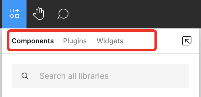
I’m used to Shift+I to open the Components tab to search for a component to import. It’s a very convenient workflow since as soon as I click on the component I need, the panel disappears (and I no longer need it) and the component show up in current view in the file.
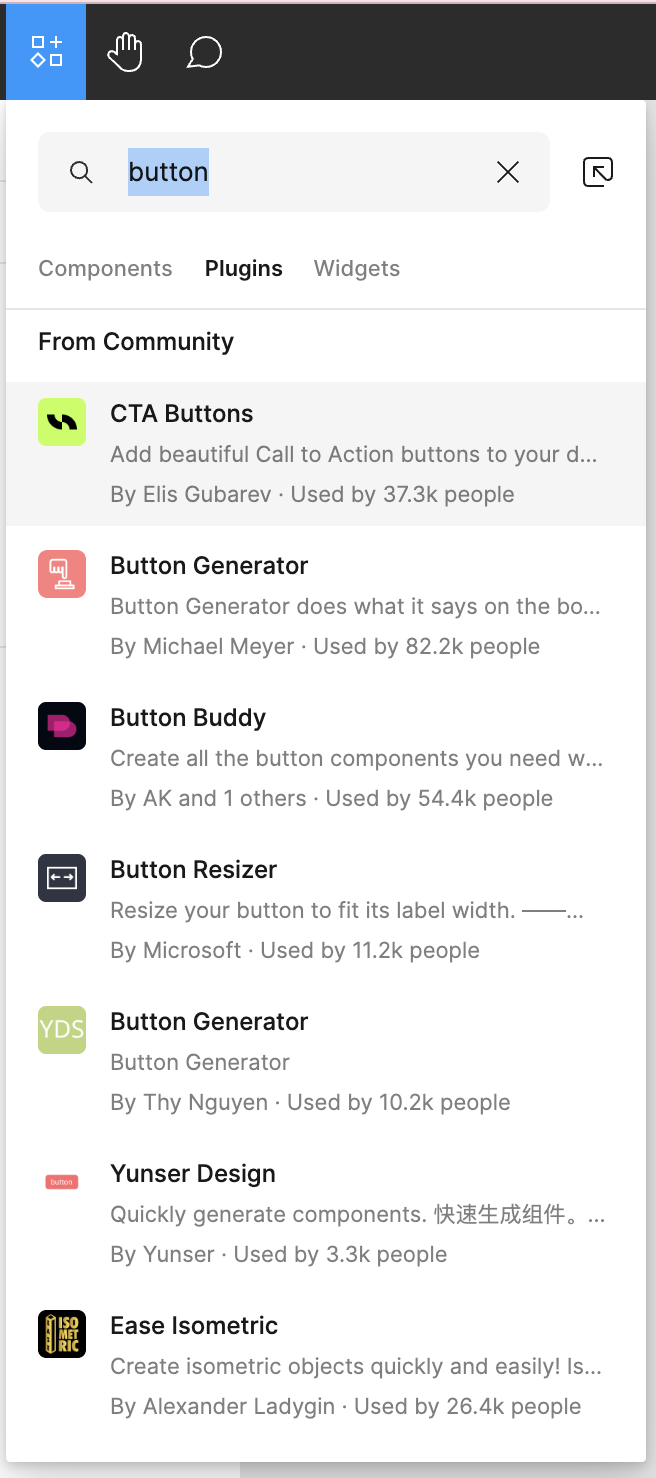
Now every time I hit Shift+I, I get this Plugins tab opened for no reason at all. If I need to launch a plugin I hit Cmd+P to find it through the launcher.
I’m aware there’s an alternative workflow by hitting Control+Option+2 to open the Components tab on the left hand side. But that workflow sucks as I have to drag and drop a component to use it in the file (compared to clicking on it in the Shift+I workflow). Additionally, the panel persists after I have “imported” the component I need… I got the component I was looking for, what do I need the panel for? The chance of looking for a 2nd component right then is smaller than doing work with the 1st component found, so I don’t need the panel opened anymore then.
I can confirm, I have the same problem since a few days now.
Not only that, but it seems the Components tab also forgets whatever filtering or drilling down I had before (e.g. local components vs. library components).
Using the Mac desktop app but it reproduces also in the browser.
For some reason whenever I open the Resources menu (Shift + i), it no longer defaults focus to the “Components” tab. Instead, it opens to “Plugins” and I have change the tab everytime. I am trying to access Components 1000x more frequently than I am trying to access Plugins, so this is extremely frustrating to have to do every single time I open this menu. It seems like this just started happening in the past few days or weeks? It used to open right into components and it was a very swift workflow to find and insert the component I wanted…
@Vaccaro_Matt When I use the shortcut, I’m defaulted to components (not plugins).
If I switch to plugins from components after opening the resources menu with shift + i, and I close the menu and use the shortcut again, I go to “plugins” immediately instead of components.
Basically it seems like switching to one changes the default for me – if I reopen the file, it goes back to components and stays there. Tried this in both the app and web browser and it works this way on both.
I’m not sure if that entirely made sense, but this is interesting – no matter what you do, it auto-defaults to plugins?
I wanted to reply here to confirm. Very frustrating issue, between the last typed phrase being stuck, to the panel defaulting to plugins and having to manually click the library icon to enable libraries in new files. Not really sure how all of this got broken but would greatly appreciate a fix from Figma.
Same issue here. Having Shift+I defaulting to a tab that is used far less frequently adds unnecessary interactions to user’s workflow. I found myself having to switch tab hundreds of time every session. This is a very unintuitive change, which is strange for Figma, you guys were usually good with UX. What happened?
Replying here to bump this issue. It is slowing down my workflow significantly. Please revert to opening to the “Components” tab by default. Also, from reading the comments this seems to only be affecting Mac users (I am one as well).
To piggy-back on this, usually when I type a new search into the quick component insert menu it will immediately revert to what I had previously typed the last time I searched for components. This is very frustrating and is costing me a lot of time because it happens constantly.
The “resources” menu that opens when pressing Shift + I seems to have changed recently to search for Plugins instead of Components. I use that menu frequently when inserting components into my designs. It takes extra time to have to click into the “Components” tab since the default is always “Plugins.” Is there a way to change the default search?
Attached is a screenshot of the menu I’m referring to.
The issue seems to be also file based. Not all files exhibit this forgetting the tab behaviour. Some older files seem to be having the good old behavior.
It would be great if we can choose what is the default view of ‘Component’ tab in Ressources!
I work on a lot of design files with many different libraries and I would like to have ‘Local components’ or the distance library of the document selected by default instead of ‘Recents’ view which is useless for me. This ‘Recents’ view suggests me most of the time some components of libraries that won’t fit in the open document.
For example, with two clients, or many more, it’s useless for me to have the clients B buttons suggested in the client A design file, just because I worked on client B design file the day before.