Set Default Section Colours in Figma

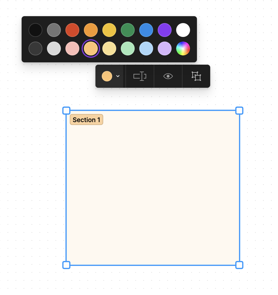
Hi, I wanted to suggest preset colour options for Sections in Figma, similar to FigJam.

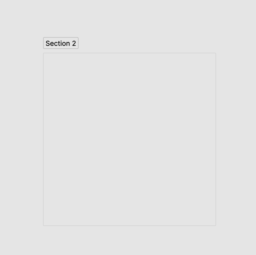
The default grey colour blends into the default canvas background meaning I always need to choose a custom stroke + fill after using it. It’s an easy task but it breaks my flow to have to stop and change the colour of a section in the middle of whatever I’m doing.

To be honest you could improve this just by changing the default colour from grey, but having some of the FigJam presets makes it a lot easier if you have different colour sections for categorisation.

8 Likes

This topic was automatically closed 90 days after the last reply. New replies are no longer allowed.

I want to add my +1 to this thread. Thank you @dvaliao for opening it back up.

I would love to be able to change the default section color in my Figma without having to manually set it every time. Currently, it’s set on #ffffff and it’s causing all of my designs to blend in. Hope there’s a fix for this soon!

7 Likes

Just had this question today. It changed from grey to white and that really clashes with all of my designs now because for my job the webpages are often white. haha!

1 Like

I feel your pain because when the default page background colour changed to #F4F4F4 it clashed with the BG colour in my designs.

I think allowing you to set a couple of defaults would go a long way!

+1 to this. It’s so annoying that new sections between files in our org are so different as the defaults from Figma kept changing so it looks random.

2 Likes

Yes please it’s very irritating to have to change this every time!! The page backgrounds are white so I want the sections to be darker for contrast.

2 Likes

+1 to this!

+1 to this, especially the white default background color makes it a bit more annoying because it’s a common background color used in frames and components.

I as well am needing a way to change the default section color in my Figma without having to manually set it every time. Currently, it’s set on #ffffff and it’s causing all of my designs to blend in. Hope there’s a fix for this soon!

Yet again I am sadly out of votes but please imagine that I did vote xD

+1. We need more QOL improvements like this in Figma.

1 Like

I would love this. Even just somewhere in the admin settings to set what the default section colour is would seriously help.

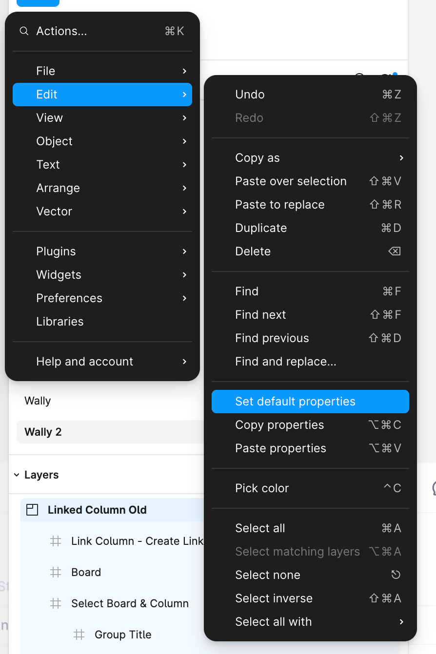
+1, and I highly recommend use global variables to manage all default style instead of “Set default properties” in Edit menu. It keep the logic simple.
More detail explanation: a place, may be in Figma setting, there are some variables like “Frame’s default background”, “Section’s default stroke”, use can set object’s default style by edit those variables.

This would be really helpful for me. I work on app pages with a white background, so I always have to change the default white background in sections to make sure it doesn’t blend in. Changing the section colour by default would be really helpful.

To help with this, I created a plugin called Quick Section that lets you set a default color and create sections. You can also add section headers that align with selected layers and set up app shortcuts for extra speed. Hope it helps! :slightly_smiling_face: