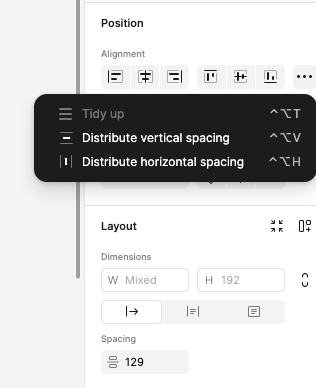
New:

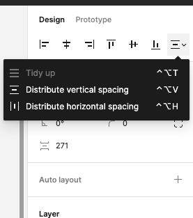
Old:

I can sympathize with the thought behind “not needing two different spacing inputs, one at the top, and one in the autolayout area” but the fact is the context of autolayout is completely different that just trying to move things around. Autolayout creates a rigidity which isn’t always what’s desired at that point in time.
It’s very odd to keep the spacing distribution alongside standard alignment, but then have the control for the actual spacing to live a whole section away.
I can also see that the idea was to put “positioning” in one area (the top), which includes alignment, and “layout” in another, which now contains dimensions (questionable choice because I’m not sure width/height should be considered “layout”) and spacing. But, positioning and layout go hand-in-hand (in fact, “laying out” things is literally trying to position them), and this interface was easier to use when the controls were meaningfully placed near each other.
Splitting them out just so they can be batched underneath a nice label is not worth the hit here. “Autolayout” is conceptually and functionally a different way to do things, and either (1) deserves its own dedicated section like the old UI had it, or (2) needs to be recombined with the top section.
