
Hi mates! I unexpectedly got access to the beta version of the new UI Figma. After using it for several days in a row I want to share my thoughts on why it sucks.
First, let’s take a look at it.
The most obvious changes:
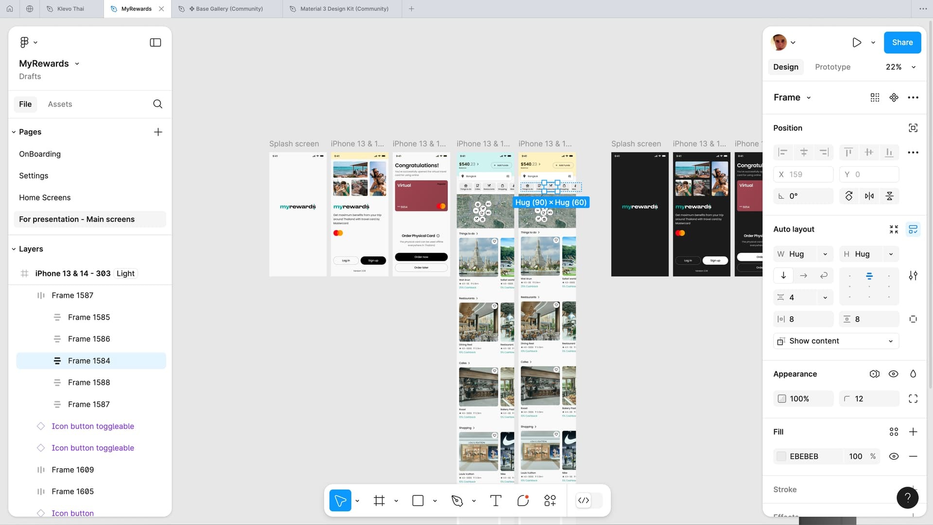
1. Side panels have been redesigned. They no longer stick to the edges of the screen.
2. The top control panel has been partially moved down.
3. The design system has been updated.
I want to start with the main feeling of it before focusing on the details. I lost the sense that Figma is a program for designers. The lightness inherent in the words “design”, and “art” has gone somewhere. The feeling that anyone can learn this program easily has gone away.
Now it looks like a program for engineers and developers. Boring, heavy, tedious, and uninteresting. All these new endless strokes and contrasting backgrounds on inputs are similar to the well-known services for assembling business card sites, after which returning to Figma, for me personally, was a breath of fresh air. Because Figma is a creative environment, not an engineering one.
What bad exactly in the last changes?
1. Side panels have been redesigned. They no longer stick to the edges of the screen.
Due to this, focus on the work area was lost. There is no feeling of immersion in the project. The project you are doing is the main thing, and the side panels are secondary. Now they are perceived as part of my project. This feeling is especially enhanced when working with a dark theme.
2. The top control panel has been partially moved down.
This is a total shock. For two reasons.
The first reason is that:
All design books and design classics teach us designers that the human eye reads information from left to right (in Western culture), from top to bottom. Now Figma has decided that the key actions should be at the bottom…
Yes, I rarely press these buttons because I use hotkeys. But I see a lot of beginners and people who are not professional designers clicking there to create a rectangle.
In the previous UI, all available actions are in one place, on one line at the top. If you need something, you know where to look for it. Everything is conveniently organized. In the new UI, everything is scattered across different parts of the screen: Creating objects from below, there are also plugins (there is a separate topic about the panel with them), and the dev mod. But share the project, previews, and active users are at the top, and on the panel, which is dedicated to managing the selected object.
The second reason is not less trash, but probably even greater.
Now the available actions with selected objects are located not at the top in the center with large icons, but in the panel on the right, in the second row, with micro-icons of size 24. This was almost the key feature that helped newcomers adapt to Figma. No wonder it was located at the top and center.
It’s so cool when you select an object and see how the list of available basic actions with it changes! In the center, large. There was nothing like this anywhere except Figma. Now this won’t happen in Figma either, because it doesn’t work well with the fancy menu at the bottom.
Hmmm, what to choose a convenient functionality or a fashionable menu to collect likes for Behance?? The question is rhetorical. The answer is clear.
Other points:
Plugins.
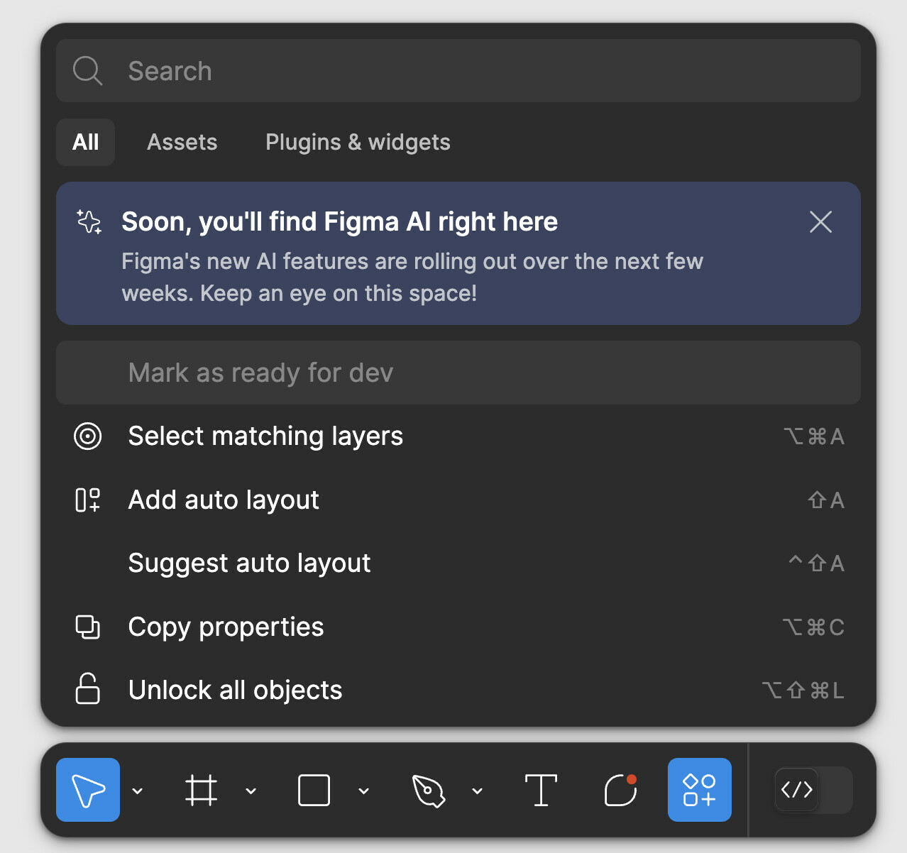
Am I the only one who uses them all the time? Why do you need to make a lot of clicks every time to launch something? But the useless console, which I use at most once every 3 days, opens with one click. Yes, of course, there will be AI, but it doesn’t have to be placed specifically in the console, right? 🙂
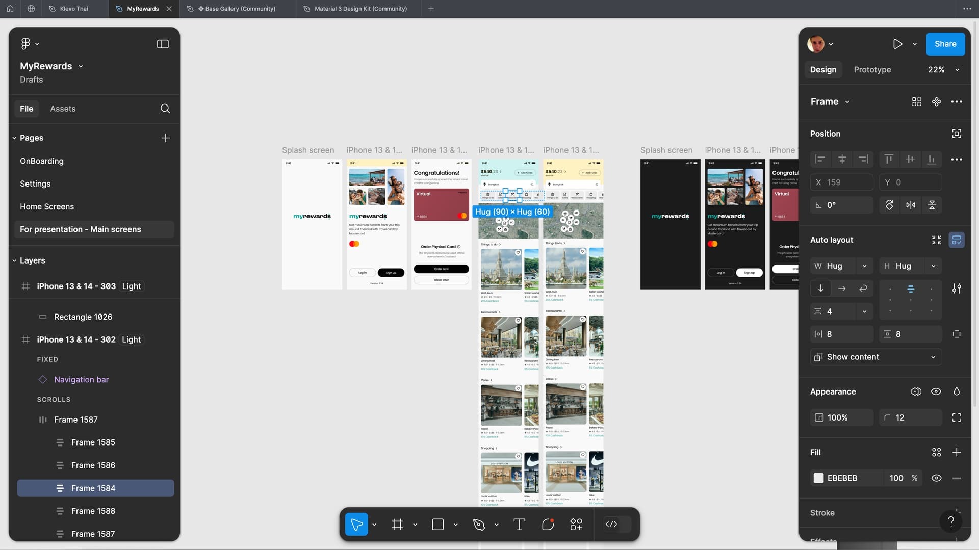
Assets.
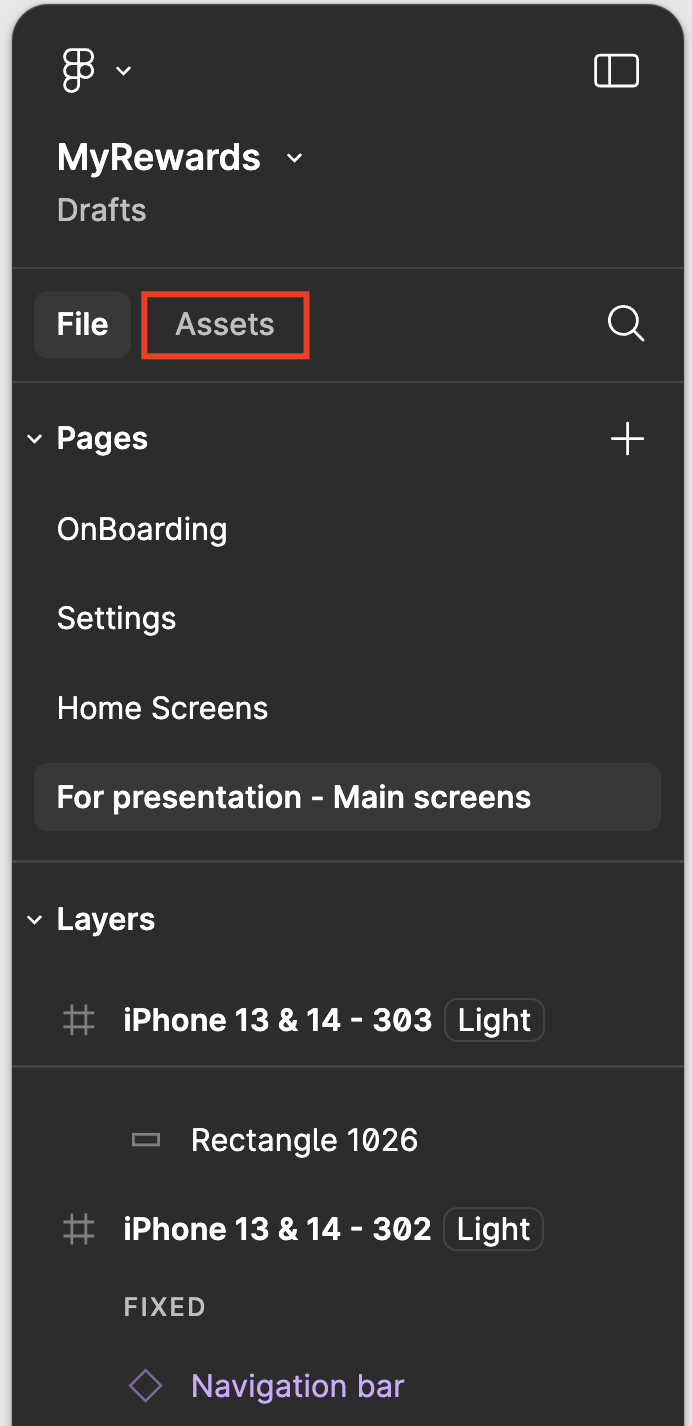
As before, assets from the library can be added from two places. Let’s finally decide on one. I vote for the sidebar. (Assets panel 2 on picture)
List of pages.
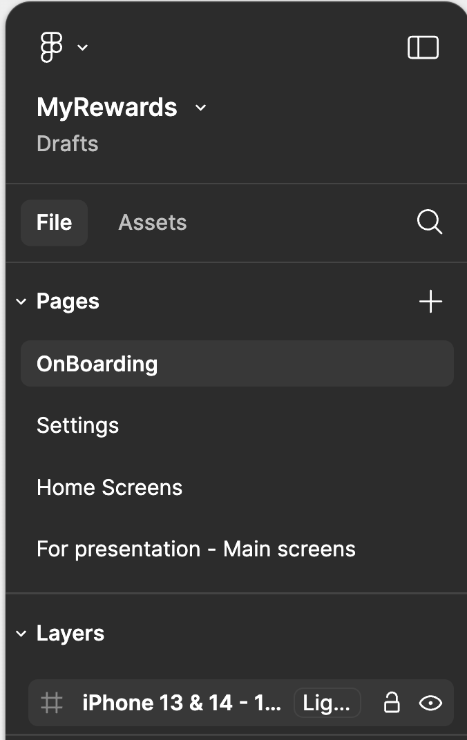
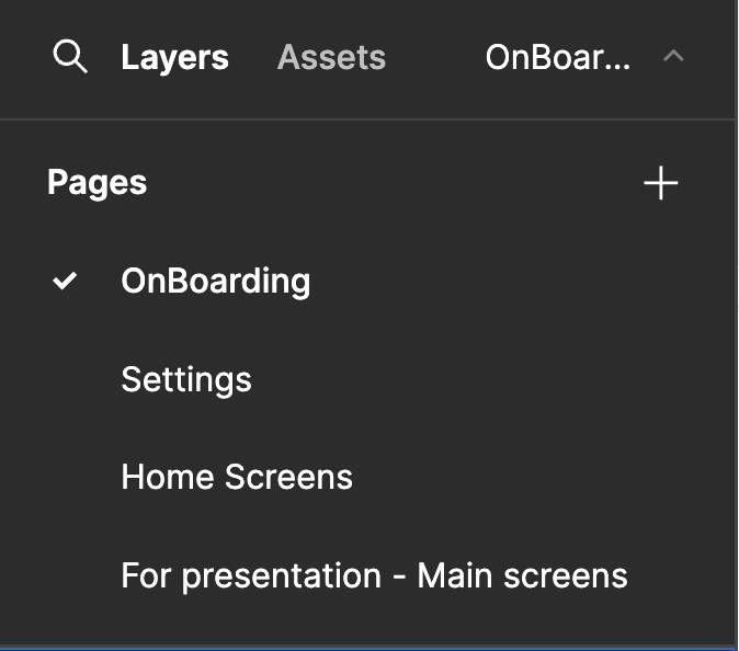
In the new design system, the section heading and the active element are on the same level and written in the same font. Which makes it hard to see what page I’m on. Even if this happens for a split second in my head, it doesn’t happen in the old UI.
Sorry for the Figma team 🙃
