
Hello,
In my workflow i have a set of variant propeties, to kind of configure the elements i want inside a module.
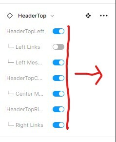
Turns out that by default the space allowed to display the names is pretty narrow, and makes difficult to identify what is what.
Example:
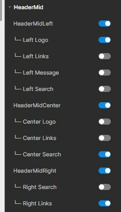
On Figma (Web) i’ve been able to tweak it a bit.
Big difference:
Wish you guys could give it a look and allow more text to be seen so we are more able to identify stuff.
Thanks in advance.