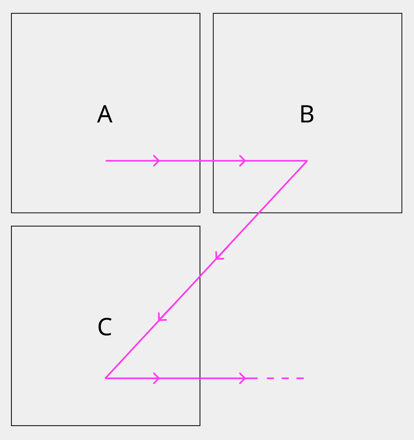
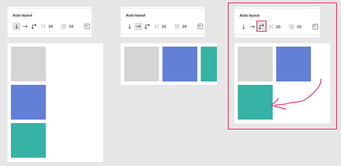
It would be really great if there was an option in an auto layout frame where the frame would wrap the objects to the next line. Like this. Objects would respect the padding set in the Auto layout.
Update: 2021-11-02T04:00:00Z
This is now the #2 most voted feature next to support for RTL language support. It would be nice if Figma had a feature to mark that a request like this is currently being developed or is on the roadmap.
Update: Jan 13, 2022
You can use this plugin as a solution for now.
It would be a game-changer if there were more flex-box options, such as ‘wrap’ for autolayout, where you had the option to let elements wrap to the next line once the max width of the parent container is reached.
This would create a more realistic flow, and significantly reduce the number of layer structures needed. Currently, to create something like a list of tags, I need to create a separate row for each list and constantly adjust, delete, edit them to get the right orientation based on the tag content/text.
I made a layer hack to achieve this since I doubt this feature would be implemented any time soon. → Check this out ←
I’ll make a tutorial on how this is made if people are really interested.
I have tried for the last two weeks to make a tutorial for it but two of the crucial mechanisms just refuse to be reproduced (only works on direct copy) so yeah, that’s how hard that challenge was.
I guess I did cast some magic spell on it the first time it’s made.
Auto layout is a very useful feature, and I like to use it very much. However, it is still not convenient and smart enough, because it lacks the automatic line wrapping function, just like text, the content exceeds the range and can automatically wrap.
This is some crazy wizardry. I thought I was pretty advanced with Figma, but I have absolutely no idea how this works. Super impressed, even if there’s almost no chance I can use it in my production files.