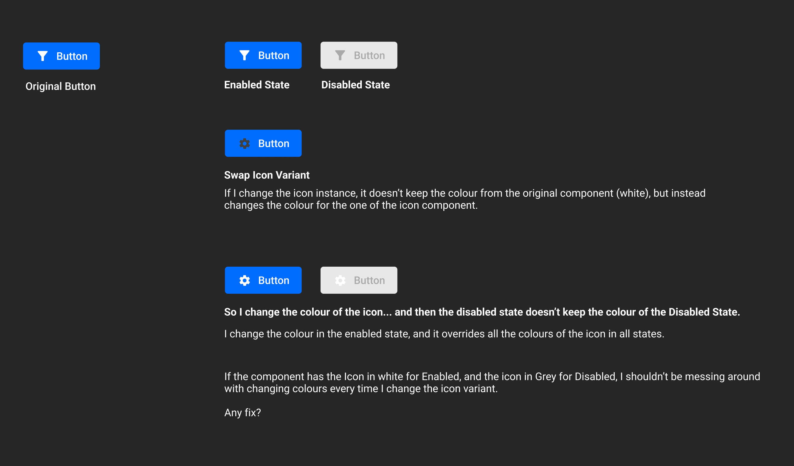
Hoping the image is illustrative enough.
I’m trying to create an iconbutton where the disabled state has a specic shade of grey for the icon, different from that of the enabled, hover, focus and pressed states.
The component for the button specifies all the right colours, but if I change instance of the icon, all colours are overriden and messed up.
Any possible fixes? Thank you!