
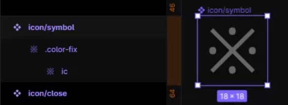
I have been trying to find a way to preserve the icon color override within my button component. As you can see here, I used the trick from Rogie (Perserve Icon Color Override) to apply union to the icon, and everything seems work.
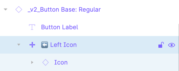
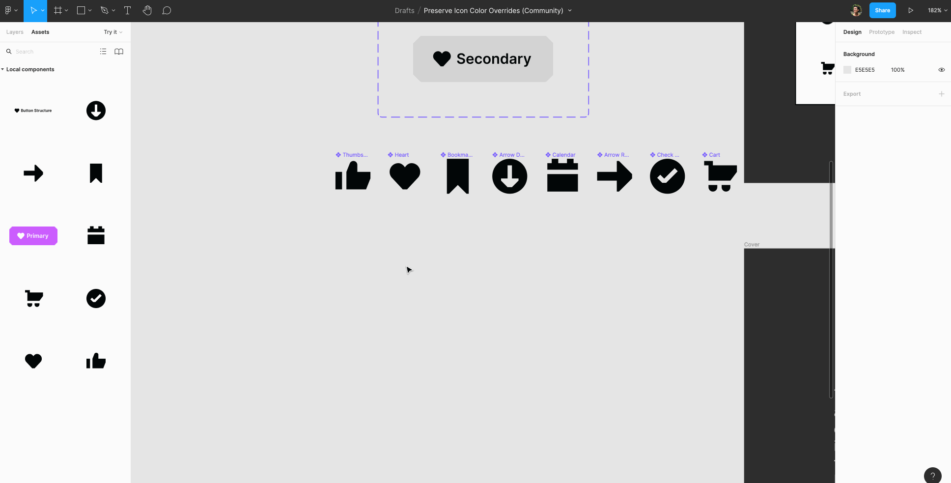
However, now when I swap an icon, the union makes it hard to control the icon size (even though all icons have a frame 24x24, the content inside are vary). It then affects the auto layout and size of the component. Therefore, I tried to add another frame to contain the union layer and set fixed size, but it still didn’t work at all.
With the old approach, which I have to change the color every time, it allows me to constrain the icon size within the button to be 16x16. I am wondering is there a better way to preserve both color override and icon size?