How to choose the right frame size

This is a question from a very beginner. The first thing when starting to wireframe is setting the dimensions of the frame, right?

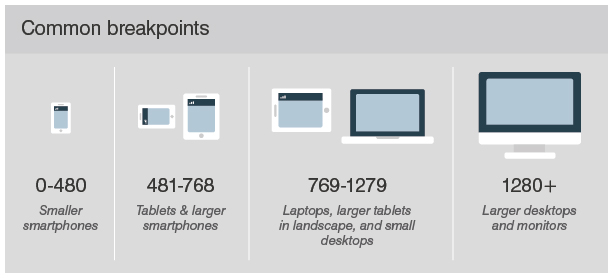
Imagine you’re designing an app for smartphones. In real life, the app will be displayed at multiple screen sizes (depending on the device). This means, if I design it on an “iPhone X” frame, it will then show some differently as planned when using a “Samsung Z”, for example. How do you choose the right frame size to wireframe?

I’m sure you don’t design it for every device, do you? Maybe is there any “safe frame size” from which you can start to design, which you know from experience that makes it optimal for every device?

I would like to know how you usually go through with this “problem” when starting a project. Looking forward to your answers!

5 Likes

For a beginner, you should try to design for mobile first, it’s easier to go bigger than it is to get smaller. (if your applications has smaller and larger screens/is responsive)

However, once you’re experienced, you will just know/understand how it’s going to break down to smaller screens. (once again if it’s a web app or something)

Start with 320px as the min width as the iPhone SE was/is one of the smallest still “in use”. Some people have already done away with that and started at 360px. as per the smallest common androids.

Breakpoints going larger or smaller, should generally follow your design/product and cater to what you want to do, there’s no hard or fast rule, it should break/respond/change once it hit’s desirable points to do so. This may vary if you have per say a card that changes, or maybe it’s a large video viewer on the screen etc… the breakpoints may be totally different. Whatever feels (and/or tests) more naturally.

5 Likes

Exactly, I meant it for a website or app that has to be responsive, for example, for several smartphone models.

So the recommendation would be to always start at the minimum screen size, right? Then it should adapt to larger smartphones following my design (although there might be exceptions with certain elements, as you said).

Thank you Eric!

Then my second question would follow: Imagine you have to design this website for both mobile and desktop, and always responsive. If designing for mobile first, do you then create a separate file por desktop version? In this case, would you also start with the minimum desktop screen size available? Let’s say Mackbook 1152 px.

Found this picture, I’d say this is pretty accurate, however every project is unique and you may want more or less or different breakpoints depending on your target devices screen sizes.
Common breakpoints chart. Mobile: 0-480. Tablets: 481-768. Laptops: 769-1279. Desktop: 1280+.

If you need more info, just google something like “breakpoints web design”, you will find lots of articles on this topic.

13 Likes

Yes, that’s all fine. This is mostly a beginner practice, eventually you will just know how everything’s going to work and how a page/component will break down, so you can start wherever, but for starters, it is much easier to start with mobile and go up.

So you should have a list of desired features/things you want in/on this site/web app etc… so start from how does this menu/submenu/bar/avatarbar work on mobile etc…

It won’t always be that way. You won’t have to do that forever, just until you know how it works.

3 Likes

Thank you @Gleb and @Eric for the tips and resources! I think it’s more than enough for me to get started :slight_smile:

4 Likes