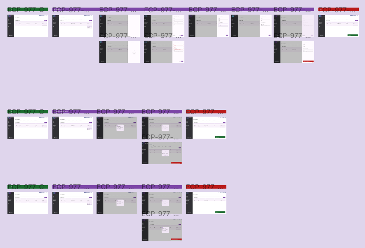
I’ve done a few forum searches and noticed many of you design mobile and desktop frames side by side in a Figma page. I’m looking for some tips on how you arrange those frames in your page.
Example: Mobile Screen 1 on left, with Desktop Screen 1 on right? Or top/bottom?
I’ve tried a few things but it starts to get confusing when I’m creating flows. I’m pretty new to this and working on a small team, so any advice is appreciated!
Sharing an example below of a current set of desktop flows to provide context: