Question

Font in browser seem bolder than in the figma?


Shailesh_singh
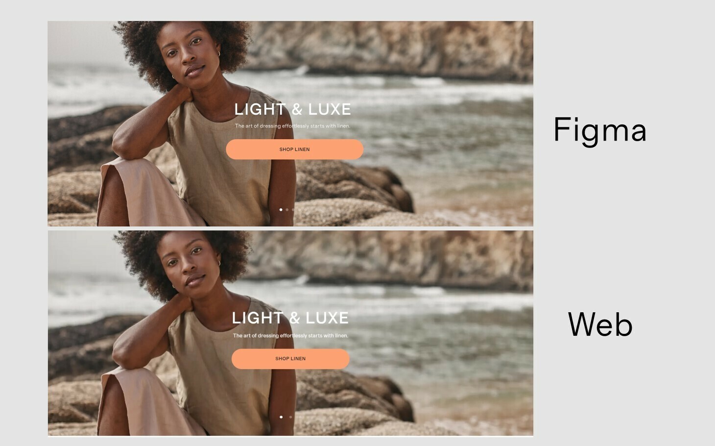
  1. We’re seeing a difference in how font looks in Figma, and how they appear in the browser.

  2. The font size on the site was a lot bolder visually, despite being the exact same size, weight and the exact same font file. It feels very misleading and I’m not sure if maybe this was just an isolated experience because of the font we used.

  3. Attaching the screenshot of comparison

  1. Font – Grosa, type – woff2

  2. Did anyone else experience this? What could be the issue here?

Edited: Added few more Images for better visibility of difference in typography.


11 replies

Baffour
  • 53 replies
  • June 27, 2022

Might just be my eye for typography but I’m not seeing an obvious difference. Could you make the examples use the same text and background image? Might help


Shailesh_singh

Hey Baffour sharing two images for better visibility of difference in typography.


Baffour
  • 53 replies
  • June 29, 2022

Ah great that’s a lot clearer! I’m not a massive expert on font files but I know if a certain weight isn’t defined in the font, your browser will try to approximate the weight itself. Is there any chance that’s happening here?


Shailesh_singh

Thanx for helping Baffour.
Sadly No, We have defined that particular weight in the font.


Ilya_Ivanov

This topic is a bit more complicated than many designers think.

The thing is that every browser engine has its own font renderer that rasterize vector fonts and performs smoothing in a bit different ways. And it also depends on platform-specific algorythms, so that you might get significantly different look in MacOS and Win, for example. More of that, there are user-specific settings on particular machines (e.g. ClearType) that also affect the look of the font. Figma uses it’s own engine to provide consistent cross-platform view for users sharing the same files and it doesn’t always match the view provided by the Chromium engine.

In most cases you won’t get equal view for all platforms and cases. However, some cases can be solved by playing with smoothing params in CSS at the frontend level. This is my typical snippet:

-webkit-font-smoothing: antialiased;
-moz-osx-font-smoothing: grayscale;
font-smooth: never;

Inbal_Pinto

Thanks @ Ilya_Ivanov for the answer,
I encountered the same problem, and searched for the smoothing mechanism Figma uses.

It seems like Figma’s engine is doing font smoothing (antialiasing) on the level of the pixel.
Some browsers supports (by default) subpixel smoothing, which gives sharper results and slight bolder font.

Note that switching from subpixel rendering to pixel level anti-aliasing, to make Figma and browser aligned, will create lighter font, which will affect, for example, readability when using light text on dark backgrounds.

to read more about technical browser support

developer.mozilla.org

Maddy
  • 3 replies
  • March 7, 2023

I think Figma is respecting the actual Native font weights?? But yes each browser is going to programmatically handle it differently. I would suggest looking at all font weights by number value in the browser, making a list of the weights on figma and what number value is shown in the inspect tool, then using the font weight in the CSS that looks most similar to the correct weights, rather than going off what it says in the inspect mode on Figma.


You are a life saver <3


V_ng_H_u_Thi_n

Thank you so much. You saved me a lot of time.


Afique
  • 1 reply
  • August 22, 2024

Thank you, I needed to adjust and the CSS worked flawlessly.


Joe_Garlick
  • New Participant
  • 40 replies
  • October 24, 2024

I think Figma should remove smoothing/antialiasing so it looks more like what it looks like by default in most browsers. ort at least offer the option to toggle this. I find it incredibly frustrating when I set the tone/contrast and size and then it looks different in the browser and I’ve heard from front-end devs they prefer to shy away from adding smoothing/antialisasing to the code. It can make for less contrast and be harder to read which becomes a usability and a11y issue. I’d prefer to just design with what it looks like int he browser.


Reply


Cookie policy

We use cookies to enhance and personalize your experience. If you accept you agree to our full cookie policy. Learn more about our cookies.

 
Cookie settings