
Hello!
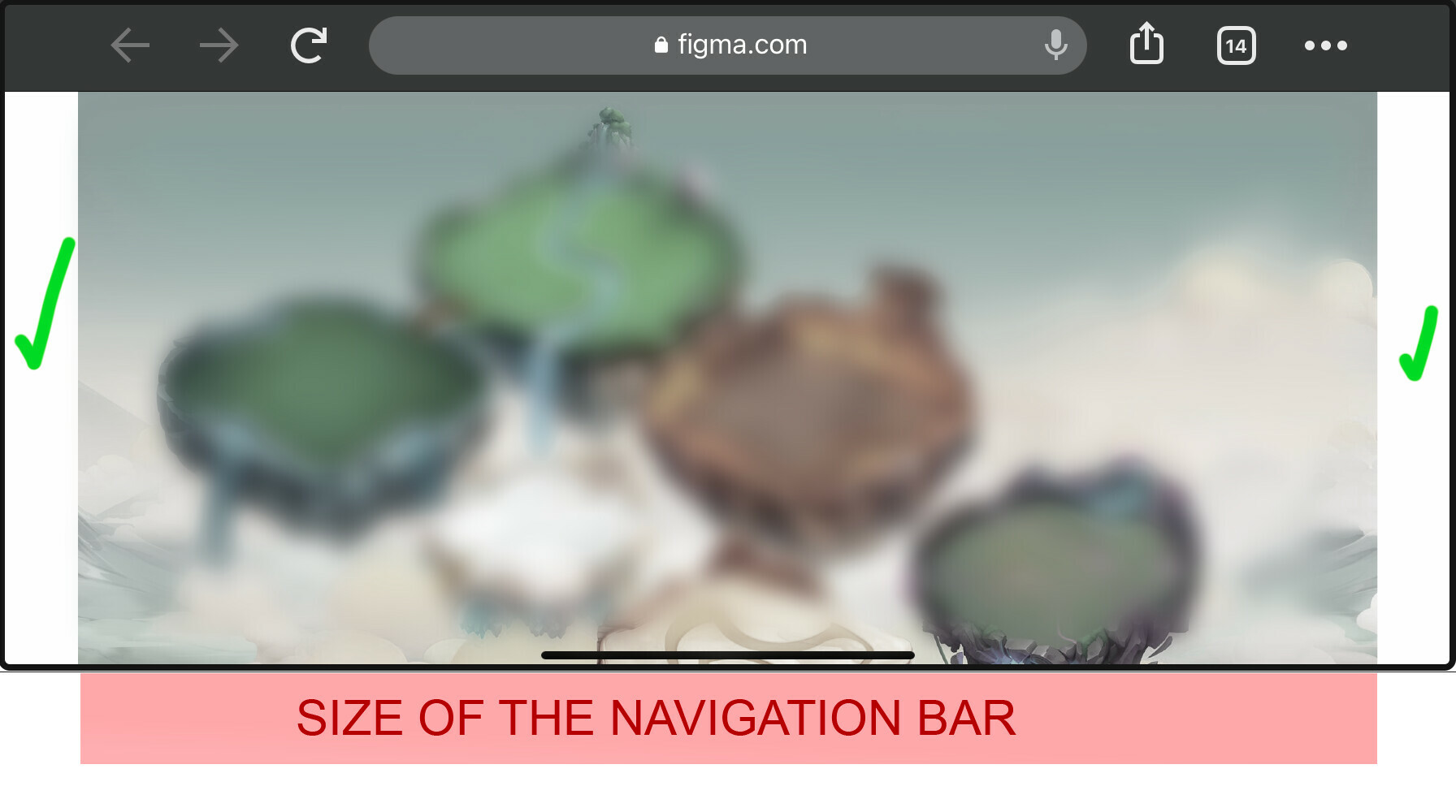
We are trying to play our Figma prototype on mobile using the browser (chrome, firefox, etc.) that opens the “Share proto link” that Figma provides.
The loading works well and you can see the prototype even if you are out of the project and not logged in to the Figma app. This is ideal, because our tester doesn’t have access to Figma.
However, when we play in Horizontal View (the prototype is designed for iphone6 in Horizontal), the prototype is not scaled correctly to fit the screen, it just scales until fills all the width and then keeps the aspect ratio and adds a vertical scroll in order to show all the proto.
This is not correct behavior, should scale until it fills the vertical size and keeps the aspect ratio, even if it needs to add extra black space in the laterals, but at least, users could play the game without weird scrolls and watch the full proto.
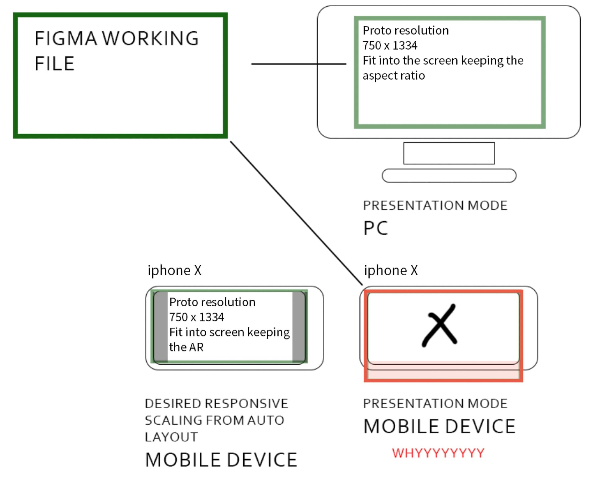
How we can fix it? We need to be able to play the prototype in Horizontal view Mobile without scrolls.
Thanks in advance!