- Describe the problem your experiencing and how your idea helps solve this
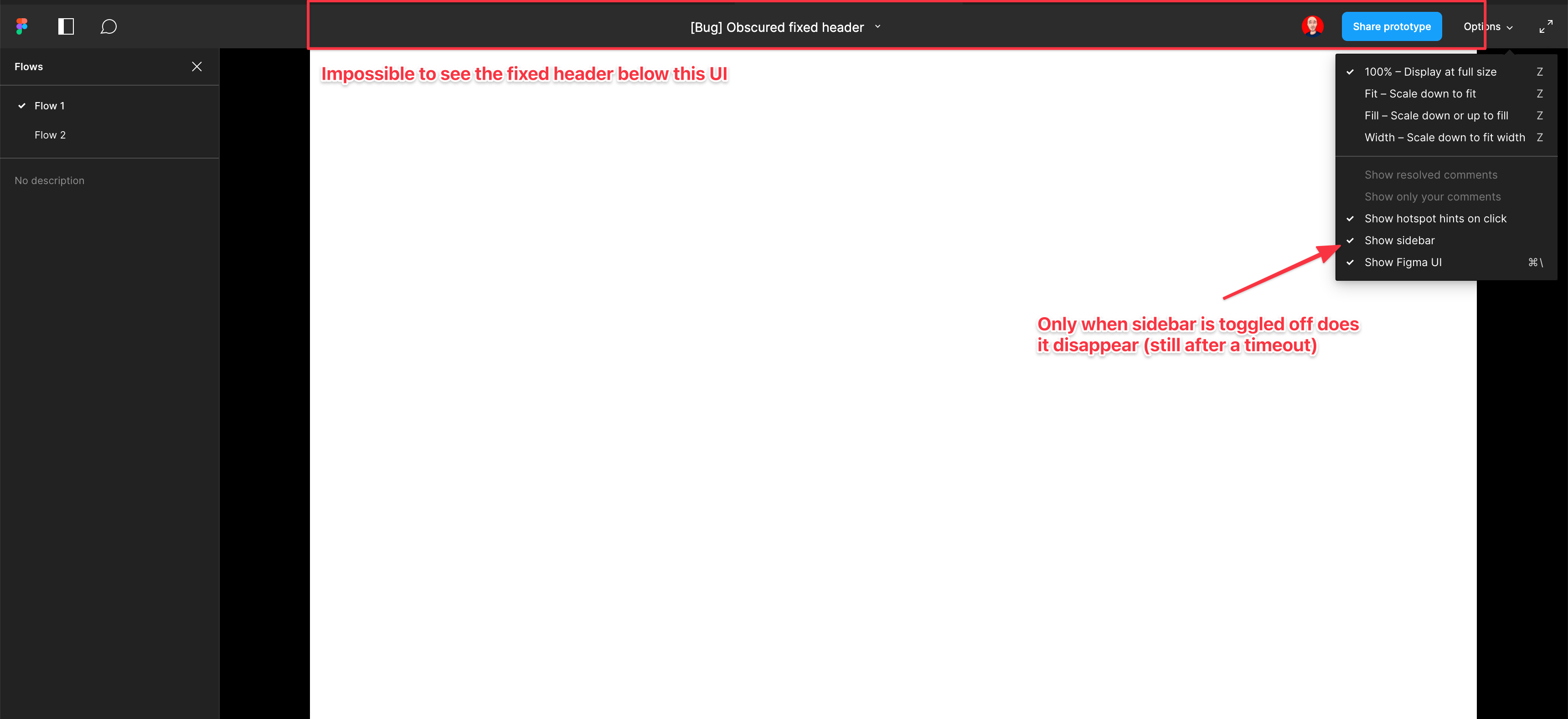
Screenshot and sample file below. I’m using an iMac sized frame with extended height. This issue is exacerbated by the fact that this is the now the default view when using multiple flow starting points and is the only way to actually change the flow starting point. So you have a constant trade-off of whether you want to see the Figma controls or your prototype’s. Annoying as hell.
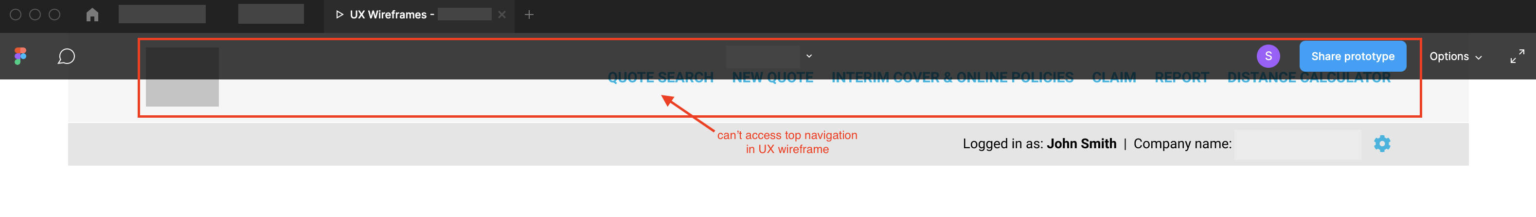
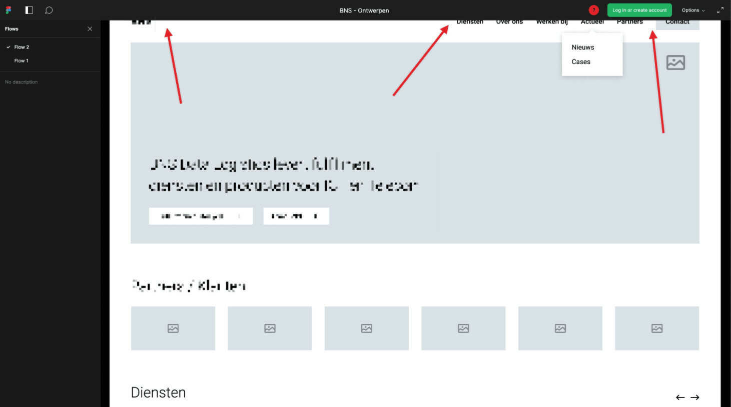
EDIT: When sidebar is hidden, the fixed header is visible but inaccessible. As soon as the cursor hovers near it, the Figma UI appears over the (clickable) website header. Wow…
- Add as much context as possible (screenshots, Figma files, mockups, etc.)
https://www.figma.com/file/WlYbWyHwtBGEFZihdMt2az/Bug-Obscured-fixed-header?node-id=0%3A1