I’m working on updating my company’s design system. I am working on checkboxes and am struggling to get the line-height right, for lack of a better word.
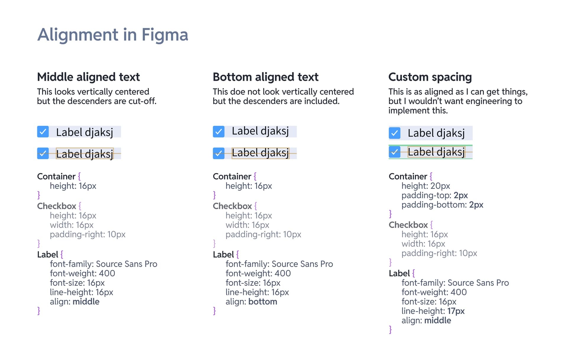
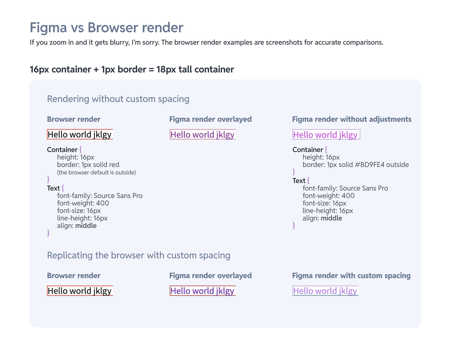
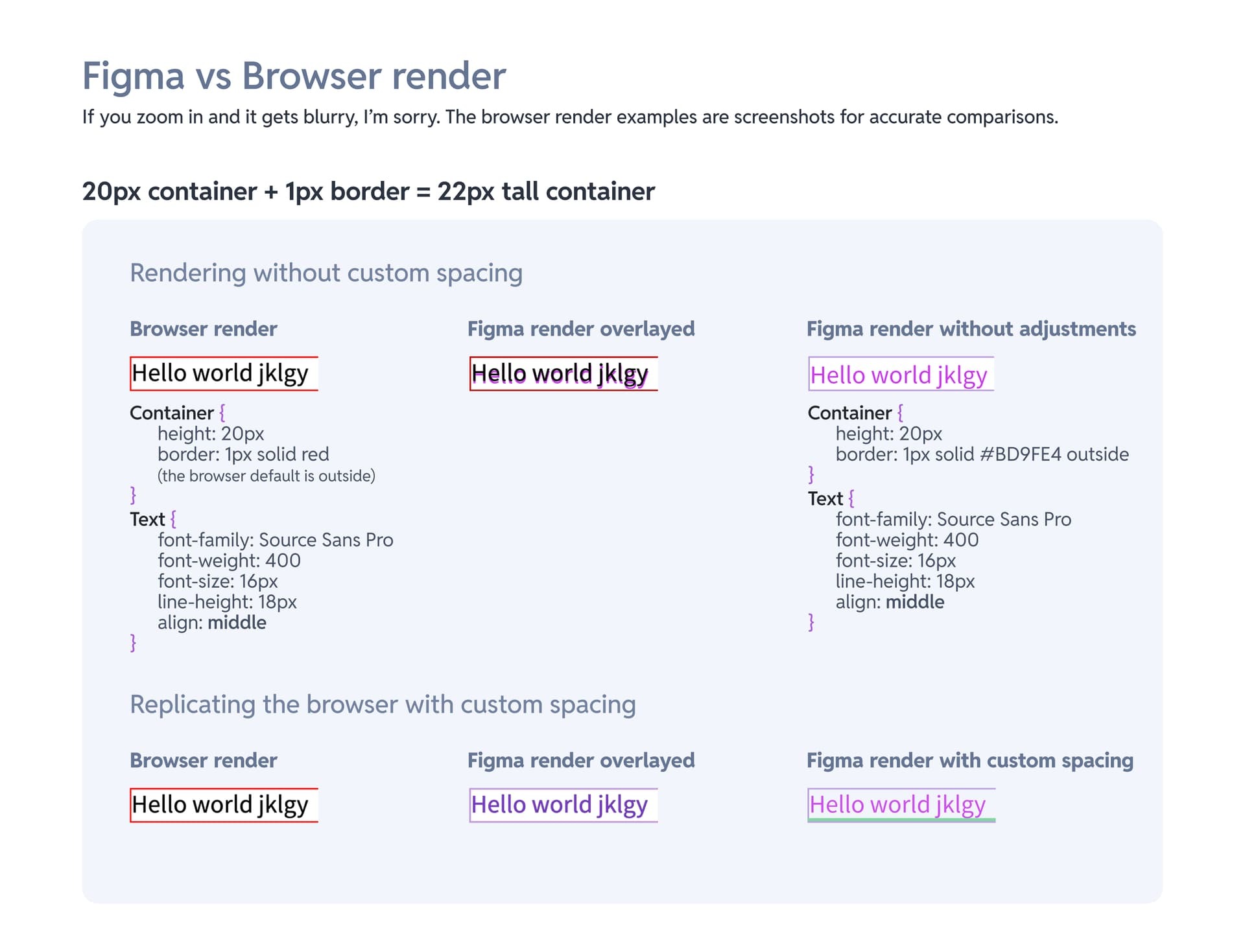
Before I begin: I understand that fonts/text display different in different browsers-- I am not worried about that. I am worried about getting the text correctly aligned in Figma while using standard styles so our engineers can use Dev mode. If I need to set inconsistent spacing for components in Figma, Dev mode won’t be useful for our engineering team.
Like many companies, we use Source Sans Pro. I noticed that Source Sans Pro’s line-height seems to be off. If I have text center aligned, the descenders are cut off. If this was for only text like a paragraph, this would be fine. But since the text needs to be aligned with other elements, I’m not sure what to do.
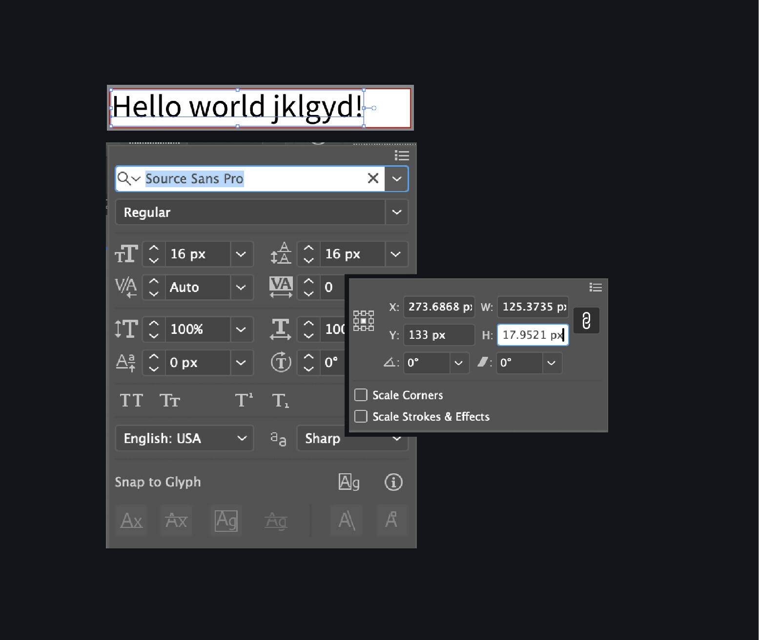
I also checked how Illustrator handled this. When Source Sans Pro has a font size of 16px and a line-height/leading of 16px, its container is 17.95px tall (I had to take a screenshot of a screenrecording to get the bounding box so that picture is poor quality).
I tried upping the line-height to 18px in Figma but it didn’t improve anything.
Does anyone know what is going on and/or have recommendations?
Thank you!


