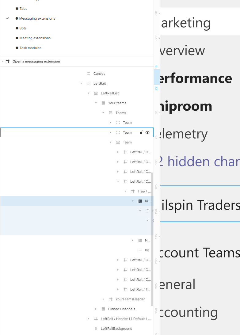
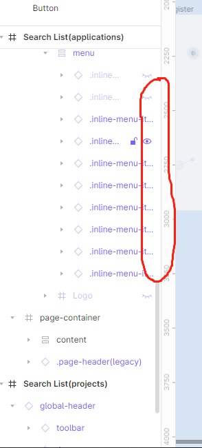
Unless I am totally oblivious to some complicated aspect, it seems like a “low hanging fruit” fix to allow for horizontal scrolling in that panel - but I don’t know what I don’t know. This needs to be resolved.
They need one of those old-school Apple™ cycles where they say: “No new features for now, we’re just going to focus on bug-fixes and stability”.… (not holding breath).
I got an idea. I bet, all each other know some fellow designers using Figma. Let’s share this thread with them and ask them politely for upvoting. Maybe we can reach over 1000+ points and somebody at Figma will reconsider the value of this issue.
Same here. Adding a big +1 on this feature ASAP. It’s not only about real estate screen space but the sidebar even when expanded has a limited with. This is affecting productivity like mentioned here by many designers. @Figma_Moderation or someone please help the community to push this request, it has been started in 2021!
This post was merged by a moderator to this thread, and was originally titled:
Request to change UI panels to palettes
First off, let me say that for this post I am using the term “panels”(perhaps mistakingly) to refer to the two UI columns in Figma on the left (containing Layers and Assets) and the right (containing the Design and Prototyping tools). They are contained within the window and are fixed and inflexible. By "palette,” for this post, I am referring to the UI elements in many Adobe applications (but not XD) that are like mini-windows. You can move them around and resize them freely. And show and hide them individually and at will. And save your arrangement of palettes in order to have more than one.
One of the biggest problems I have with Figma (and frankly, XD) UI is these panels:
1. Tools and functions come and go depending on what exactly is selected. I find myself frequently searching for a button or a menu that jumps up and down within the panel and sometimes disappears. If the panel were a palette, then I would immediately see the item I’m looking and be able to click it OR see that it is disabled. I spend a lot of time trying to understand where something went or what I selected to make it disappear.
2. If I’m working with text, I want to see all my text styles and be able to select them. If I’m working with colors, then that’s what I would like to see. Instead, I’m limited on my 27” high definition monitor to seeing, for example, a mere seven colors. And it takes multiple clicks to get there. If I had palettes, I could see dozens of colors all the time and be able to click them instantly.
I don’t understand how Figma (and XD) took such giant steps backwards from palettes to panels. I can’t even comprehend the advantage of panels. I wonder if this is a massive compromise in order for Figma to make their stand alone electron app and / or constrain it to a browser app?
To be clear, I’m not requesting a mere option to expand the Layers panel more (though that is important). I’m looking for an overhaul of the UI to a better system for everyone’s needs. Here is an example of palettes in Adobe Illustrator — 100% customizable. On a two monitor setup, you can even put all the palettes on one monitor with your workspace on the other.
Arghhhh this is spot on. To resizability, please add dockability.
The inflexible left panel doesn’t stretch far enough open to reveal the ends of some name strings, and that’s without using control naming.
Can you please also permit resizing of the variables table! While it may be a general rule that one doesn’t want scrolling inside scrolling, in this case, managing the scrolled contents is easy (it scrolls) while managing its window is not possible, and the table easily occludes the content. Popping it closed and back open to see edit results is cumbersome.
For a tool that is all about UI and usability they really fall flat on this very important issue.
When you incorporate a tool like Autolayout that requires a lot of nesting to function properly, this is a necessity!
I read people here comment that i shouldn’t use so many layers, but that is just making excuses…components have a lot of layers, and if you put components inside other components, all with autolayout… it’s going to get to a unreadable level very quickly.
If they add an ‘ai’ feature before this i swear i’m going to scream.
I still can’t believe isn’t there a solution for this very serious UI problem (I guess the whole team is busy adding useless AI features to FigJam). Hit a critical wall today, in a way that I cannot hide and unhide items on a child component because I cannot reach the floating menu and cannot scroll horizontally. It’s like you not being able to type on Notepad. Please Figma, fix this!
Three years of ignoring a major issue that is trivially fixable with minor css change.
Figma desperately needs competitors to put it out of it’s misery.