

What do you think about having a horizontal scroll on the layers panel? I can’t see the name of the layers and usually widen the panel to be able to see, but since I use a 13", this makes the canvas smaller.
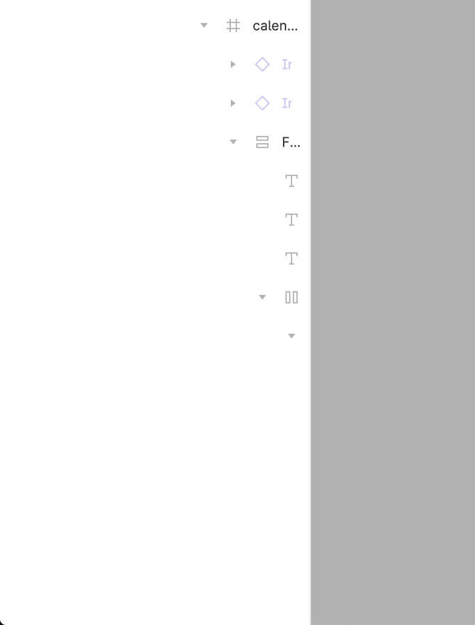
I’m working on a project where I’m building a hierarchical menu next to a data table and the way I’m constructing it is by nesting lists within lists in the layer panel. I know it would be possible to componentise the list but at the moment I need the flexibility to just keep it simple. The problem I have is that the indentation in the layers panel quickly makes it wider than the content so you can’t actually see what is going on.
Hopefully the screenshot crop below shows what I mean:
Does anyone know if it’s possible to make the layers panel wider? My workaround at the moment is to work on the lower levels in the list and then paste them back in to the full list.
We have color and type libraries set up to align with our development environment meaning we can just have “red” or “body” as a description. It needs to be longer.
However, The right bar containing all our properties has become almost unusable in some circumstances due to it’s hugely constrained width. We can often just see a category title, and not the actual label of the color or type.
With the left layers panel being resizable, it would make sense to provide this same flexibility for designers to better utilise our working space.
If Figma is going to “grow up” and be a solid enterprise tool, the UI needs some work and this is a big one that shows no one dog foods complex designs on the Figma team or there is a willful ignorance of solid UX for navigating one’s designs.
I used to make the hierarchy so complex, but then I try to make everything in components, components in components,… (actually not all). It relaxes me so much, I don’t have to care about the detail and the layers panel anymore, now I just edit the main components and it works well, hope it helps you
I was wondering if there’s a way to see the layer hierarchy in Layers panel when the layer nesting level is too high (20+). As shown in the attached screenshot, I can’t really see the name and hierarchy of some layers.
What I tried: I can’t increase the panel’s width further (there seems to be a limit). I can’t horizontally scroll the panel with my trackpad.
I was wondering if we can do something to fix this issue, e.g. by enabling horizontal scrolling on this panel.
(My instinct is that horizontal scrolling might be nontrivial to implement. E.g. calculating the maximum cell width among all the cells inside the list is time consuming; the list may be using infinite scrolling, so the maximum cell width is not a constant)
totally agree. shorter indent for child layers and/or pop-up tooltip of layer name on hover would make this Layers panel way more usable for day to day work.
It would be great to have a horizontal scroll or a way to lock or align right the layer selected since it gets lost, on really complex screen or in nested components the group of layers could get too high, and the further layers inside get lost and doesn’t appear completely on the Layer panel, it would be great to have a way to scroll or view the layer and options ( Lock and hide ) of these layers that get outside of the panel view.