I’d like to create components that have nested icons that allow for not just single color icons, but say I want to be able to swap for the multi-colored Google “G” or a photo element for a logged-in account status. How would I build that?


I’d like to create components that have nested icons that allow for not just single color icons, but say I want to be able to swap for the multi-colored Google “G” or a photo element for a logged-in account status. How would I build that?
Best answer by AlicePackard
Cool! Okay I think that makes things a lot easier for you.
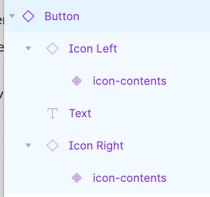
Structure-wise you don’t need to sweat the layers at all. In fact, if your goal is to preserve logo-icons’ original colors, I would suggest purposefully deviating from the layer structure your regular icons use. Like this:
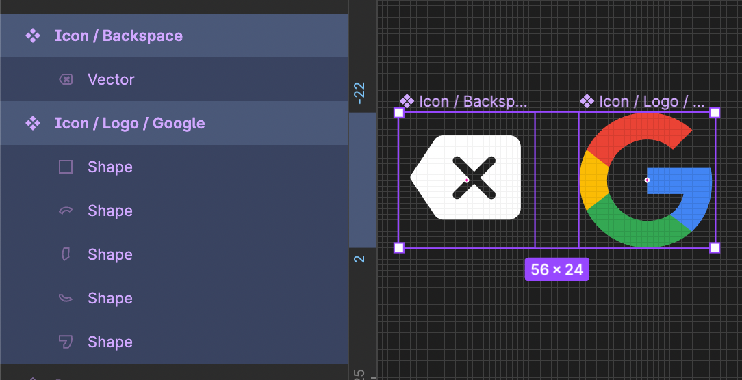
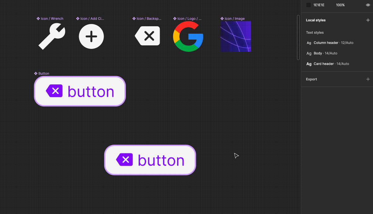
That way when you do make color overrides, they don’t transfer to your icon-logos. In the example below all the icons are white, but when placed in a ❖ Button I override them to purple. But because ❖ Icon / Logo / Google has a different layer structure, it’s protected from also receiving that purple override:
The only things I can think of that you’ll want to make sure are aligned between these things for consistency when swapping:
Let me know if this helps!
Enter your E-mail address. We'll send you an e-mail with instructions to reset your password.