thank you, making the overall page/frame names the same did fix it for me.
very annoying though since having a bunch of frames with the same name also makes it hard to link to the correct one if you’re scrolling through the options of which screens to navigate to for the prototype, and also hurts the file organization. i had changed the names for a reason.
I just had the same issue and what fixed it for me was checking auto-layout settings of all parent containers:
This seems to happen especially when you have your main frame set to autolayout for automatic height adjustment (so while designing it adapts it’s height automatically when adding new elements).
My structure was:
→ Main frame (mobile view, removed auto-layout from this for fix)
→ Content frame (Auto-Layout stacks vertically)
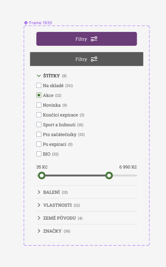
→ Fold-Out element (auto animation changes height, content folds out)
Yeah but then when accordians are opened the main frame doesn’t stretch meaning the bottom accordians go outside the frame and are either clipped (with clipping on) or behind my next section (with clipping off)
Still doesn’t fix the issue that the entire space should stretch without the jump to the top.
A bit late to this topic I gather, but highly agree with this. It is immensely frustrating to deal with these problems, especially as a paid user, expecting complex conditional smart animations to work flawlessly. Not to mention how frustrating it is to present projects to clients.
This problem feels entirely like a case put on a lower shelve by the team Figma unfortunately - even though it’s tied to most of the paid functions -, I wish it would get prioritised over some of the needless changes that get reversed anyway recently.