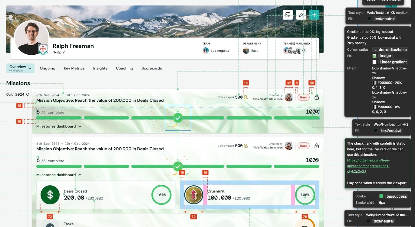
Would be good to see the selected annotation clearer by either have a stronger focus state or lower opacity on the other unselected ones. I almost didn’t notice that the selected layer had an annotation because the green glow is so subtle.
Enter your E-mail address. We'll send you an e-mail with instructions to reset your password.


