Hello Figma Community Team,
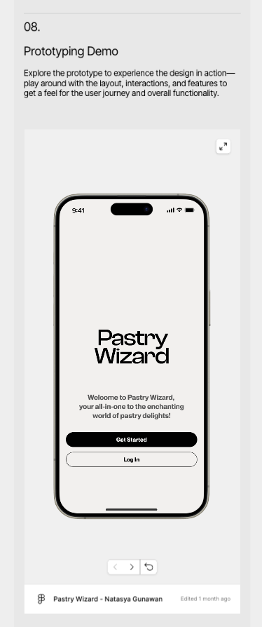
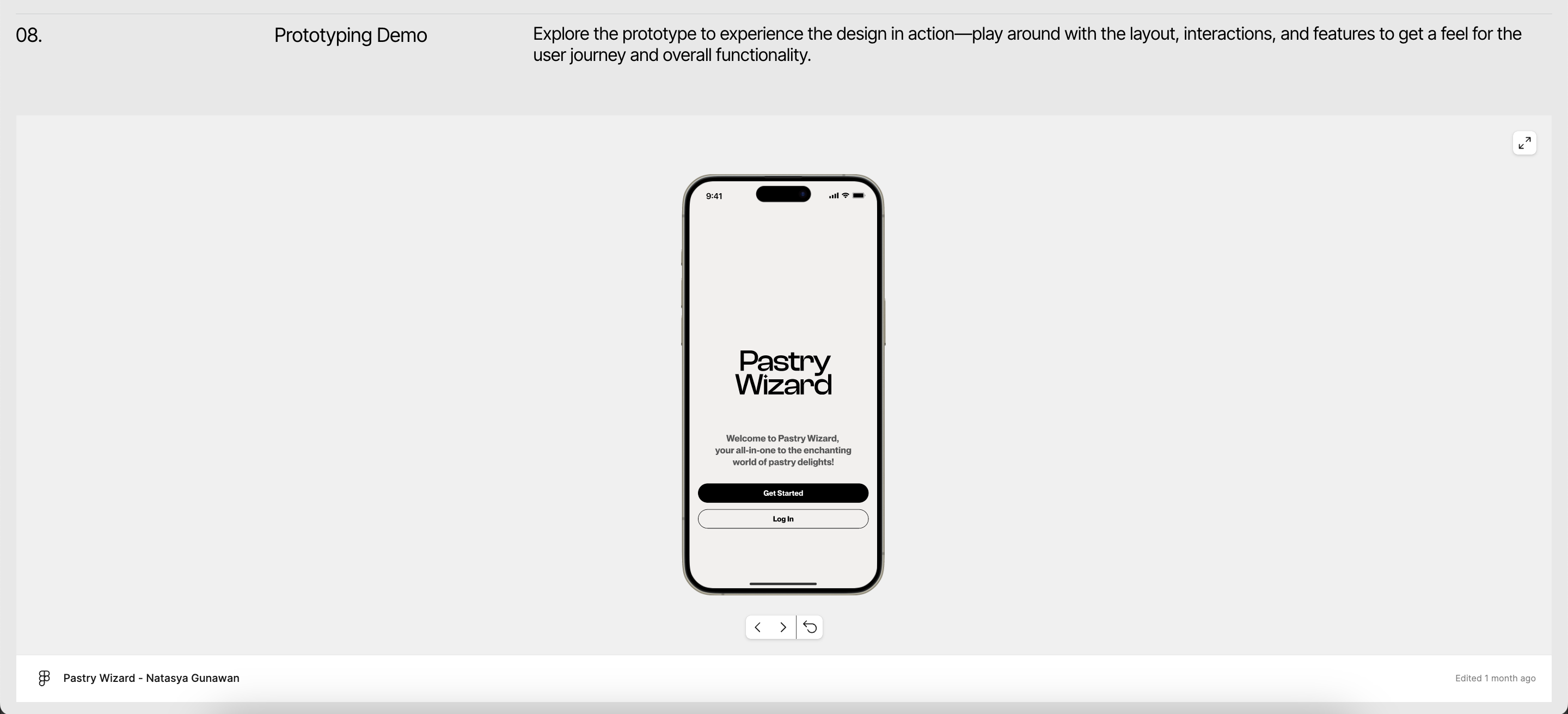
I need assistance with my embedded Figma prototype on mobile via Framer. While the mobile version appears fine when viewed on the Framer canvas, it looks cropped when accessed through my published page at Natasya Gunawan Portfolio. Additionally, I noticed that the iPhone 15 Max is not included in the prototype. On desktop, everything appears to be working perfectly, so I’m unsure what’s causing the issue.
I would greatly appreciate your help with resolving this.
Attached reference images (in order):
-
View on the Framer Canvas
-
View on the published page (mobile)
-
View on the published page (desktop)
Reference links:
-
Published Page (bug when viewed in mobile):
Natasya Gunawan Portfolio -
Figma Working File (edit access provided to support-share@figma.com): https://www.figma.com/design/mJF2ErMhHP63bcab5x23Mm/Pastry-Wizard---Natasya-Gunawan?node-id=0-1&t=p5mlagRQqi6l8KJE-1
-
Framer Project: Framer Login
Thank you so much for your assistance!


