I’m loathed to post this because Figma is becoming a time sink and nothing ever gets fixed, sh!t just gets bolted on with very poor testing and planning to avoid fallout. It’s the new Sketch, Photoshop, you name the bloatware, Figma is it.
Having a group elements in a container that i want to apply auto layout to, let’s say a simple row with cells, doesn’t matter. I have the row, I apply auto layout… yet now I have auto layout of one item with the rest being absolutely positioned. The container element with the background and shadow is now within the auto layout and the rest sit on top with some arbitrary position. This is garbage. Manually fixing this retroactively to the elements is a massive waste of time. Figma is becoming a massive waste of time.
There was an update that changed this behaviour. Previously the container element would be applied as the background, and the contents would be auto-laid-out as you’d expect.
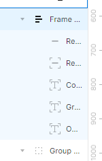
@Figma_Moderation Is there a fix for this? This is becoming increasingly annoying, even the simplest of groups, a rectangle with text in it, applies absolute position to the text.
This automatic ‘absolute position’ was a new, expected behavior following Auto Layout updates made in July 2023. It’s automatically applied to elements that are not a frame to maintain formatting. If you remove absolute position, the elements will stack, which will show the previous default behavior.
This change was made to prevent a frame or layout that you’ve already created from visually changing when you apply auto layout. Even if that means that the auto layout settings you’ve applied might not exactly match what you intend. Previously applying auto layout to a rectangle with an element on top would have moved to elements to sit next to each other, so you then had to move them back or adjust your layers once auto layout was applied.
We understand that not every change will fit with every user’s way of working, but we appreciate your feedback on this. We’ll be sure to pass this onto our Auto Layout team to consider for future versions.
Please note that Figma_Moderation is not associated with Figma or our Community moderation team. The forum is primarily run by the community, so if you have an important bug to report feel free to submit a bug report to our support team directly via the form here: https://help.figma.com/hc/en-us/requests/new?ticket_form_id=360001744374
This is the Dreamweaver equivalent of “ApDiv” and the automatic part of auto layout forces a rebuild of the component and slows down the productivity that made Figma great. Not to mention the inspect panel is full of garbage code.
Please can you point me to the Topic that reached this conclusion?
We understand your frustration. There is no specific topic we can share asking for this behavior.
Ultimately, it was a judgement call that our Auto Layout team took into account after launching Absolute position in Auto Layout. It was discussed and tested internally that the absolute positioning of a nested frame is a preferable outcome after adding auto layout, because the alternative would shift the overall size of the stack and its child’s position quite significantly.
The team has also confirmed that we’ve received pushback from the community regarding this change, so we can confirm that they’re already actively working on this to ensure a smoother and more efficient experience for our users. While we don’t have an exact timeline we can share, keep an eye out for future releases: https://www.figma.com/release-notes/
I keep getting this issue when adding autolayout to two frames. Usually, I would expect the new autolayout frame to hug both elements, and depending on where the two child frames were, they would either align top-bottom or left-right. However the issue I’ve been having is that when I try to add autolayout, the autolayout frame only hugs to one of the frames. This is extremely confusing and I can’t seem to fix it. I can’t seem to get it to hug both child frames without resizing it, however this doesn’t automatically adjust to hug, it just sets it to a fixed height or width.
I have figured out the problem - for some reason, when I create these autolayout frames, sometimes ‘absolute position’ gets set for one of the child frames without me pressing it. This must be a bug.
Hi Dvaliao, i’m not sure this statement is accurate. In this simple example you’ll see I have only 2 shapes on a canvas. No frames at all.
I select both, apply autolayout with kb shortcut the first time and you’ll see that autolayout is applied without absolute position on either item.
Next I undo back to the starting state, nudge the line a bit, select both and apply autolayout again and this time, absolute position has been applied to the line.
I think the system is applying logic to approximate a ‘guess’ as to what the user wants/expects in terms of layout direction… It’s trying to determine if autolayout should be applied with vertical layout, horizontal layout or wrap by default. When the arrangement of objects isn’t clear (enough), it picks the layout matching the majority of the items and places the others using absolute positioning. You can see that happen in this vid.
I suppose this is an elegant solution and in most/many cases users get what they would expect, however when the absolute position outlier logic is applied, it’s definitely NOT obvious to the user WHY or even THAT absolute position has been applied to a subset of items.
Maybe the toast success message could provide a hint.
Here is example of another strange and annoying behavior.
3 object are in straight line, after hitting Shift + A for Auto Layout, one of then has absolute position. Why?
All 3 objects are same size and even there is same space between them, even before applying Auto Layout.
Please add option to disable automatic application of Absolute position.
We do not want automatic Absolute positioning that has no logic.
Just want to add that is also driving me and my entire team crazy. It took my simple Shift A action and added so much extra effort every time. I couldn’t find anything in the forum about it so had made a new post here: Random frames defaulting to Absolute Position when applying Auto-Layout. Glad to see I’m not the only one who has been frustrated about it. Wish they would revert back to the previous behavior
Yes, this is what I keep experiencing too!! In some of the examples shared above its (somewhat) justifiable that absolute position is applied by default to one of the objects. But the more common thing that keeps happening to me is the example you have shared here where it makes absolutely NO sense for it to be applied.
Thanks for providing these examples. It’s somewhat ironic that having “auto” in the name is adding extra manual effort each and every time.
Also, when developing components, it is extremely rare to consciously use position: absolute; for anything other than decoration. So this needs to be a conscious decision to enable absolute positioning for layers in Figma, rather than assuming that to maintain the visual arrangement. I’ve had many situations, like my first screenshot, where all are absolute except one… wtaf lol
This change was made to prevent a frame or layout that you’ve already created from visually changing when you apply auto layout.
Regarding this decision - Layout is layout, not visual design. It is a consistent way of organising elements. If I apply display: flex; to an html element I don’t then go and apply absolute positioning to some of the child elements to keep the visual design.
Love the toast idea, I think that would help! What would be even better would be:
If you hit undo, it could snap everything back into autolayout. So, applying autolayout with absolutely positioned elements would work like it does now, and be one-step, but undoing would be 2 steps - first undoing absolute positioning, then undoing apply autolayout.
I think snap to autolayout should be the default behavior, and you should have to manually override the element you want absolutely positioned. Right now it works the exact opposite way.
But IF preserving absolute positioning is going to be the default, there needs to be a simple and elegant way to undo/override that. Otherwise what’s the point of autolayout?
Final bit of feedback from me, small usability issue. I only googled this because I could not figure out how to undo the auto-applied absolute positioning on my elements. I kept clicking the resize to fit button. Took me forever to realize you have to un-click the active absolute position button. Could just be a me problem, but it added to the frustration.
Yeah the design of some of the UI elements in the Figma app/tool panels contradict each other. Some are so subtle, others hidden in nest dropdown menus (WTF!!!). Just bolt-ons
yeah, it SHOULD help, but it doesn’t! and how can Figma decide what size of frame do I need? when I autolayout objects, because of this Absolute position all my nested layers just get stuck onto layout nearby (image you build a form with many fileds), no help!
I would like to add to the chorus of feedback that this feature is more problematic than helpful. I train designers on Figma, and even I’ve struggled to figure out an actual use case for this feature that’s not an edge case. It’s hard to explain to people who are already confused and overwhelmed by Auto Layout. Absolute positioning might be the least understood facet of AL as is. When it’s applied automatically, objects might be hidden out of frame, making it even harder to resolve.
If I create a new frame with Auto Layout (with Shift+A that’s usually the case), there’s no need to hide any content to preserve a height that has yet to be officially set. It adds extra steps to a tool that is supposed to remove them.
One additional rumination… Even if we entertain the notion that every user of AL possesses expert-level comprehension, acknowledging that when applying it to multiple objects, absolute positioning might affect some, all, or none of the objects, the lack of transparency regarding the pattern or algorithm AL employs renders its behavior unpredictable at best.
In situations where AL fails to apply absolute positioning to desired objects, manual intervention becomes necessary. Conversely, for items where absolute positioning was undesired, users must expend effort to remove it.
Perhaps in the minds of Figma developers and product teams, the implementation of absolute positioning prompted discussions on enhancing its functionality. They might have contemplated employing a “best guess” algorithm to intelligently position items when AL is applied to a frame of objects. Ideally, this would align with user expectations, with items remaining in their intended positions. However, the worst-case scenario entails users having to adjust items that were incorrectly positioned, introducing a learning curve. Despite this, the feature may be perceived as intelligent over time.
Yet, skepticism remains. The apparent randomness of item placement when AL is applied may never become something users fully accept or acclimate to.