
Hi there
For reference I an a relative novice whom is diving into the complexity of building out assets that tick as many of the boxes that need to be accounted for.
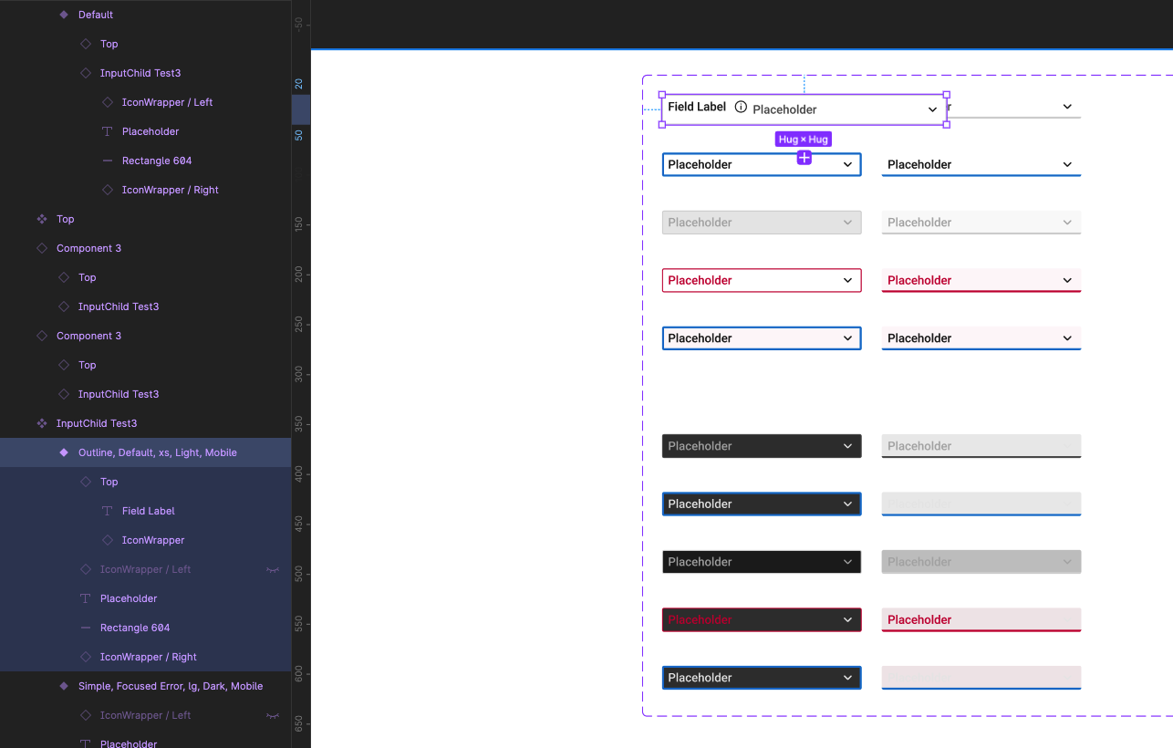
As it stand the input has been build with all its variables needed as part of its source component. I then went about creating a nested/new component with the input copy which contains all the variants needed. Above and below this input copy is the likes of a field label + icon beside it, above the input. Below the input is a helper text and below that is an error msg. All was going well as the use of Boolean properties allow one to hide these elements which then creates use usability.
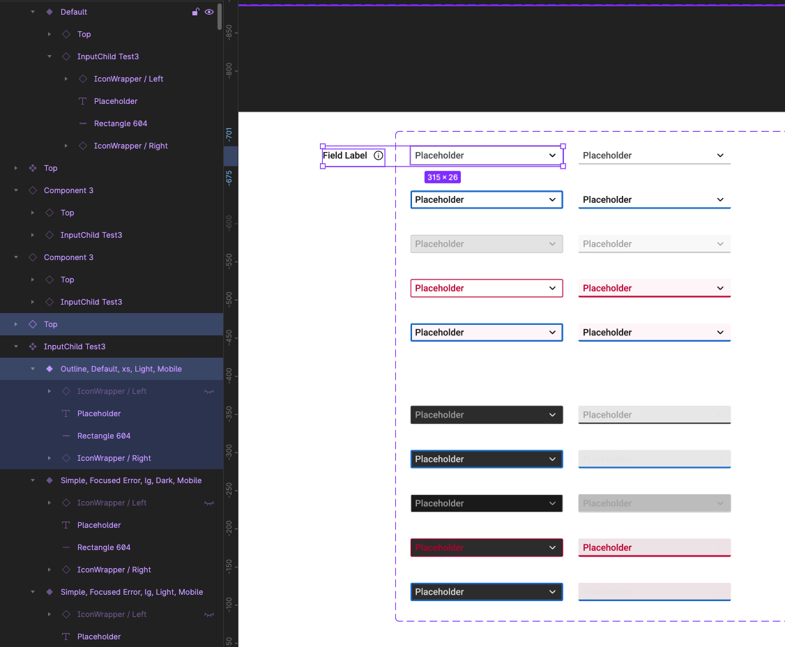
The issue that I have realised is due to the design system having different type sizes and input heights across its sizes that then means the field label and possibly the text field below the input may likely need to match the size of said input. This is achievable by way of adding variant to the above and below elements of the input, the drawback from this is having to manually change the input size and the above and below sizes. This increases the chance of inconsistency and more steps involved to reach a desired look.
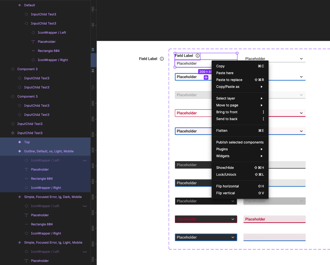
So I have tried to force or place said above and below elements in at the master input component level but I can’t seem to find a method to allow these elements to be associated with each input variant while sitting outside of said input as when dropping in external elements they only seem to be able to push into the overall input varian.
Question 1: Is there a way to expand the parent component/variant to allow the original input to remain as is, alongside the new nested elements above and below the original input, without having to take copies, detach said copies and then rebuild the whole component with the new elements as this seems to be the only way I can do this from what I can find thus far?
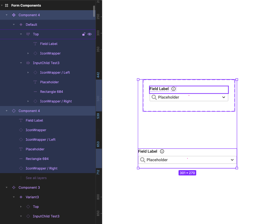
Question 2: Is there a way to keep the master component as is with a copy of this, nested into a new master component that contains the “top” and “bottom” elements but have those elements change their size according to the change in size of the input?
Q2. Below is the breakdown of that parent component and a copy of it.
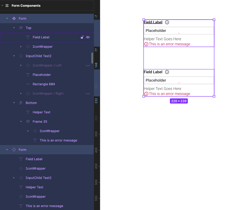
To recap I am trying to accommodate the fact that there is various size of text but those changes being all tied together into one change of size to avoid the amount of steps involved to maintain consistency.
I apologies for any terminology that is not correct, and I appreciate the help.
Scott