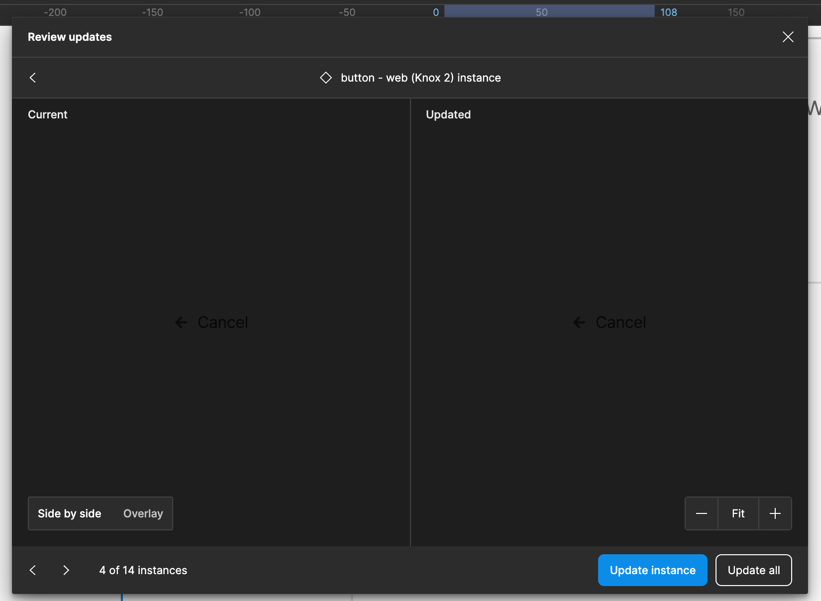
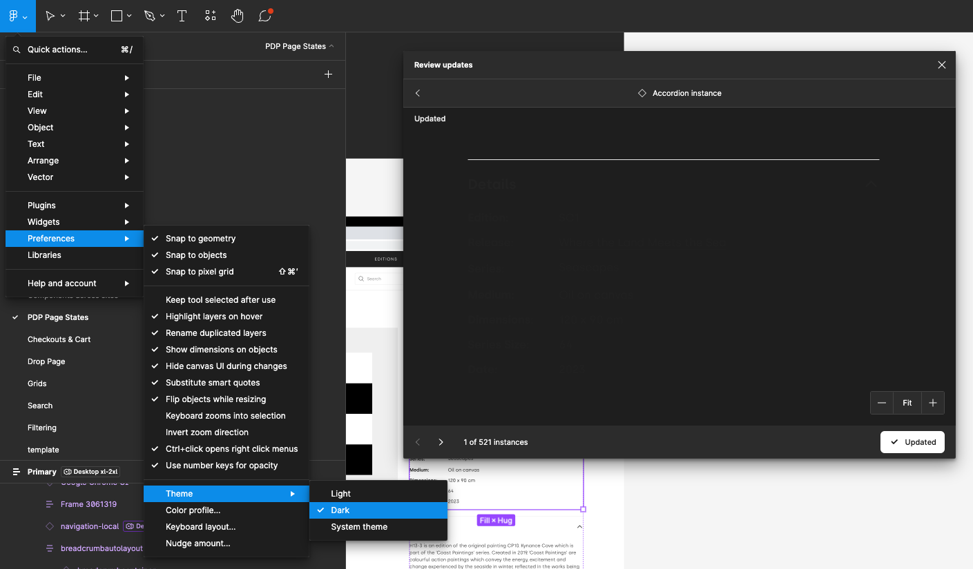
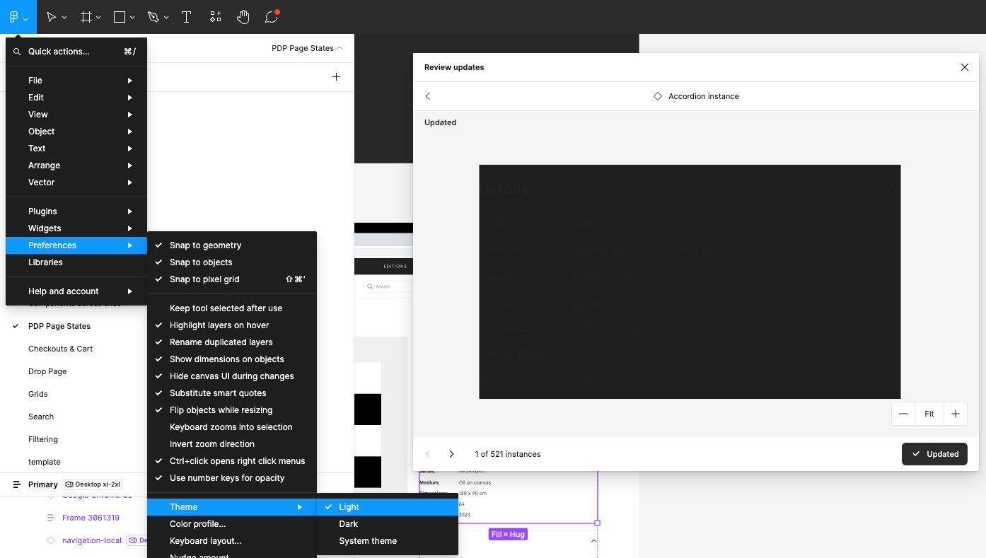
The background color of the Review updates window does not allow the current and updated components to be compared depending on the color of the components.
In example below I am using Figma in dark mode and trying to compare two components that have black text. I am unable to do so because the dark text of the component is not readable on the dark background of the Figma UI.
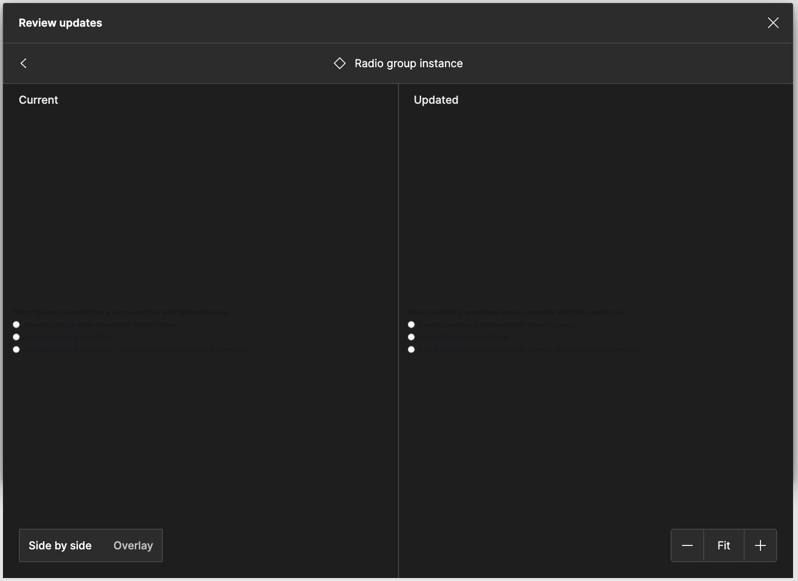
This can at least be worked around by swapping to light mode while reviewing updates, but I agree that this is unideal. A color picker near the “Side by side / Overlay” controls would be ideal.
Open the Review Updates modal when component updates are available
View a dark instance in dark theme, or a light instance in light theme
Expected result:
Be able to visually review any differences between current instance and its updated version.
Actual result:
This is often impossible due to the instance blending almost entirely with the modal background.
Suggestions:
I can imagine a smart modal that dynamically adjusts its background color to best show off the content, but really I’d be happy with a light/dark toggle.
I can’t inspect updated components when the Figma theme (light or dark mode) clashes with the content. The same thing happens in the component playground on dev mode. This happens often because its common to have components with transparent backgrounds. Even when i change the theme whilst the window is open, this issue persists.