
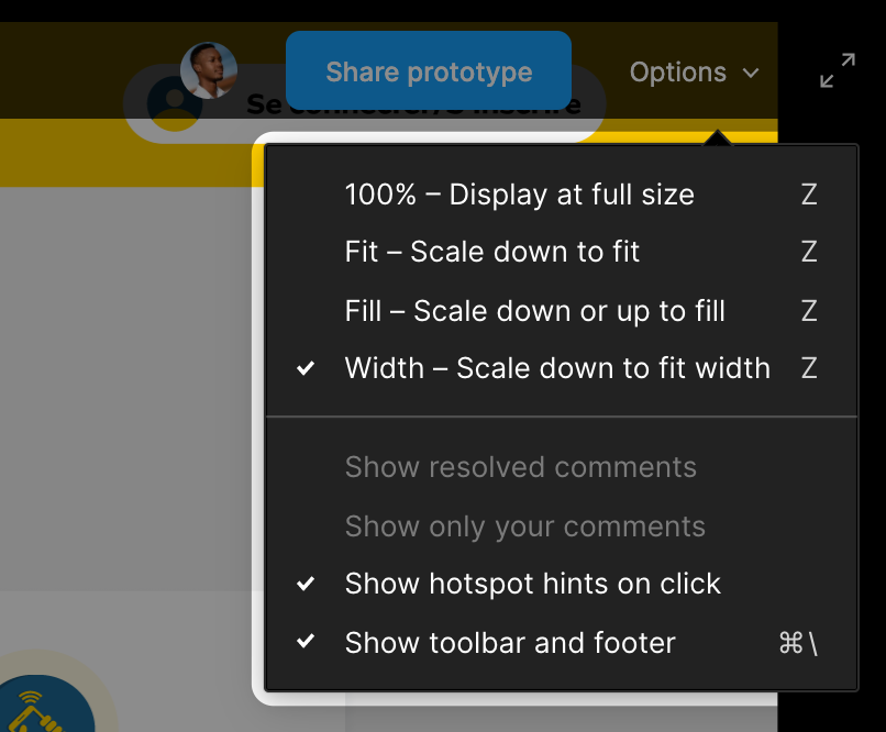
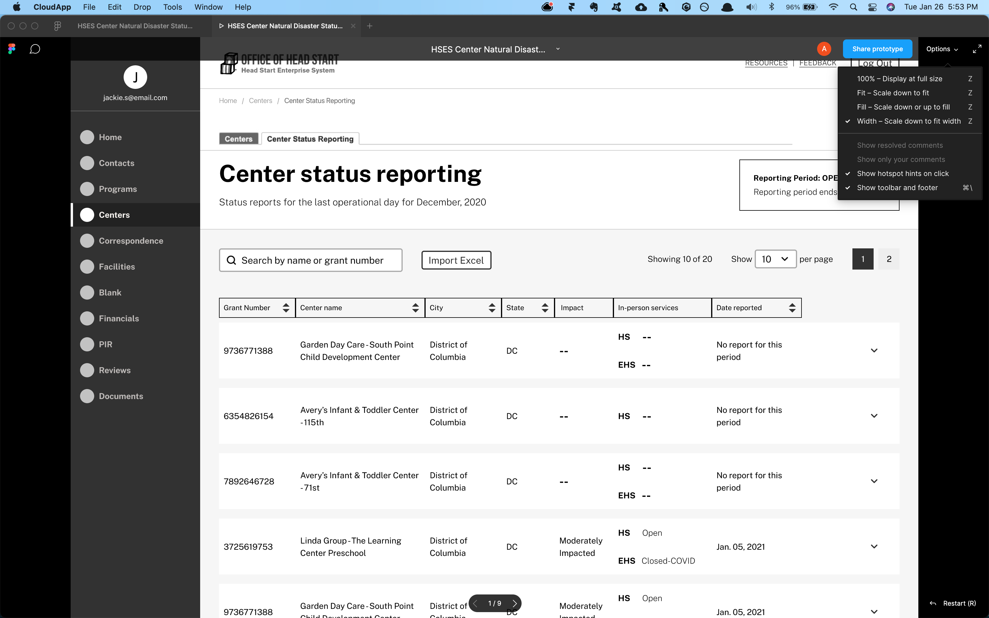
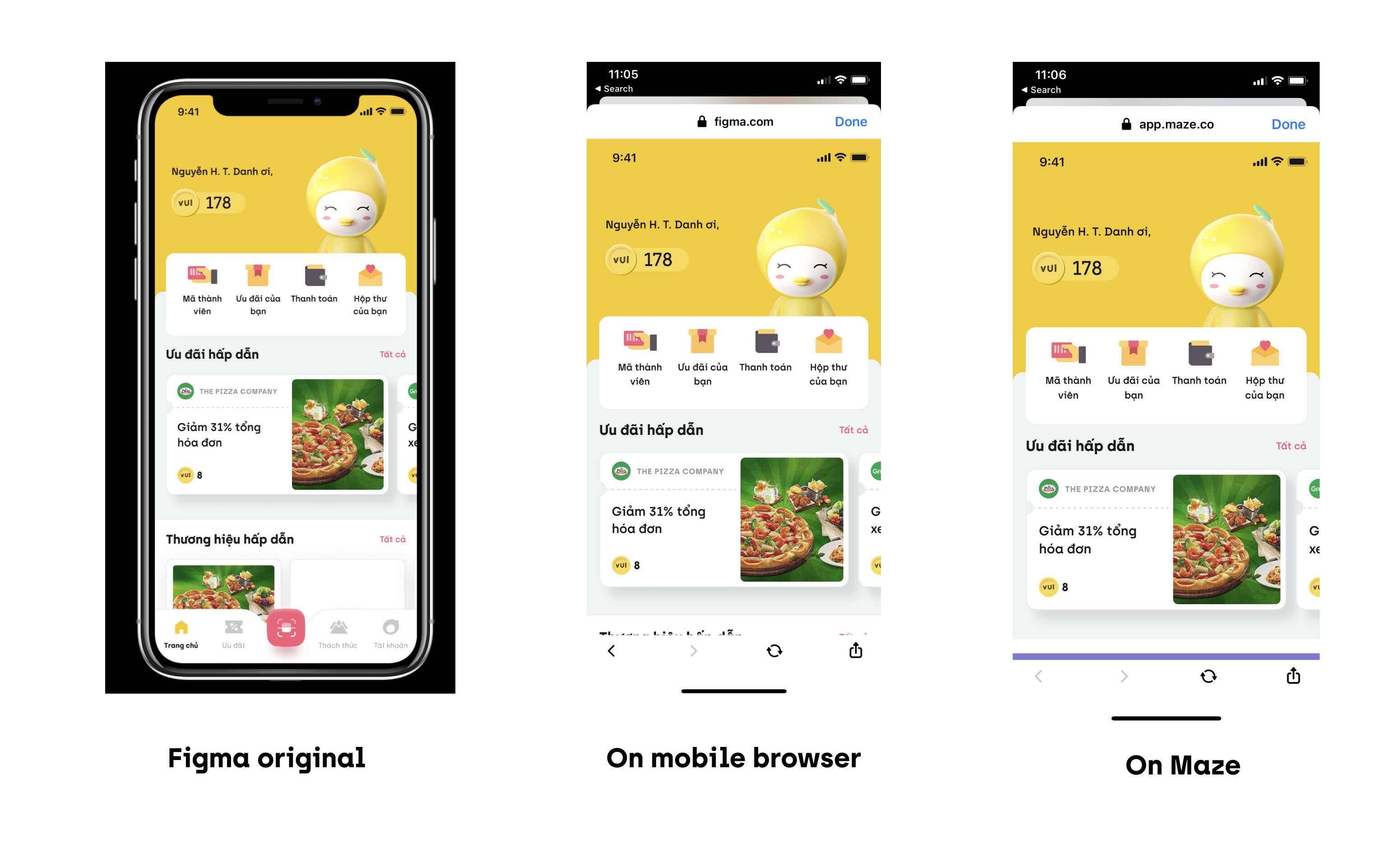
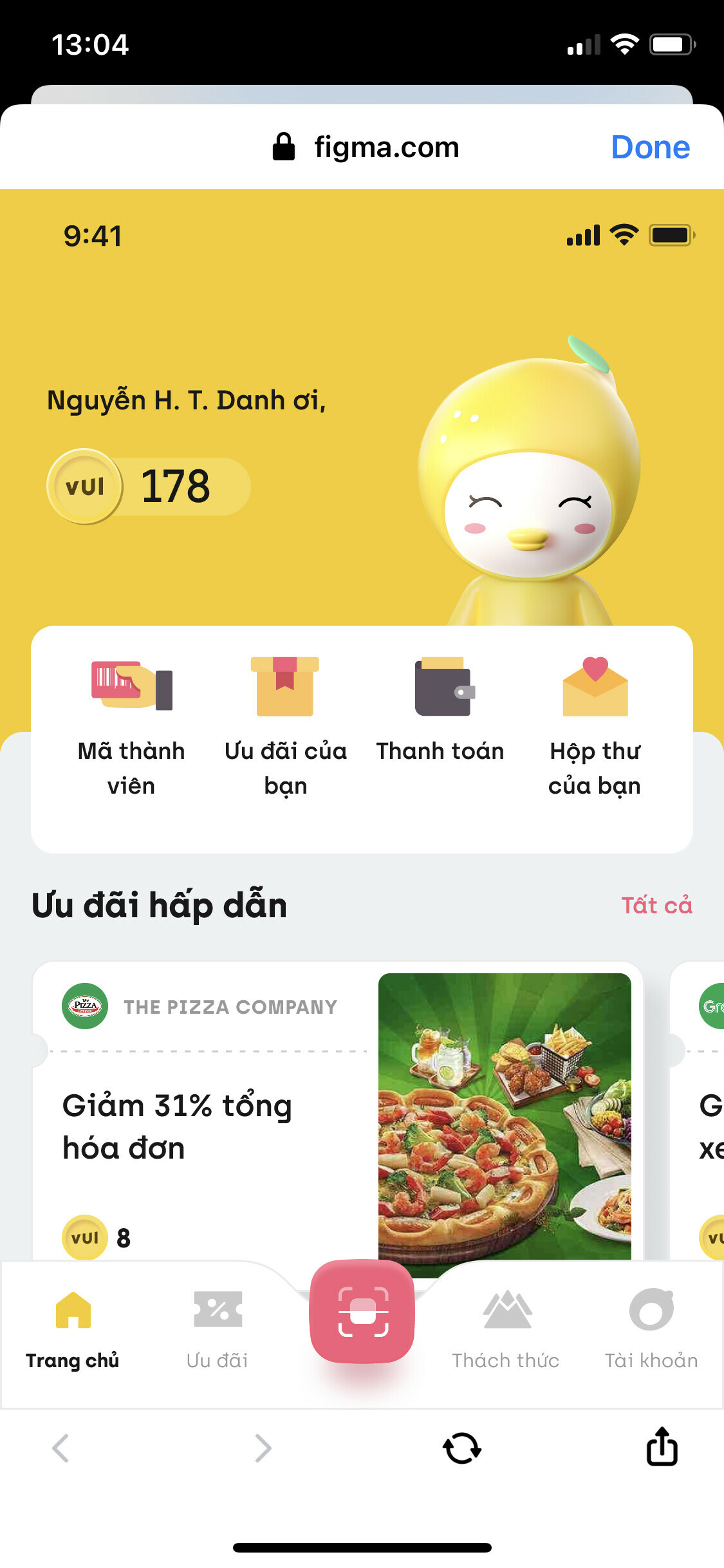
Currently, the preview is locked to whatever dimension the design is (if your design is 1440, the prototype/preview will always bee 1440). This is fine if you’re designing for mobile, where the dimensions are largely fixed; however, it’s a nightmare for Web. Especially if you need to send the design for user testing or stakeholder feedback. If their screen dimensions are not exactly the same as the design, they won’t see an accurate representation.
The preview should be ADAPTIVE to the design’s constraints and layout behavior, or else what’s the point? Framer does this beautifully and has different preview options to allow for this.
Quick Note: This is NOT the same as ‘Responsive’ preview, where the design changes as you change the screen size.
