

Hug until container is too small

  • November 12, 2024
  • 17 replies
  • 669 views

Bethany_McBride_174

I would like an option to hug content until the container it is in is too small. For instance, I am making a tab bar where the tabs are set to fill so they adjust with screen sizes. The title on each has an info icon to the right. The text has to be set to hug for the icon to stay right next to the text. However, that means if the text is long, when the tabs shrink the text extends out rather than wrapping.

I would like the option to set the hugged text to wrap when it extends past the parent container without having to manually change it a each breakpoint.
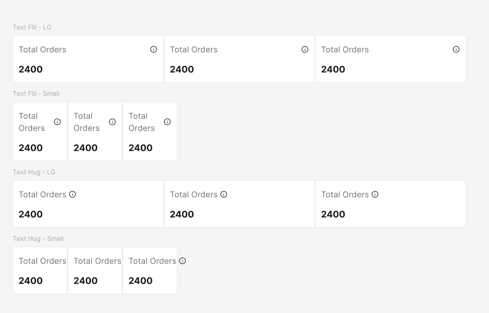
17 replies

Adam_Rodriguez

Have you tried max and min width sizes? This isn’t always the best but it does get the idea across in some cases.


UsabilityJeff
  • New Participant
  • April 4, 2025

Ugh, I currently have a requirement for this too!

In my case, I am making labels for the Y-axis of a chart. It would be easy except that on hover there is fill color, so the frame of the text needs to “hug” the text.

Some labels can be quite long though, so they need to wrap to fit in the “label gutter” container. That is, the frame magically needs to turn to “fill” when the “label gutter” container responsively narrows.

My work around is to have two variations of the component, one for short labels that don’t need to wrap, and one for long ones that do, But this only partially works for a defined range of container widths, where all the short labels never need to wrap, and all the long labels never need to hug.


Francesco_Fagioli2

I'm building a responsive alert banner and trying to achieve a behavior similar to fit-content in CSS. Here's what I need:

  • The banner container stretches to 100% width,

  • Inside, there's a button and a text label,

  • The text should stay on one line and hug its content until it reaches the limit of the container,

  • Once it can't fit anymore, it should wrap onto multiple lines (essentially behave like fill).

Think of it as:
"hug content until there's no space left → then behave like fill".

This should happen dynamically, depending on the container width,

so no fixed max width.

Is there any way to simulate this behavior in Figma, maybe with some clever auto layout nesting or constraints?

Trying to avoid duplicating the component with two variants (hug and fill).

Thanks in advance for any ideas or workarounds!


Bethany_McBride_174

Have you tried max and min width sizes? This isn’t always the best but it does get the idea across in some cases.


That is a good suggestion, but as you said not the best.

The problem with min-max widths as a workaround, is that it limits the reusability of the component. I could set the max width to the width of the current text, but then if we need to change the copy or use this in another area with different labels, then we would need the max width to change for each use case. 


Harry-Pekka_Laakso

It would be nice to have more CSS-like options for designing auto-layout content. Making min and max values for each breakpoint just feels wrong but currently there’s no other way 😥


Mohsen_UX
  • New Member
  • September 26, 2025

Hey there! Have you found any solution for that issue? 


Dan2
  • New Participant
  • November 5, 2025

Came here looking for a solution to this as well


Martin Rasmussen

Same here. Missing an ‘always respect parent boundary’-option of some sort.


Stevie3
  • New Member
  • January 22, 2026

something like this? 


Narelle
  • New Participant
  • January 27, 2026

This function is so needed to be able to effectively communicate what is required, and seems like basic principles that figma should support. There is max-width function but it is a fixed value, so does not support building a responsive component. Potentially allowing percentage values in max-width could achieve this i.e. 100%, so it response to the parent container size. However, max width would also be required to restrict to an absolute max - i.e. to ensure paragraphs don’t exceed a width suitable for readability when the parent container is even wider.


Narelle
  • New Participant
  • January 27, 2026

Stevie3, that example only supports the wrapping, not the hug required when only one line of text


Narelle
  • New Participant
  • January 27, 2026

Francesco, it appears to be a current limitation of Figma, as the container can either be fill or hug only. You can use the max-width to force a wrap on a container that hugs until it reaches that max-width, however the max-width is a fixed value so it can not be set to follow the parent container size.

There is this post that is related to this same topic 


Alina Peycheva

This functionality is essential!
The text should hug when short, and fill the parent container when it exceeds its width.

Figma add something like 
max-width: 100%;


HappyDance
  • New Member
  • April 22, 2026

As a developer trying to provide responsive components for the design team, I’m completely shocked that this isn’t supported.


This should be as simple as text defaulting to wrap… just like standard browser behavior. When the parent is smaller than the length of the text, the text wraps. That’s it. Done. Add a property to disable wrapping when you don’t want it.


Unless I’m mistaken (?), there isn’t anyway to wrap text in a responsive layout unless it, and all of its ancestors, are set to ‘fill’? This, combined with the lack of percentage-based widths, outside margins, and calc()-like functionality make it seemingly impossible to support truly responsive components.

Something as simple as positioning an icon at the end of text or expanding the height of the text when the width collapses should be essential behavior for responsive layouts. You shouldn’t be required to make a new fixed max-width variation for every breakpoint to support such basic, standard functionality. 


Damian_Summersall

Likewise, this would be so handy in matching how our components work in dev. 


Callum T
  • New Member
  • June 11, 2026

Please Figma make this a feature. It’s so painful having over lapping text when I need for example.

[ Price: £10.00 per month ] < I want Per Month to wrap under this. But I can only get it if FILL which makes it look odd. [ Price:             £10.00 per month ] - I want my £10.00 content next to my Price text box. 


Carmen XiTrust

This really is a necessary feature #upvote