It works exactly how it is on image. And in case of “Hug Content” basically both options look the same.
Is there any particular reason for it not to work normally?
I encountered the case when I need bottom row to actually be bigger then top one.
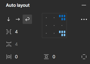
It works exactly how it is on image. And in case of “Hug Content” basically both options look the same.
Is there any particular reason for it not to work normally?
I encountered the case when I need bottom row to actually be bigger then top one.
Hi @Volodymyr_Kosianchuk, Thanks for sharing your thoughts about Layout flow Wrap direction. I understand your frustration.
When one or more resizing properties are set to “Hug contents”, some Alignment selections may not visually change the layout on the canvas. This is because “Hug contents” removes any extra space around the child objects.
For more details, you can refer to: Explore auto layout properties | Alignment
Regarding the Wrap direction, I tested on my end, and even when selecting align bottom right, it seems that objects are arranged in multiple rows and columns flowing horizontally and wrapping to the next line, as shown in the alignment box.
For more details, you can check here: Explore auto layout properties | Layout flow
While I know it may not be a perfect fit, to maintain the position, absolute position and constraints with right top or right bottom might help.
I totally understand that due to the current limitations mentioned above, you might need an additional wrap option to be able to make the bottom row bigger than the top one.
Thanks again for your feedback! I believe this idea would be beneficial for other community members! Please let us know if I overlooked anything.
We rely on votes to gauge community interest and prioritize accordingly, and we are excited to see the reaction from other community members. Please give it a vote up!
Thank you.
Enter your E-mail address. We'll send you an e-mail with instructions to reset your password.