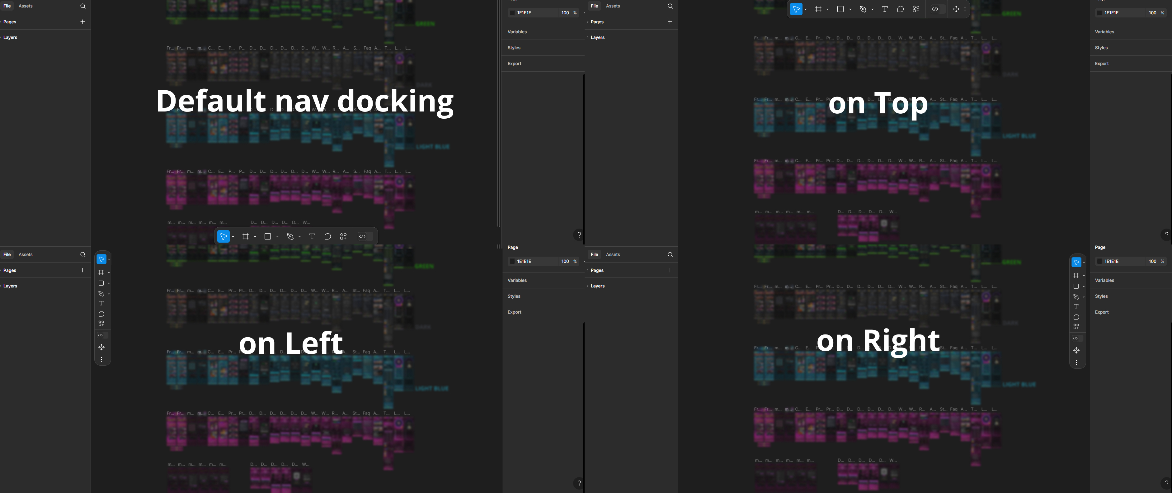
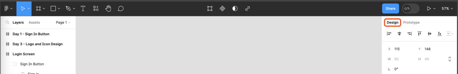
- What I can’t stand the most is that the panels of the new UI can’t be attached to the edges. They leave some gaps, wasting the space to display the main design and operation area. And visually, these gaps are also distracting my attention.
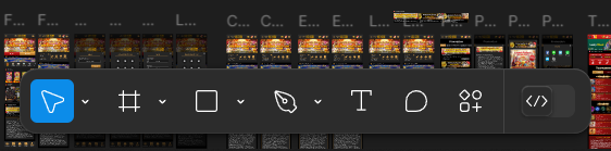
- The toolbar at the bottom also interferes with the main operation space, especially if its color is the same as my design draft. By the way, is it just for the convenience of novices to move it from the top to the bottom? If someone who uses Figma more frequently, he will use shortcuts instead of mouse clicks to trigger these functions.
So I hope that adjustments can be made in time in the official version of UI3, otherwise these redesign will seem like a subjective conjecture of someone who doesn’t use Figma much.

UI3 Feedback
Reply
Enter your E-mail address. We'll send you an e-mail with instructions to reset your password.