I’ve embedded my Figma prototype in Framer, which is working fine for all viewports in Framer before deployment and in Chrome inspect after deployment in my Chrome (for all viewports) but as I open my site on my mobile the prototype is not scaling properly.


here’s my embed code -

“style=“border: 1px solid rgba(0, 0, 0, 0.1);” width=“100%” height=“100%” src=“https://www.figma.com/embed?embed_host=share&url=https%3A%2F%2Fwww.figma.com%2Fproto%2Flj0zhz4tMlHcTV3aipmuMC%2FGreenThumb%3Fpage-id%3D1%253A6%26node-id%3D76616-1601%26starting-point-node-id%3D76579%253A4686%26content-scaling%3Dresponsive%26scaling%3Dscale-down%26t%3DHqkiFYSugJZQ3f16-1&hide-ui=1” allowfullscreen>”

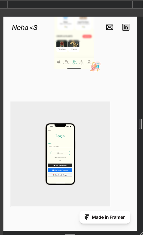


Hey @Neha_Ghariyal, thanks for reaching out and sorry for the trouble!


Are you trying to view the prototype embed from the Framer mobile app?

With that in mind, please note that you can only add and use embeds in browser-based version of applications.


No, it’s after the deployment of my site on Framer Web. I tested my site on a mobile device.


Thanks for confirming, @Neha_Ghariyal!


It looks like this is a bug that the team needs to investigate further in order to reproduce and work on the fix.


May I ask what mobile device and mobile browser are you using?


The mobile device is a Samsung Galaxy A23 with a Chrome browser.


Thanks, @Neha_Ghariyal!


I’ll send this over to our team as they continue their investigation. It seems to be an Android mobile specific bug, so due to its complexity and other priorities, keep in mind that it may take some time before the team is able to fix.


Sure, thanks a lot for considering it.


Reply