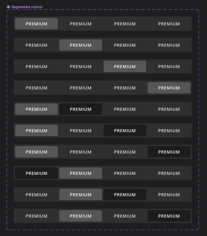
Hi guys!


I want to create a segmented control component with default, hover, and active state. We want to have dividers between the default states. The problem is with the hover state because the dividers should hide. It works fine on the right side, but it doesn’t hide on the left side.


I’ve tried to put the divider in the default component (in the text), but it doesn’t solve the problem. I’ve filmed a video to show the problem.


Any ideas on how to create this component, to solve this problem, will be much appreciated. The states should work in prototype as well.


Thank you!


Hey Maja, thank you for reaching out! I’ve tried to replicate your case. Please correct me if I am wrong. You’ve placed 4 components next to each other. And the the divider is only on the right side of each component. So this is how it looks now.


You might need to make a component of the whole bar and set the interactions. See in my screen recording.


Is this what you want to achieve?


Hi @Gayani_S


Thank you very much for your reply and help! Yes, this is what I want to create, but I need it to work on hover and when clicked (default, hover, active states) and it needs to work in the prototype. Is there any way I could do it with the 4 components? If I have all of the states in the bar component it’s a mess in the design system and also I need 3 different sizes of the bar (4 elements, 3 elements, and 2 elements). I’ve attached a picture of what it would look like if I create states it the bar component, and it’s not even all of the states for all of the elements, but it shows what I need hopefully.


Thank you for the explanation. Would you mind sharing a copy of your file with me so I can test this out myself?


Reply