Question

Variants for disabled buttons

  • February 26, 2021
  • 3 replies
  • 5396 views

Zlatko
  • New Participant
  • 38 replies

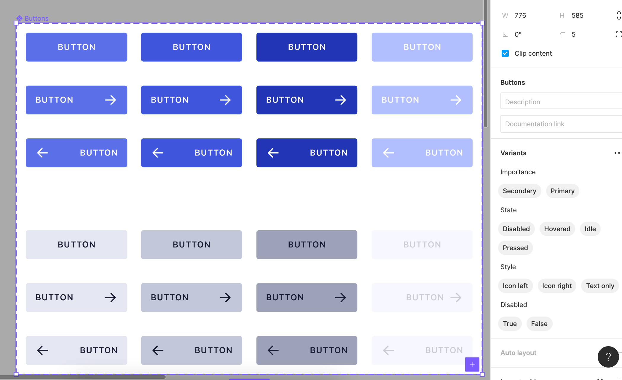
What‘s the best practice for having disabled buttons? In the screenshot attached, for example the very first button (top-left) has:

Importance=Primary, State=Idle, Style=Text only, Disabled=False

And then the disabled button will have:

Importance=Primary, State=Disabled, Style=Text only, Disabled=True

But there is a catch. If disabled is a boolean, then how state can also have a value of disabled? Am I missing something?

3 replies

sebastien.giroux

What is the purpose of the boolean if you already have disabled as a state?


Baffour
  • 53 replies
  • February 26, 2021

I think you have to decide whether you want the boolean or the state. Theoretically you might want the boolean so you can show the hovered, pressed and idle states when a button is disabled. In that case you’d keep the boolean and remove the state. It’s also going to be more similar to code where whether or not a button is disabled is usually a completely separate property.

But in reality you probably don’t want different states for disabled as there’s no point responding to hover over or press if it won’t do anything. So the slightly simpler approach is to just have disabled as one of many states.


Zlatko
  • Author
  • New Participant
  • 38 replies
  • February 27, 2021

That‘s how I‘ve been doing it for years. I only saw some people use boolean as disabled, so I thought they might do something smarter that I know not of. 😊


Reply


Cookie policy

We use cookies to enhance and personalize your experience. If you accept you agree to our full cookie policy. Learn more about our cookies.

 
Cookie settings