
Layers order + Interactive components in auto layout


Igor_Dudnyk

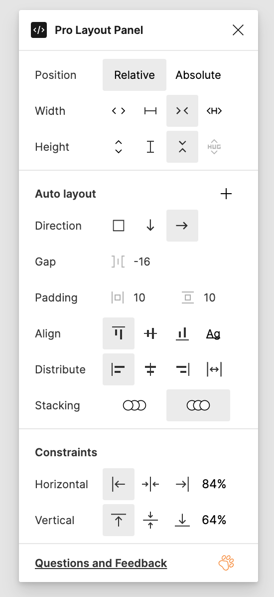
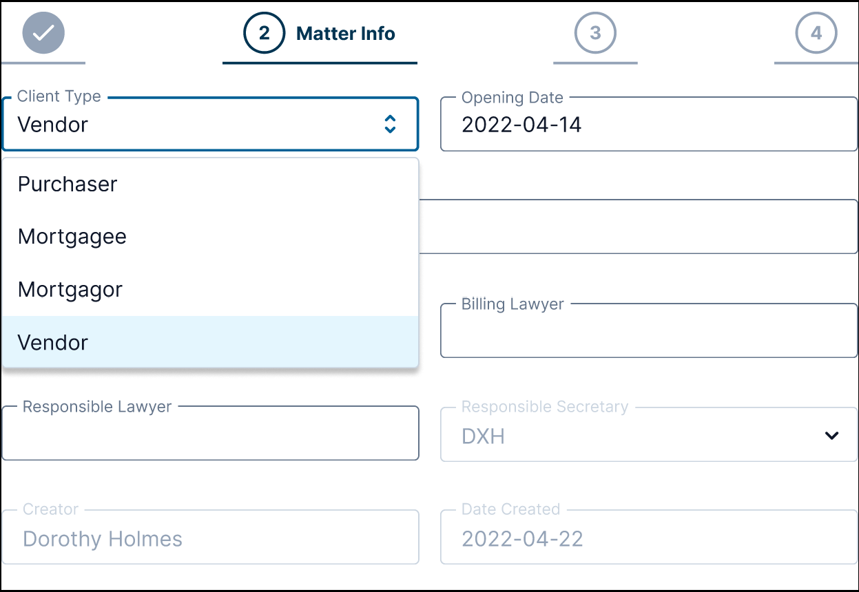
I have frequently met this problem earlier, but now I have another good example. When I need to build a form with interactive components, some layers are above the others and my dropdowns can’t open normally. Layers hierarchy is a very logical thing, but very restrictive, especially in auto layout.

33 replies

Baffour
  • 53 replies
  • February 26, 2021

yeah auto layout layer order is such a pain! I made a table without autolayout recently and I wanted to allow scrolling, but it causes the rows to overlay the table header when you try to scroll.
I ended. up wrapping all the rows in an auto layout container, and then surrounding the header, footer and this row container in a regular frame. If you need the equivalent of fill container you can just use left+right or top+bottom constraints. So I think you just need to go without auto layout in certain cases, where it makes sense but isn’t essential.


Yulia
  • 39 replies
  • February 27, 2021

+1


Thomas_Renon

Definitely a need, it is the same with tooltips. Having a z-index for those elements would be best.


chudoloo
  • New Participant
  • 35 replies
  • February 28, 2021

Here’s a hacky way to reverse the “z-index” ordering of Auto Layout layers:

Figma

Not the ideal solution and if you follow the Twitter thread linked from the file above, you can see that there is no easy answer. Figma mentions that a “layer ordering preference” could be a solution.


Tomjohn
  • 2 replies
  • March 1, 2021

We really need z-index to be separate from layer order. I find myself detaching layouts frequently for these types of use cases and they’ll be even more common now that component hierarchy is removed from the context of the prototype.


Krystian_Kubicki_Shiji

This is why we don’t use overlays in auto-layout frames. We know double 180 hacks, but this causes a lot more problems. Like swapping components with hack and without a hack. Autolayout order in practice and in everyday work makes no sense for us.


Thomas_Renon

Thanks @chudoloo, interesting! But yeah it looks like a hacky way.


Nic_Stauber

May not be ideal, but couldn’t you solve this by manually positioning a prototype “overlay” component?


Baffour
  • 53 replies
  • April 8, 2021

Issue is that overlays aren’t supported so won’t show if you use the component on another page, or via a library. So you have to redo it every time you want a dropdown and lose all the benefits of interactive components


Harald_Skogland

will it work?
I think separating z-index and layer order will not fully cover the issue. The way I see it, the issue here is that an element is expanding and the expanded area is visible below another element.
explained
If you have a set of drop-downs arranged vertically, this is fine. Giving the ‘highest’ element on the Y-axis the highest Z-value will give expected results. Instead of drop-downs, consider a thumbnail gallery. There are 4 square images as in image below. Interacting with images scale them. If the images are given Z-index from left to right - top to bottom, only the top left would work as expected. Top right would scale up and be visible under top right. The bottom images would have both top images over them.

So in this case it wouldn’t be enough to be able to control the z-index, the ordering must also change with the interactions.
suggestion
A (hacky?) solution might be that the last layer interacted with would always appear as the top-most layer. Once another layer is interacted with the previous layer re-positions itself back to its original z-index. This way, a drop-down or scaled image will always appear on top when you click it.

…I’m sure this has issues if there should be interaction with several components simultaneously. But it should work for the use case of a form, where typically you only interact with one field at a time.


Radley
  • 11 replies
  • April 15, 2021

Could this be done with three layers:

  1. bottom layer are the thumbnails
  2. middle layer are the same thumbnails, not visible, that will be animated
  3. top layer are thumbnail-size hotspots that trigger a middle thumbnail to show and animate

Yorgos_Koussoroplis

The main issue, as I see it, is with interactive components. Think of a tooltip variant that is triggered when hovering. If the component is inside an autolayout frame and the tooltip overflows the space of the component’s space, then it will be trunkated by the second frame in the layout.


Harald_Skogland

…That is neither the concern of OP nor how it works in current version. You can display a tooltip or a drop-down that exceeds the bounds of its parent frame. Dimensions of layer items will not be altered by interactive components inside auto-layout frames in preview. To intentionally have content grow or expand from interactive components in preview is a highly requested feature, but is not yet released.
You can watch this video to learn how auto-layout and interactive components works in current beta version.


Cedric
  • 2 replies
  • July 15, 2021

Also need some sort of z-index in Figma. My auto-layout components appear visually at the top where they should, but they are at the bottom in the layer list. Very annoying for interactive components like Dropdowns or stuff like that.


Casey3
  • 2 replies
  • July 20, 2021

Considering how many interactive components work like these drop-down menus, I honestly don’t see how they can release this feature until this is resolved. Interactive components are amazing and they’re just one more reason I’m sticking with Figma; however, with how they operate currently they just aren’t ready for release.

They almost need some kind of override system built into the interactive component variants itself where you can label a particular variant as an overlay “or something similar” that would bring it to the front so that it lays on top regardless of its position. I understand that this isn’t a “quick fix”, but I don’t feel it would be wise to release this feature until this is addressed.


Alyssa_Maac

Dropping a comment since the interactive components just released. This is also a problem for me as well. I don’t want to do overlays everytime. The interactive components is kinda useless if I do it that way.


pierre_herault

Dropdown with interactive components are still an issue.Even tho it somehow works when i want to do top tooltip… weird


Antonio_Guedes

This improvement would make me very very happy. Thanks!


AnneK
  • 14 replies
  • January 25, 2022

+1 This would be invaluable for forms


Yulia
  • 39 replies
  • February 16, 2022

I’m waiting and waiting and waiting…


Henri_Fournier

FYI an update just dropped at #Config2022, which changes the visual order in auto-layout and gives you the option to change the canvas stack order as well. See What’s new in Auto layout

However, when I tried it out it seems to work in design time (toggle variant and dropdown list appears on top of other auto-layout items below it 👍🏼), but when I “present” it still shows as before with auto-layout items on top of dropdown list. 🤔


Josh
  • Former Community Manager
  • 1019 replies
  • May 10, 2022

Hey @Henri_Fournier does refreshing the prototyping tab fix this for you?


Henri_Fournier

@Josh Yeah, I tried refreshing, closing and reopening, but it didn’t help. It’s a bit of a different setup though.

I’ve created a generic Modal component with Header, Body and Footer frames. In the Body frame I have a “nothing” component as a placeholder. When I need a modal, I create a “content” component with what I want in the modal body; grab my generic Modal from the Assets; and swap its “nothing” component in the Body with my new component. Voila! A custom modal, with a lot less effort.

When I prototype just my “content” component, I see the proper behaviour, just like at design time. That is, the dropdown list appears on top of the other auto-layout components below. However, when I prototype the modal, it doesn’t work. So swapping a component in a component somehow breaks it and shows the old behaviour.

Hope that makes sense.


Mr.Biscuit

You can use Stacking on Pro Layout Panel to change the stacking order


Henri_Fournier

@Josh The first screenshot shows the “content” component with proper behaviour and the second screenshot shows that same “content” component inside the Body of the generic Modal component.


Reply


Cookie policy

We use cookies to enhance and personalize your experience. If you accept you agree to our full cookie policy. Learn more about our cookies.

 
Cookie settings