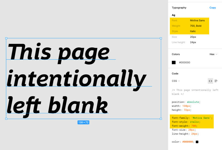
My team frequently runs into this problem:

Figma’s font CSS does not match up with how our particular web-fonts are set up.


This may be a team-process-thing and not a Figma-thing, since this was an issue with Sketch as well. But we’ve been unable to solve this in the 4 years I’ve been at this (very large) company, and communicating “everyone remember to ignore this bit and replace it with this bit” is hard to make stick across multiple teams, especially with pandemic turnover still happening. I doubt we’re the only ones using our own web fonts, so hoping someone has an idea or a process we can borrow!


Figma uses the “font-style” and “font-weight” CSS attributes, but when developers use this code, we wind up with the “faux bold” and “faux italic” fonts that look messy & wrong.


The way our websites are set up, we need to use font names like “Motiva-bold-italic” with a font weight/style of “regular.”


Is there any way to affect how Figma outputs font CSS? Maybe a plugin I haven’t found yet? 🤞


If not, how do you folks handle documenting your web fonts’ special nomenclature?


We’ve tried including an “everyone remember to ignore this font CSS” frame reminder in our design deliverables, but it’s as easy to forget to include that as it is easy to forget to even worry about the fonts. 😅

Facing the same issue for years.

For ex, When a Lato-medium is used in figma, the CSS for it is Lato

with a font weight of 500.

When this is implemented with CSS, the rendered font is display as a Lato-regular.


Please report your issues, so this could be fixed as fast as possible.


We are struggling with devs getting the wrong font specs with Avenir Next LT Pto.


The weight defined by the author for a specific font variant (Demi) is 700 Bold. And considering the font, it makes sense because it’s quite bold (maybe 600 Semi-bold would be more appropriate, but that’s up to the author to decide).


What happened to us is that developers, guided by what they see in the Figma font specs, added the “Avenir Next LT Pro.ttf” font (Regular) to the app, and applied a font-weight of 700 to it, which is indeed different than using “Avenir Next LT Pro Demi”, and therefore wrong.


In a similar way, the Figma generated CSS code could be considered wrong, or at least confusing or not complete, because it’s missing the font-face declaration (or the source), and reinforces that assumption developers made.


I know it’s a tricky point, as different fonts may define weights and names in a different manner, but I was wondering if it would be more appropriate to show/use the complete font name (or the name for humans) instead of showing the Family name and the weight to developers to avoid this kind of issue.


There’s a similar issue with Avenir.


Avenir Heavy is the second heaviest weight and displays as such in the design mode. In inspect the weight is shown as 900.


Avenir Black is the heaviest weight and displays as such in the design mode. In inspect the weight is shown as 800.


The inspect view shows the wrong weights.

The correct weight for Avenir Heavy is 800.

The correct weight for Avenir Black is 900.


Reply