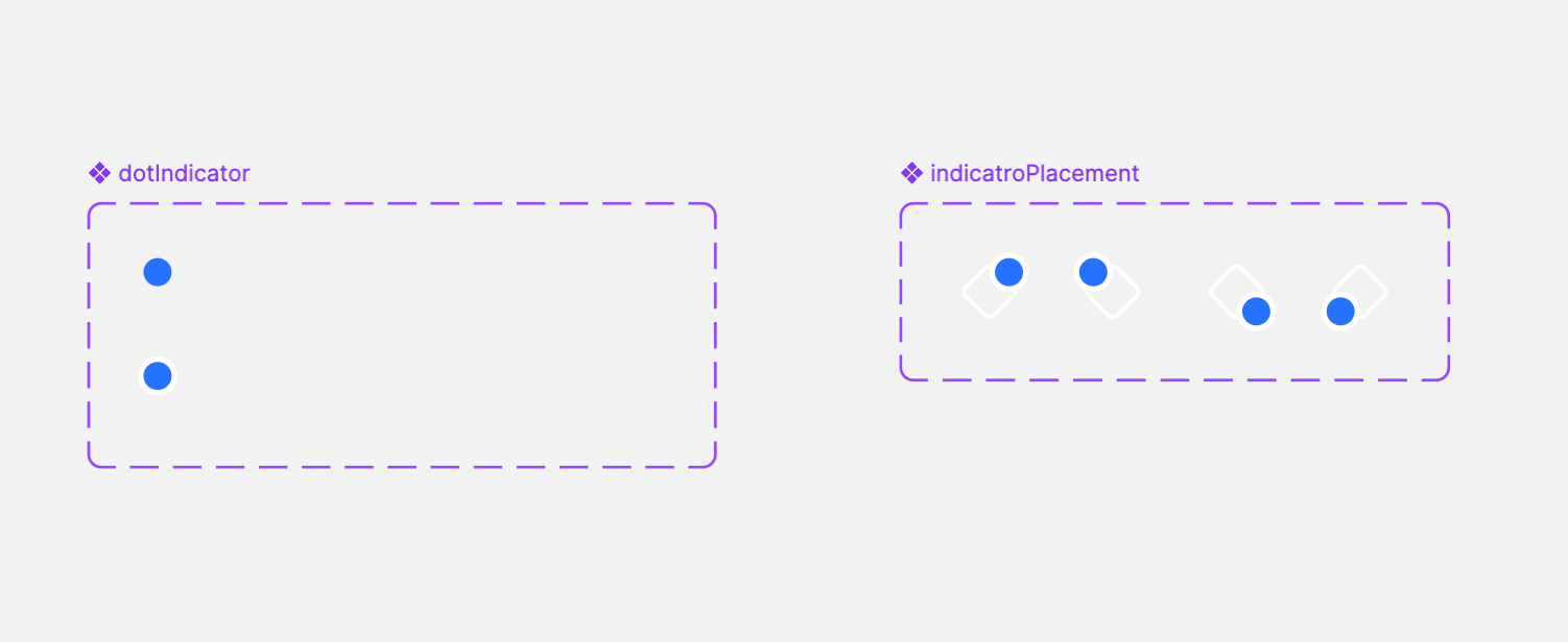
I’m trying to create an icon component with an indicator (like a dot or badge), but I want to avoid making separate variants for each icon just to show or hide the indicator. Ideally, I’m looking for a simple, reusable setup — maybe using a frame or wrapper.
One more thing: when I add the icon (with a color set via a variable) into another component, the color doesn’t inherit as expected — it keeps the original value instead of adapting to the parent context.
For context: I’m using icons from a shared library. All icons follow a consistent structure — same layer naming and default color (not linked to any style). Colors are assigned through design tokens at the component level, not directly within the icons themselves.
Has anyone found a clean solution for this kind of setup?


