This was a really fun puzzle to work on! I don’t get to do much mobile app interaction work. Here’s what I came up with:
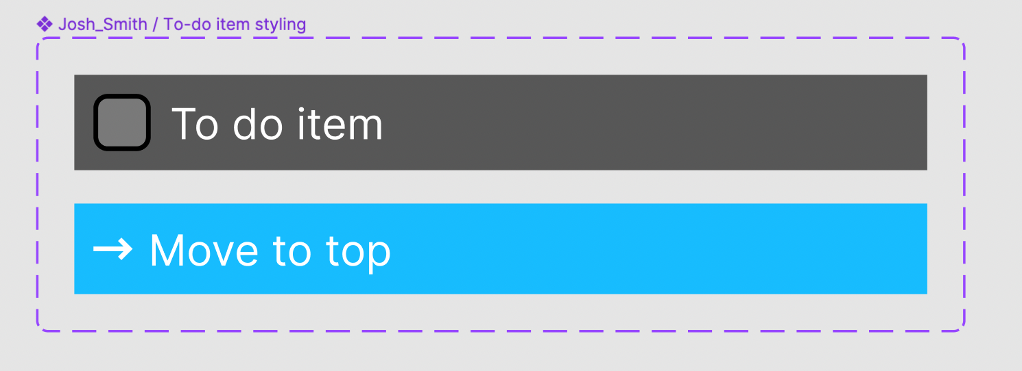
I made a component with two variants to manage the “states” (there’s probably a better, more specific word than this) for a to-do item. The “To do” state and the “Move to-do to top” state that is revealed on drag. These are using auto layout:
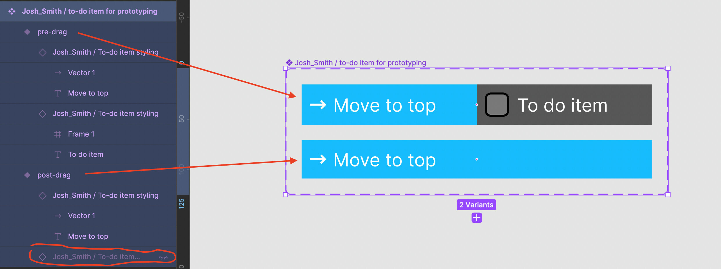
Then I took instances of these components and arranged them in an auto-layout frame horizontally and set them to fill all available space, which is great because that means they’re equal widths just like in the video tutorial! I compentized this frame, and added a second variant. The first has both the “To do” and “Move to top” drag signal visible, and the second one hides the “to-do” instance:
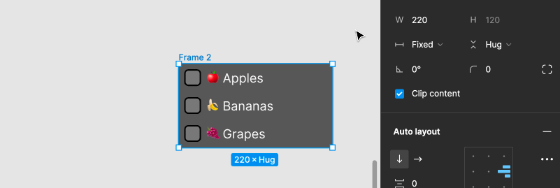
After that I set up my first of the three necessary prototyping frames. It has a list of 3 to-do items. This prototype will move “🍌 Bananas” to the top of the list. Notice that the containing frame’s auto layout is right aligned, and a fixed width that matches exactly the width of the to-do item:
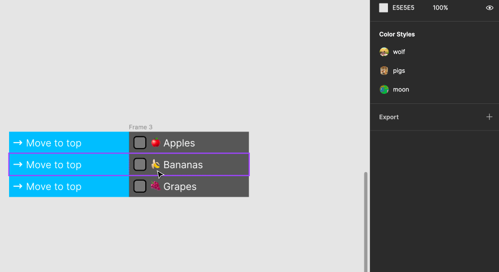
Then I made a copy of this frame and adjusted “🍌 Bananas” variant from “pre-drag” to “post-drag” and reduced the width to fit the container frame. In the following GIF I do this manually until it snaps into place, but you might be able to just set the width to “fill” and get the same result. The interaction on the first frame to this second one is an “on drag” interaction on the “🍌 Bananas” to-do item.
And finally I needed 1 last copy where “🍌 Bananas” replaced “🍎 Apples” as the top to-do item. The interaction between the second and third frame is an “After delay”, which I admit doesn’t look smooth, but it does the job.
Here’s view-access to the Figma file I used to take these screenshots and GIFs, in case you’d like to have a closer look at the layers and auto layout settings. You can also check out the working prototype!

