
It would be great if Figma can let users control the shape and placement of prototype connectors and also make them visible to anyone viewing the file, so that anyone viewing the art board can get a sense of the pathway to get from one screen to the other.
Use cases
- Handing work off to a developer, they can see what the interactions points are without having to explore the prototype.
- A random stakeholder browsing around your art board wanting context on what the journey is.
- You can connect the prototype without having to go back and draw manual lines to show the journey when viewing as an art board.
UX improvement suggestions
Pain points:
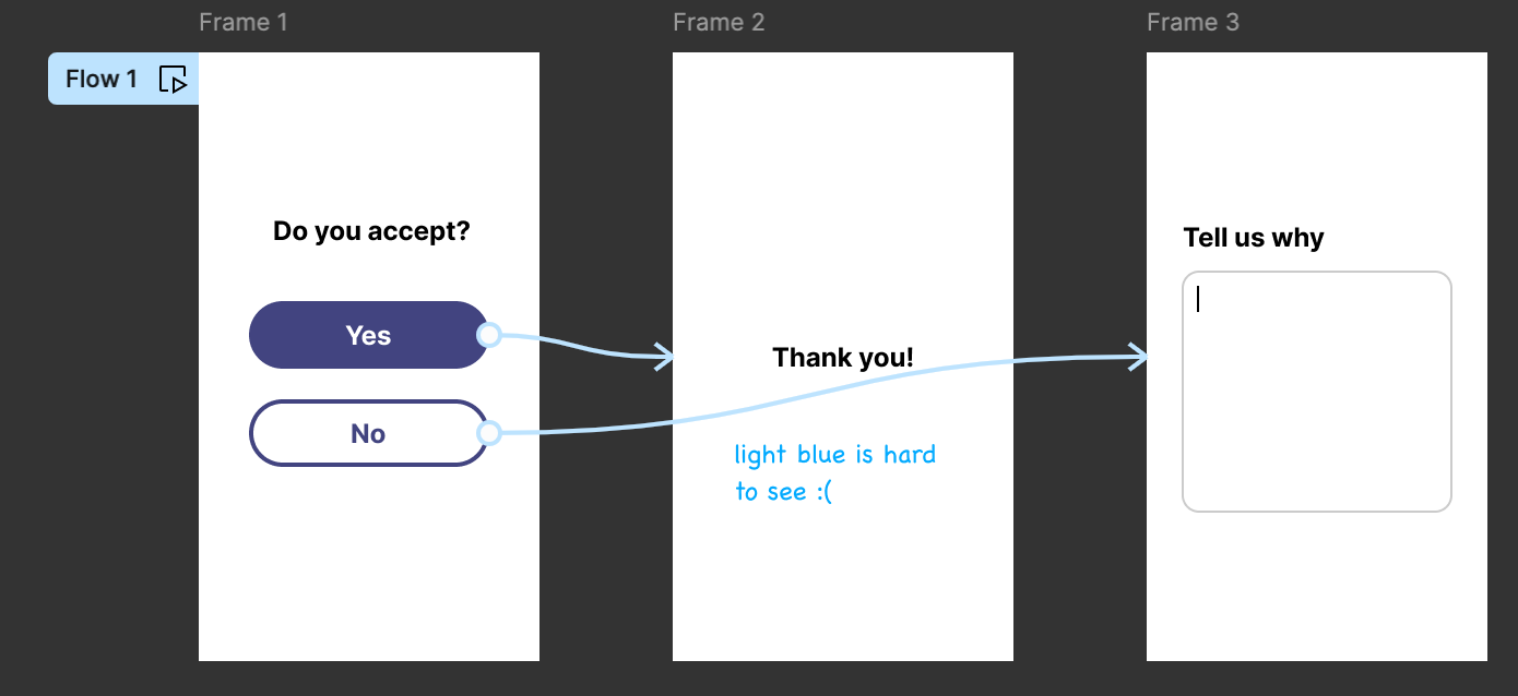
- Currently the prototype accent color is a light blue, which is hard to see over top of light backgrounds.
- Cannot control the shape of the flow line, so they sometimes may overlap other frames or artifacts, making it cluttered and hard to follow.
- Collaborators can only see this if they are editors and have prototyping mode turned on.
Suggestions:
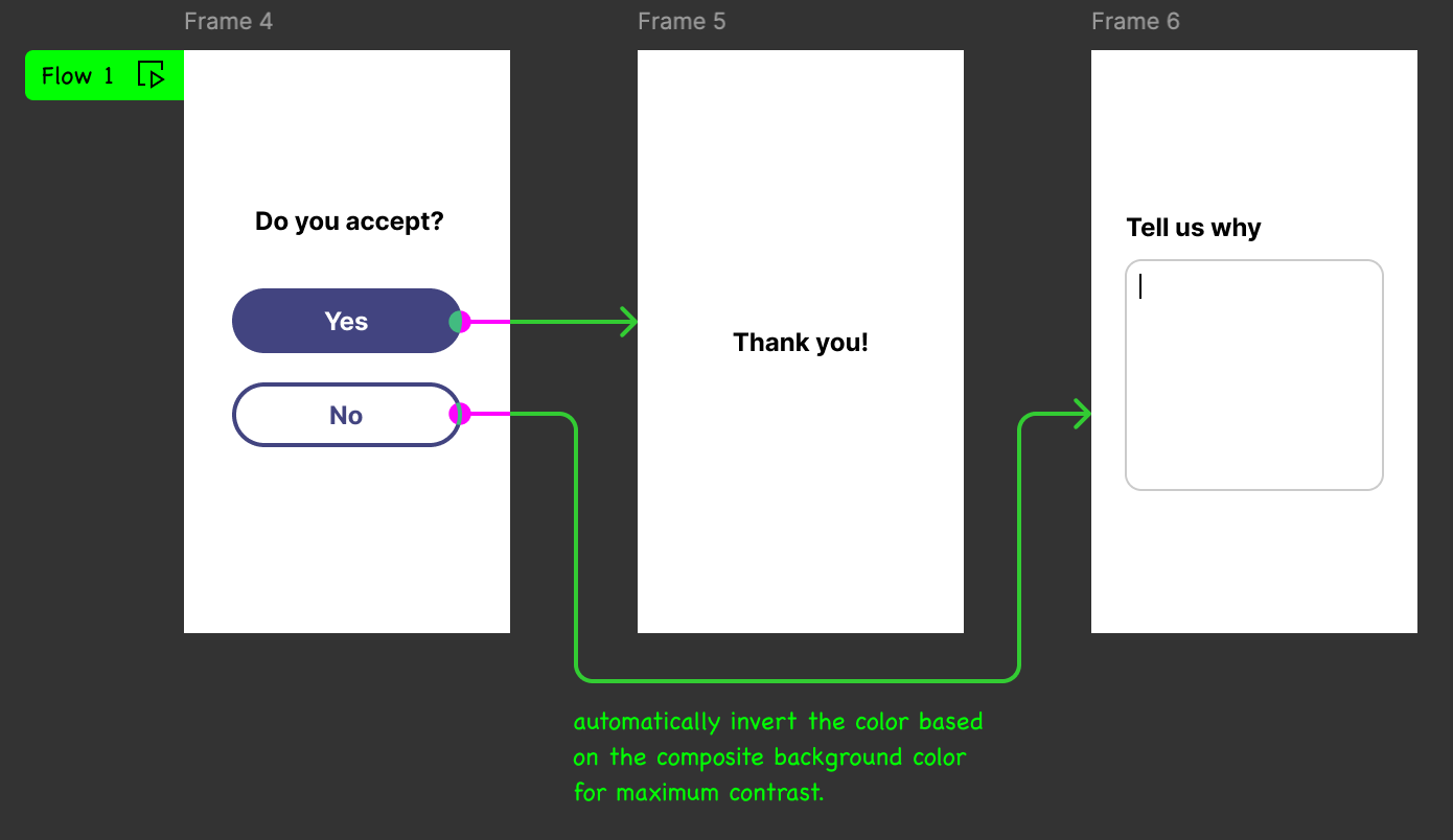
- Instead of using a fixed solid fill color, set the color based on what the composite background is.
- Mockup below shows a striking contrasting green color when the background is dark, and magenta when it is light to maximize contrast.
- Flow lines are drawn orthogonally, with rounded corners at where it bends. Attach annotations to flow lines to add context. For example, “opens in a new tab.”
- Allow the user to set the anchor points where the flow line starts and ends; currently Figma decides where it attaches, based on the prototype action (overlay vs regular navigation) or shortest path between two objects. It is hard to see especially when the background is busy.
- Use AI to automatically suggest the most optimal path to connect an interaction point to the destination frame.
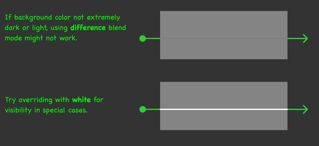
Background brightness
In case the background color is of a neutral brightness, favour a dark or light stroke color for the flow line to maximize visibility.
I think this could be a very useful feature. It would save me lots of time having to draw extra lines on top of a mockup when I’ve already done that for creating a prototype.