

I need the icon and text to be center aligned, together. So as the text expands, the icon stays next to the text, rather than pinned to the left or right of the button.
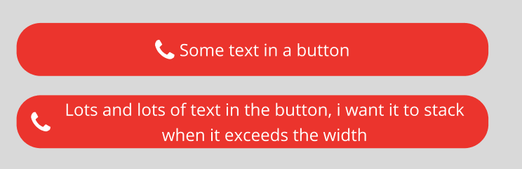
This works.
But, if the text length exceeds the length of the button, it doesn’t wrap, it just keeps going.
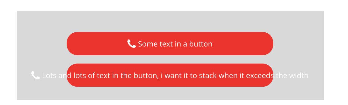
If I make the text wrap, by making the text fill the container, the icon is then left aligned to the button, as below, but this isn’t what I want:
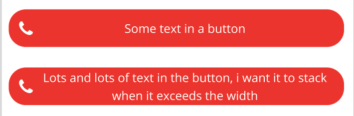
What I want is this:
But in the above example, the first button as ‘hug’ on the text, the second it has ‘fill’. Whereas I want to create one component which works in both cases, without needing to update the text fill properties on the instance.