A (another…) small rant about UI3.
The new UI3 bring a lot of good features and abilities. but some design decisions i just cannot understand.
One of them for this example is the massive reduction in the clickable area of menu components.
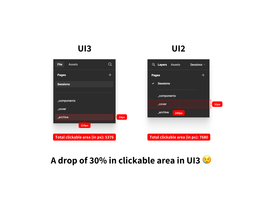
As you can see this screenshot, the previous clickable area for menu items stood on 32px heigh and (at minimum) 240px width.
This translated to 7680px of clickable area.
In contrast to that, the new UI3 is able to give us only 24px height with only 224px width (on the 240px minimal setting) which are only 5376px of clickable area.
This is a reduction of 30% in clickable area! multiply that by as many items you have in the menu. for this example i took the pages menu panel.
Not to mention the gap between each item of 5px. this makes the clicking menu items very hard.
What was the reason for this design? now we get a more cluttered design (more elements fit in the page) but with less space to select them…
You can argue that i can control the UI scale from the menu. but this solution is: A.not intuitive B. enlarges the whole UI, while my problem is specific to the menu items. C.This feature exists only in the desktop app version.
As an everyday Figma user, i would love to have an answer.

