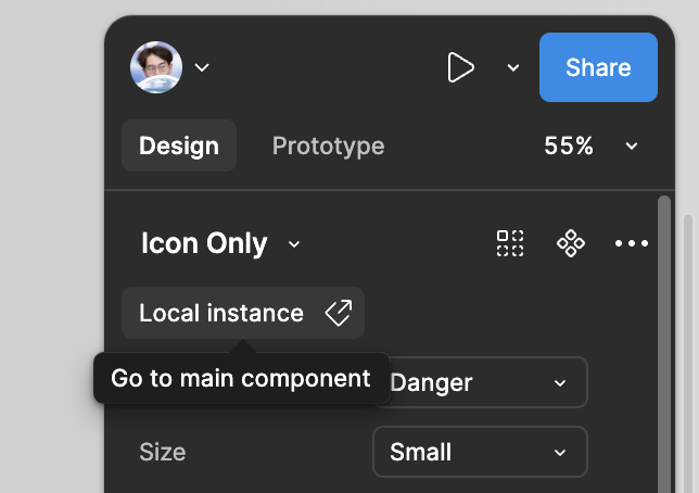
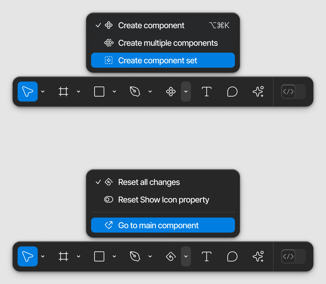
In the latest update, it took me a while looking for the “go to main component” command which was in this menu.
Magically i found out that it is hidden under the library name lol.

I have heard in the last ConFig 2024, you guys told that you redesign things not to let user waste time look for hidden buttons that would show while hovering.
You may have made the UI clean, but it is way toooooooo confusing.
I am thinking you skip UX while design this UI3, or you were giving this to some intern to be in charge. I believe most of designers hate UI3 as I hate it. I suggest to bring back the component menu in toolbar.


