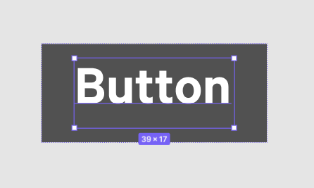
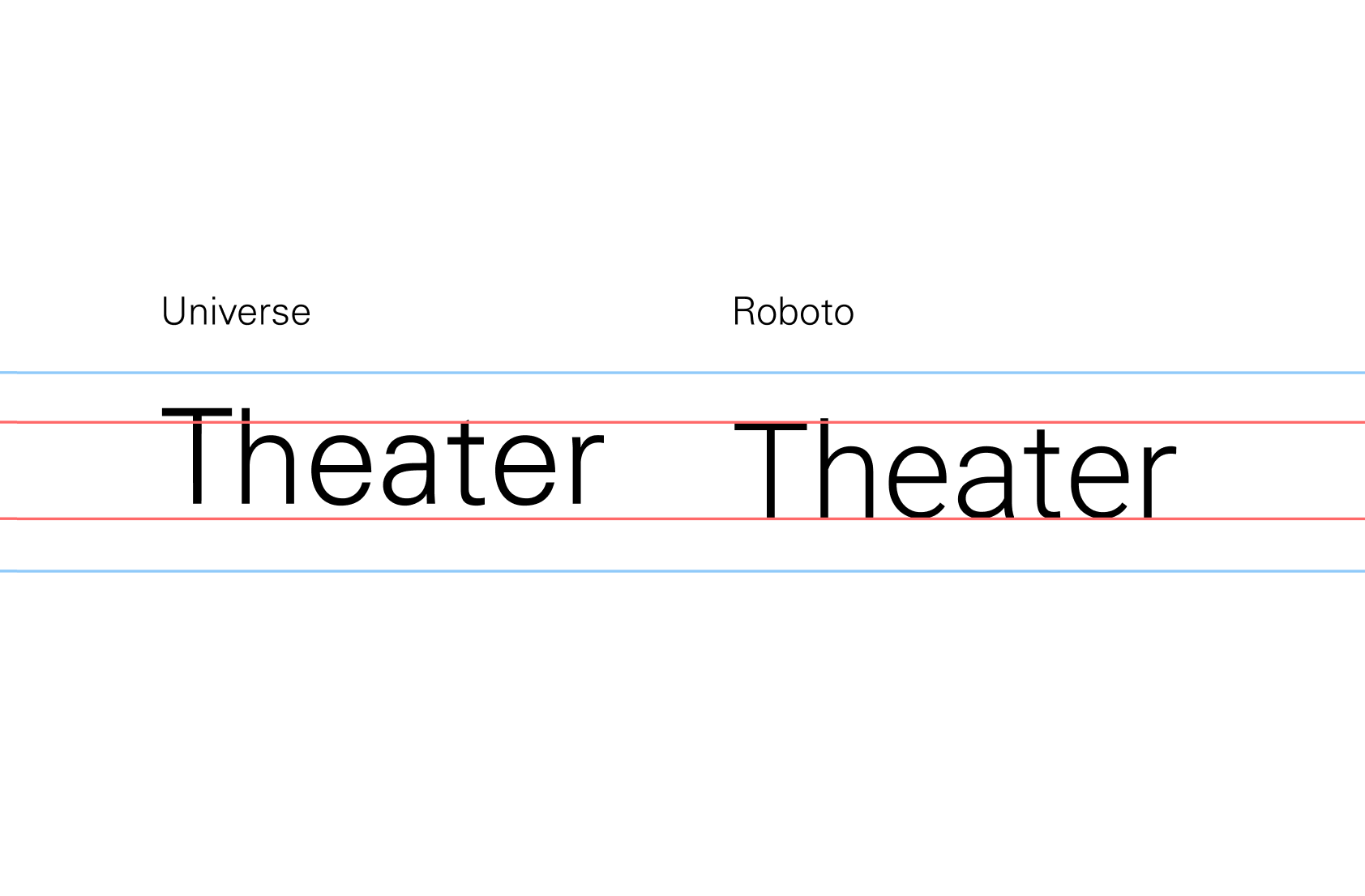
Even if you are displaying the font the way it comes to you, but it is not working for the designers, you need to provide a solution that does work for us. Especially if garbage like XD can display font in the desired way.
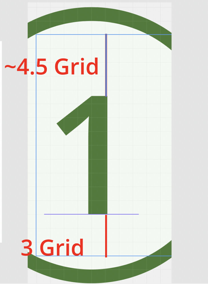
To add context to the vertical alignment discussion, when I compared vertical alignment of Univers (all caps) in Figma to the same in PowerPoint there was a significant difference. Ppt spaces evenly between top and bottom walls of text box (or creates even cell padding), whereas Figma creates thicker cell padding at bottom. Comparisons to powerpoint may be frowned upon…but if a non design tool can align text vertically I don’t think it’s an issue of fonts / font glyphs. I’ll try the transfonter work around for now, but any other suggestions would be appreciated!
I just finished reading this nearly 2 year long thread. And like many of you, my head is about to explode! WTF Figma!!! How has this issue not been resolved??? This is fundamental stuff. The fact that other lesser programs have no issue with this and the most popular digital design software can’t seem to handle this is absolutely mind blowing. Thank you to the folks who have found work arounds, but I can’t imagine how much of everyone’s time this has wasted. From the few responses in the thread it seems Figma is just blowing this off completely!!! Agree with @mick1 in that this should be a HIGH PRIORITY ISSUE! Figma please fix this. It is not resolved. And it is not a font issue.
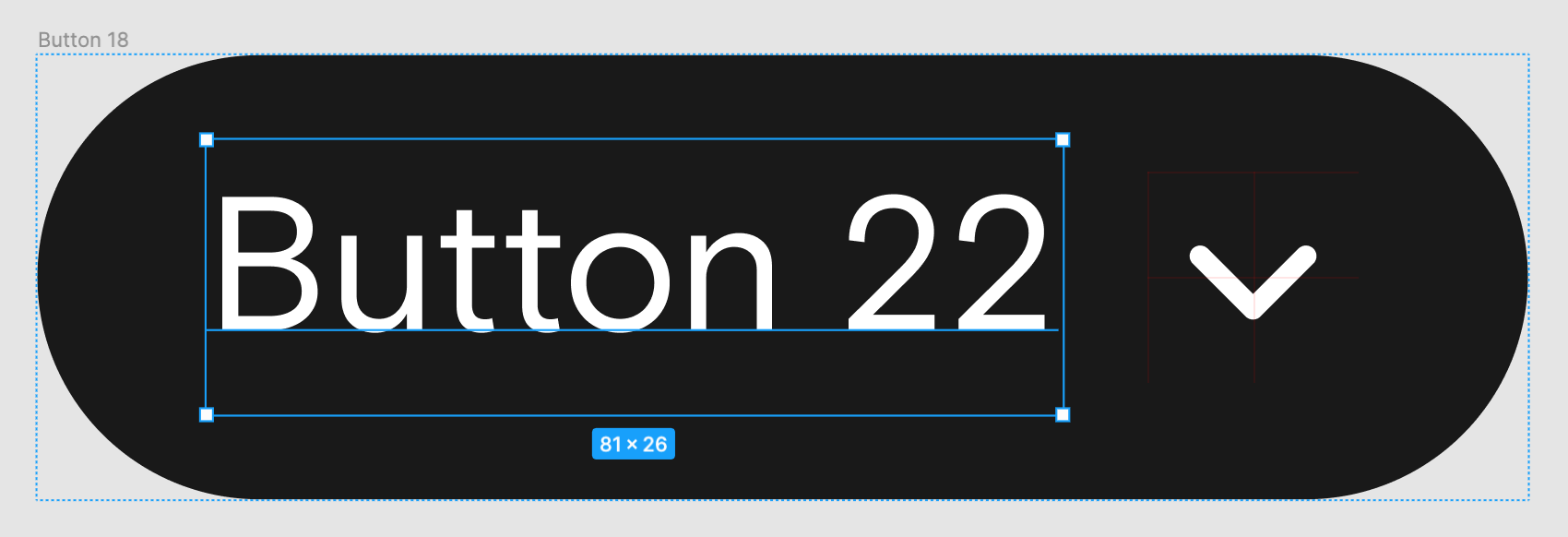
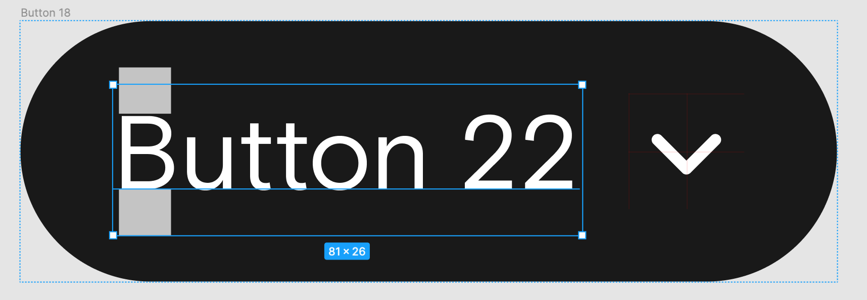
I’ve got the same issue as well. For example, I’m using different design sets for one app (to switch between designs within the same app structure) and the line height issue is VERY noticeable. It’s a struggle when trying to use auto layout to be efficient but with the line heigh it takes unnecessary time to correct and is sometimes not possible with auto layout. And if I’m not correcting, it looks like a sloppy design. Apparently this has been a problem for two years now and Figma hasn’t corrected this already? Please correct it Figma, this isn’t a font issue and a very basic necessity.
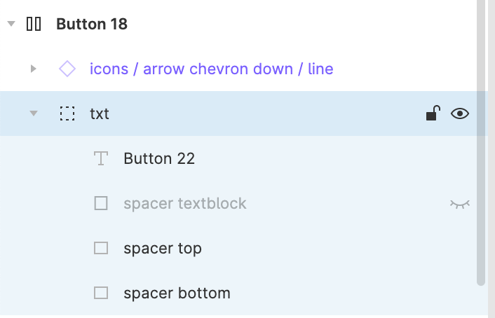
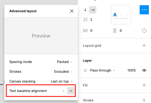
Hi Jason, thanks for this solution. It works perfectly well for me. All I did was follow your directions. I think it’s more preferred than my initial workaround which is having a spacer, which I called “space buffer”, around the text and then grouping it before adding auto layout with the icon.
Glad I could help, but all credit belongs to @Theo_Kekatos for this nifty workaround! I was just sharing my own experience since this is a very popular thread, and a very difficult problem for most who come across this issue.
Hoping the Figma team can bump this up in priority as a ‘small win’. I’ve seen numerous posts about this issue on Reddit as well, and the workaround is less than ideal. @Figma_Support@dvaliao