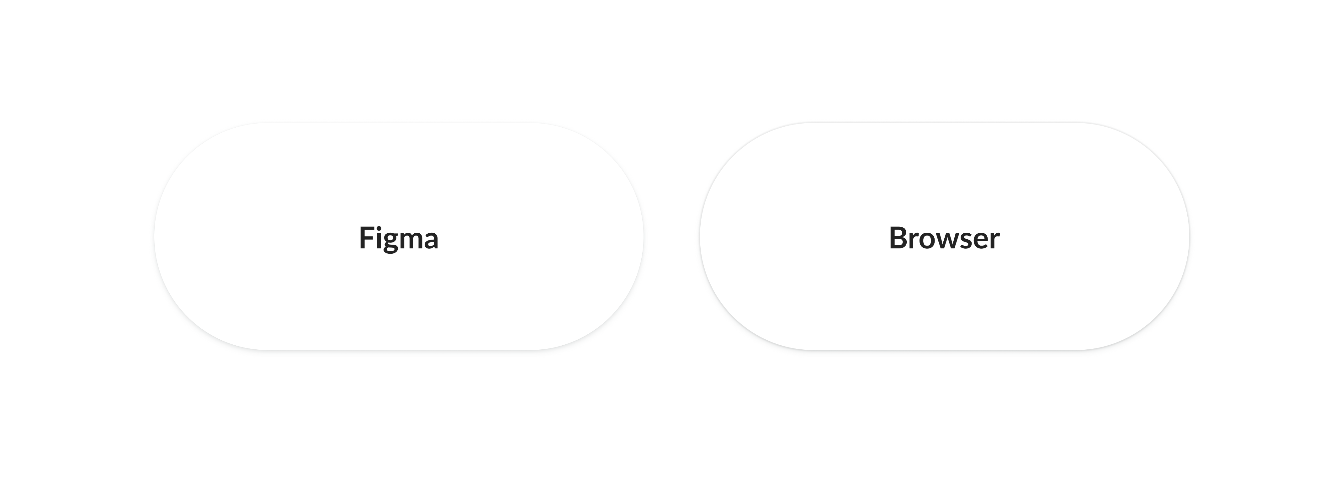
I have a shadow style in my design system. When the developer comes and takes the CSS code and implements the shadow, in the browser, it looks different. (both in Chrome and Safari)
After some playing around we realised that the shadow in the browser looks like it would be Clipped in Figma. We don’t know how to make the shadow not look “clipped” in the browser. Can somebody help? We’re using Tailwind CSS if that helps.
Attached an image for you to see how it looks. The right side is how the browser renders it
Here is the CSS:
box-shadow: 0px 2px 6px 0px rgba(89, 97, 104, 0.1);
box-shadow: 0px 1px 3px 0px rgba(89, 97, 104, 0.1);
box-shadow: 0px 0px 1px 1px rgba(0, 0, 0, 0.06);

