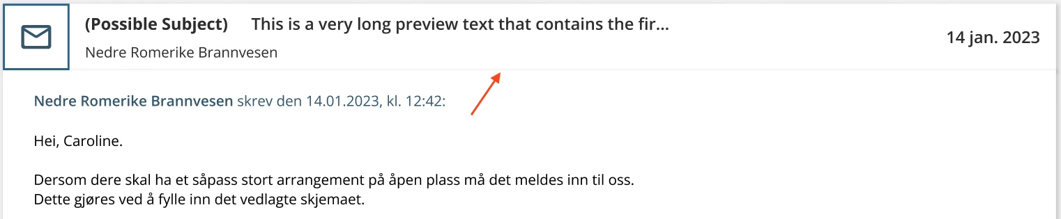
I have two instances. First is a message thread frame and the second is a message box frame that shows up when expanding the topic box. Both of these have a drop-down shadow effect.
The problem is that I want the first message in a thread to seem like an extension of the thread box, but the top part of the shadow effect makes it look like there’s a grey gap between them. (See the arrow pointing in the screenshot)
This is problem I’ve encountered several places when creating a design system for a new product. I could remove shadow effect, but it will make the product not look the way I want it to 😢
Does anyone know of a way around this that doesn’t evolve spending extra time editing away the grey lines before sending it to developers?