Hi!
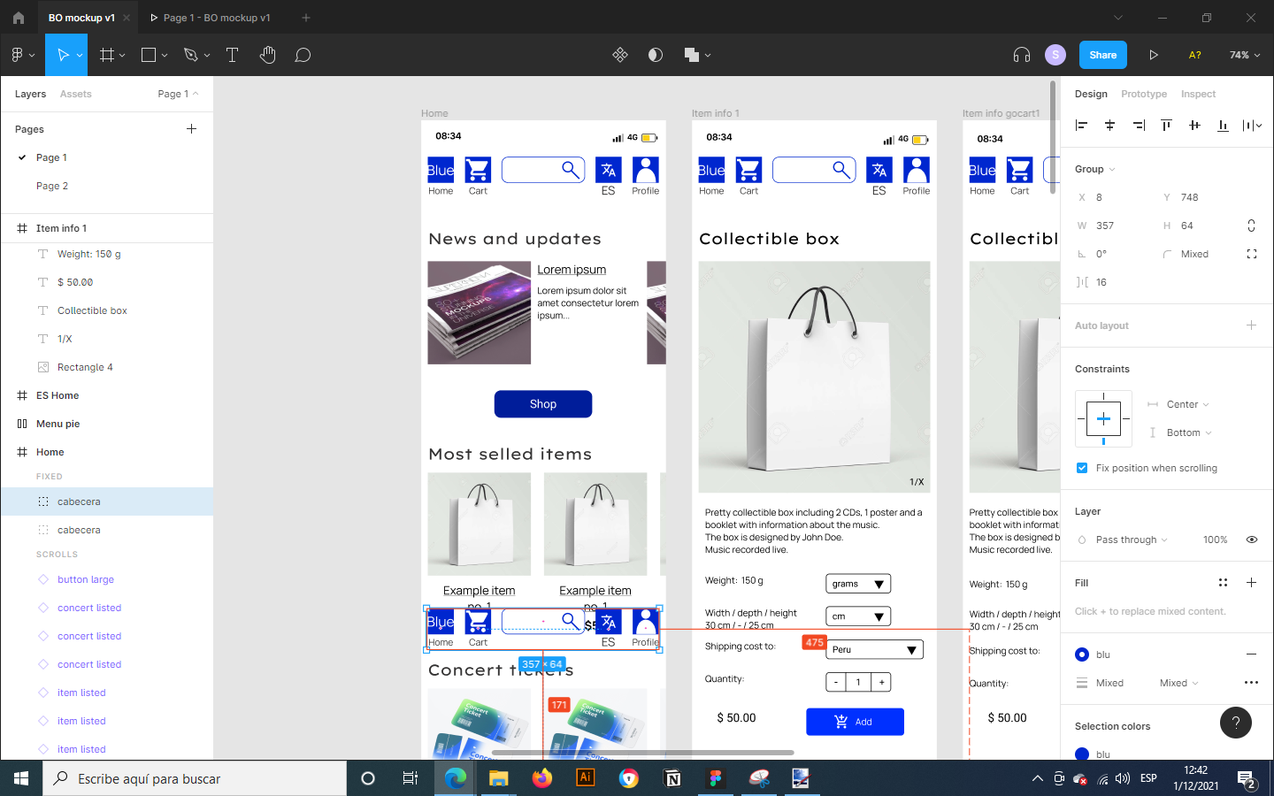
First of all, I have a mobile design for an app and I want to create a bottom navigation bar that keeps on the same position when scrolling. That’s easy, just click on Preserve scroll position.
Now, when sharing my prototype to other mobile users, with smaller screens, they see a fraction of the bottom bar or no bar at all.
In the examples, the first is the prototype shown on a PC. The frame is set to fit an Iphone X (because the client has one). I try to see it on my Huawei P20 in both Figma Mirror and the browser and the frame is gone.
I tried setting the constraints from top to bottom or center, but the vertical position just goes anywhere.
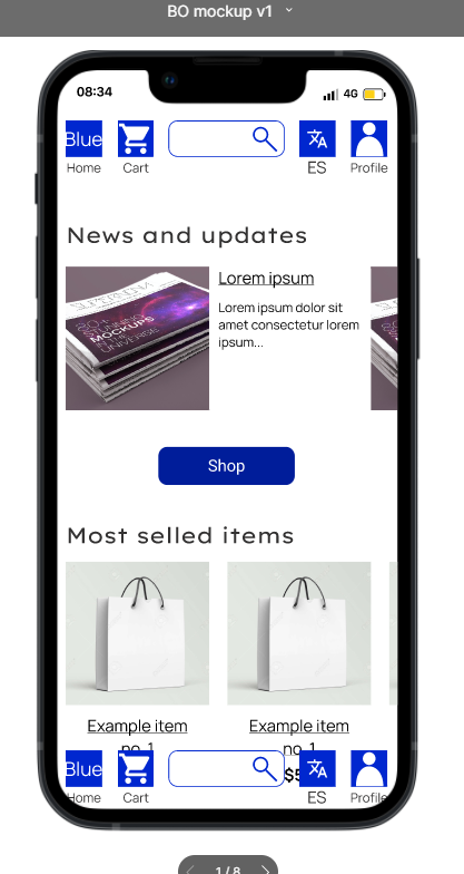
Shown on PC, sized for an Iphone X
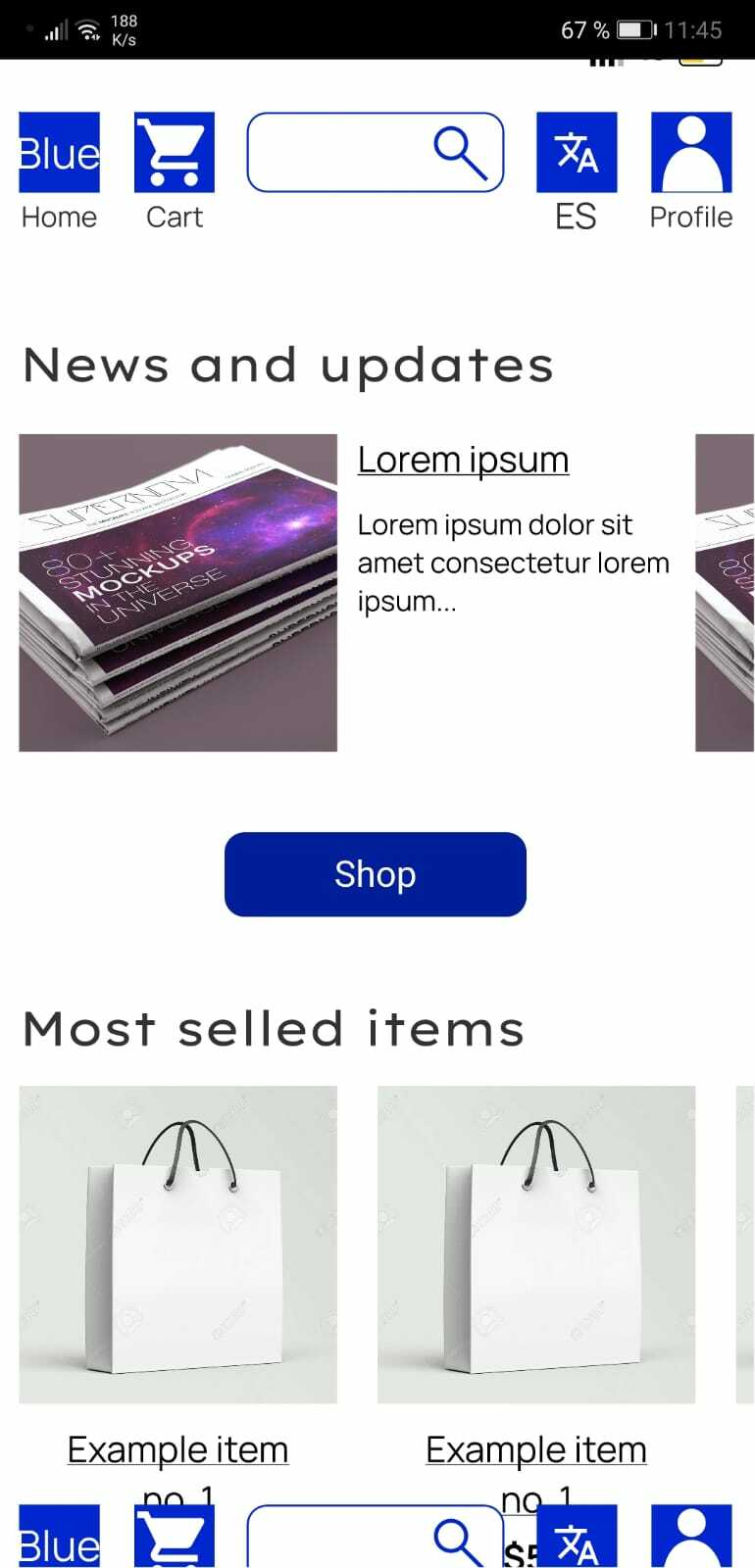
Shown on Figma Mirror for Huawei P20
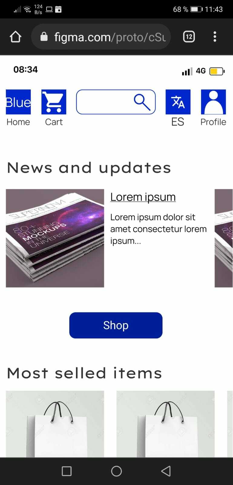
Shown on browser for Huawei P20