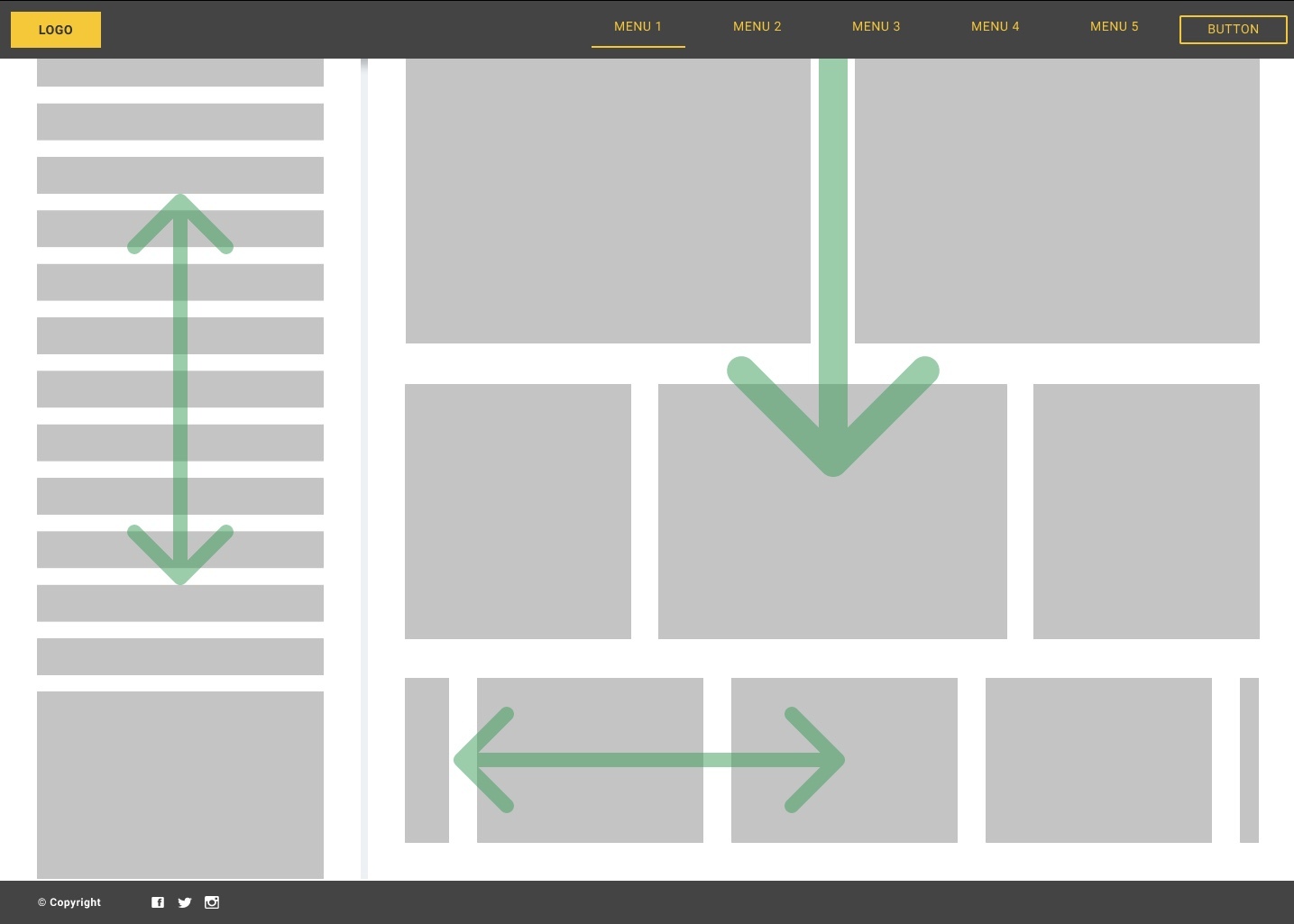
I was looking for a responsive desktop layout Figma template with scrolling areas and fixed elements, and wasn’t able to find one… so I decided to give it a shot, and contribute it to the community if I could get it to work.
But I’m running into some issues (see below). So far I have the fixed elements and the scrolling working - check it out here.
Here are the problems I ran into:
- I cannot get the prototype’s width and height to conform to the browser window (viewport), in order to properly test its responsiveness by resizing the browser window. Are there some prototype settings that I missed?
- If you look closely, the header has a drop shadow underneath, and I cannot get the scrolling areas to show up under the drop shadow. It seems that auto-layout makes it impossible to layer things in the z-axis?? For example, I wanted to “float” those green arrows on top of the scrolling areas, instead of them being part of the scrolling areas. Is it possible to do this in Figma?
- How do I set a minimum width or height to elements which are set to resize? Right now, in Design mode when I resize the entire frame to a small size, the resizing elements shrink to nothingness… How do I prevent this from happening?
Basically I am trying to replicate the common behavior of responsive websites, with a few additions like independently scrollable areas, and a fixed header and footer. Also a behavior I’m looking for when resizing the browser window, is that scrollbars should appear and disappear automatically, depending on the size of the browser window.
I’ve now been wrestling with the above issues for several hours, and no luck so far. I am pretty much stuck at this point 😦
I am still new with Figma however, so I’m sure some of you out there with more experience, might be able to point me in the right direction (and I’d be more than happy to list anyone helping me make this work, as a co-author of this contribution!)
Seb

