
I have a slide deck that’s 1920x1080. Normal. Have a little icon for “next” at the bottom of each slide, hooked up correctly to the prototyping tool. Click, scroll to next slide.
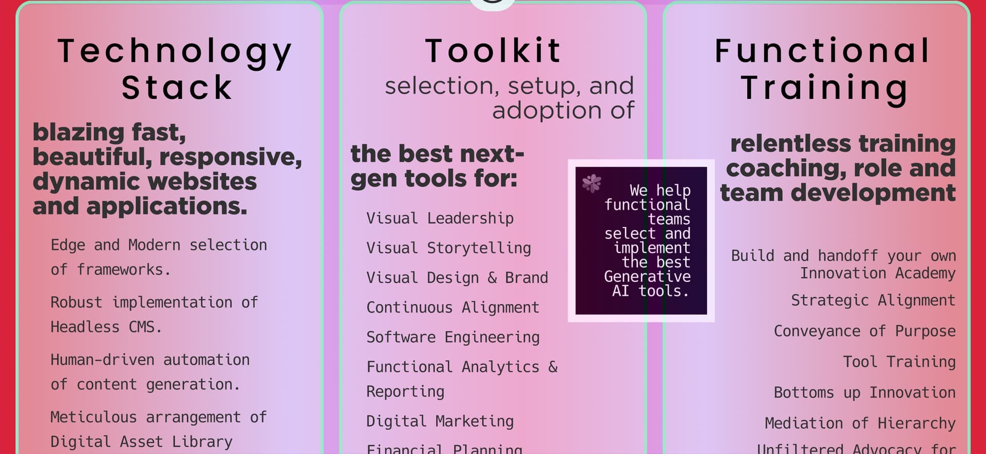
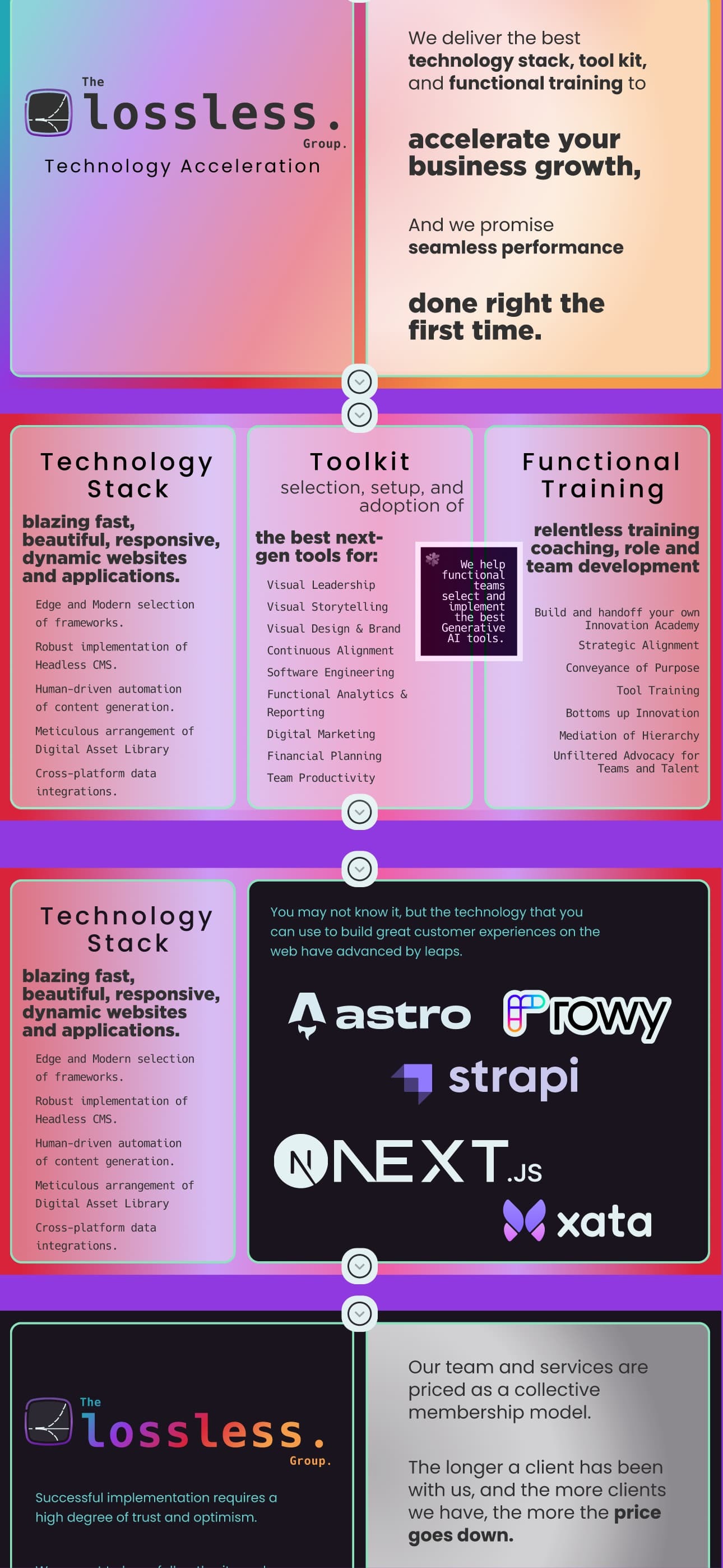
When I send the link to anyone, including myself, the slide stays within boundaries when the phone is in Portrait mode, but when it is in landscape mode it’s totally unusable. This means that people I’m pitching have to try to read text that’s compressed from 1920 width to like 386 width.
Attached are photos. And Community Manager you are welcome to give me a workaround, but your product team should just implement a “Present” version of a prototype, and there should be a setting that “constrains” bleeds and overflows.
