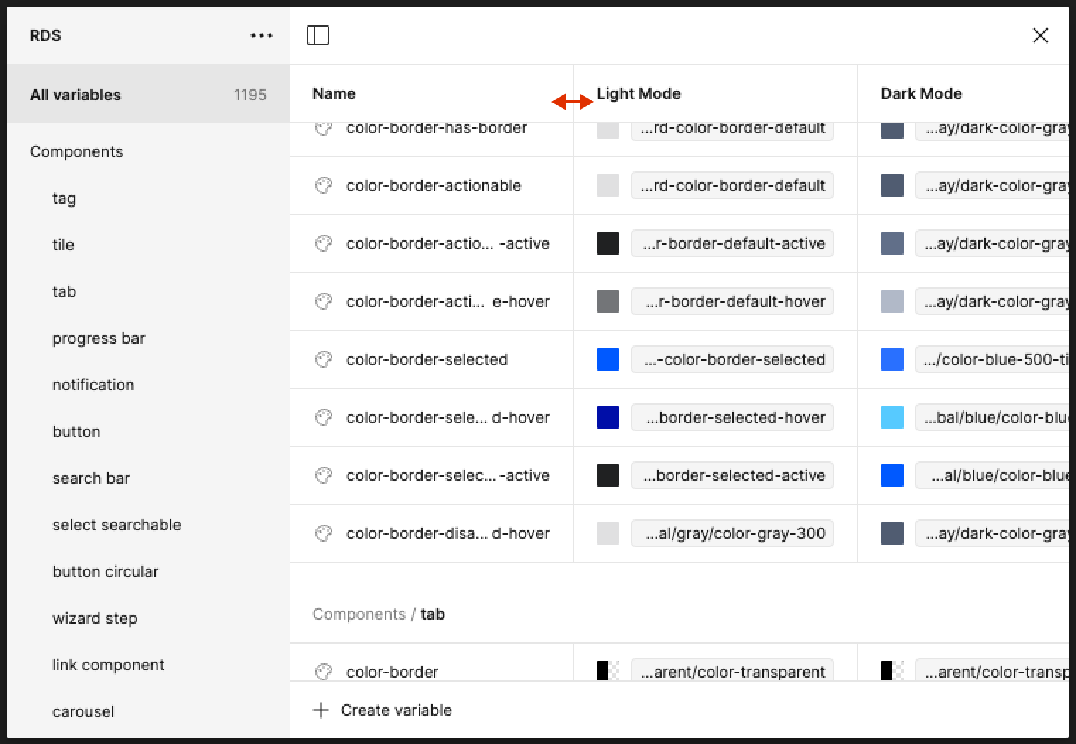
When you open the variables panel, you get columns to enter labels and values. It seems that there is no way to make a column larger, in case you have long variable names… Would this be possible in a future version?? (Actually the same is true for the properties panel, also no way to make this bigger)
Hi Stephen! Thank you for sharing your feedback! I can’t guarantee anything on our end, but I can give some visibility to our team for consideration.
In the meantime, do not also forget to vote up your idea
I don’t know why this doesn’t have more votes. You guys explicitly recommend variable names with full words and no abbreviations, which makes for some long variable names. But the default column width is very narrow making it incredibly hard to search through long lists of variables?
This is a pretty annoying issue that I hope gets resolved. I feel like it would actually be a quick fix too… Pretty please with a cherry on top, can we allow for the columns in variable be resizable.
To be more thorough - the entire variables experience is pretty rough. I know it says “beta” but I feel like there hasn’t been much change since it was introduced, and it’s a fundamental part of Figma now.
It’s hard to see at a glance of what’s going on. Selecting tokens (let’s say) forces us into this tiny little window to do this important work.
Here’s to hoping!
You are pushing design system in all talks during CONFIG24. You want us to leverage design tokens but you don’t want us to see the full token name?
Come on! Add resizing inside variables table.
Please allow to resize the column to fit longer strings or wrap the strings inside cell for easier editing… We are using these variables to manage content in the UI, so it should be easy to edit like in Google Sheet, for UX writers to feel more comfortable with this…
I can’t believe this is still not in the feature. I simply cannot work with variables in this view due to the variable name lengths. Seems like such a basic facility to have, come on Figma team, let’s try actually living the rhetoric of “for the designers” yeah?
I tried a little hack job to improve this in case anyone is as tired of waiting as I am
NOTE - You have to do this every time you reload Figma, the file OR the variables modal. It’s not convenient at all. Useful though if you’re spending days grinding through design tokens in a library file that you keep open
- Open the Variables modal
- Open Console (Plugins, Development, Show/Hide Console
- Using Element inspect (CMS + Shift + C), find the
<table>
element in the code - In the Console Styles tab, you want to edit the value of grid-template-columns.
The default is 200px repeat(1, 200px) minmax(40px, 1fr)
. If you change the first 200px
, this will change the width of the Name column. If you change the 2nd 200px
this will change the mode value columns.
As I say, this resets every time you close the Variables modal. But if you’re going through your variables and setting scoping for example, it’s easier than dealing with the equally average truncation Figma uses
Oh yeah. Wait til you get hundreds of variables and find there is no way to search within variables. Or that there is no way to collapse all or expand all in the sidebar.
Fun with unfinished products!
Figma has adopted Ron Popiel’s motto. “Set it and forget it!”
Once it is out the door, good luck with it.
Yeah it really seems that way. Used to be an amazing product, but the quality is just dropping and dropping. The focus seems to be more in profit. I guess that brush with Adobe taught them a few things
…or if you want to add an alias to a numeric variable there is no way to see values of existing variables from your library. You can only see the name of variables so you need to have another Figma window open in a new tab to actually see what you are adding… absolutely horrible UX for such a tool
That Adobe thing caused them to dump out everything they had in the works into the release two years ago. It caused so much unfinished work in the tool that I don’t think they know what works and what doesn’t.
I could live with that honestly. But their ego about it and unwillingness to examine their own support offering and to regroup like pros Is sad.
I had high hopes for Adobe to clean up some of that. It has only gotten worse.
Is this hack possible for the right side panel also? When picking variables / tokens from a list the right side panel and the modal windows for choosing variable/tokens from a list in a library should also be wider. Do you know what css selectors are controlling those widths? Thanks for sharing your hack.
EDIT: Found the html div with css width parameter for the right side panel. For changing its width you can edit the following element’s width value in it’s css: "div class=“properties_panel–drillDownContainer” style=“width: 350px;”
Upvoted. Really, really annoying with long variable names.
Thanks to @Chris_Kerr1, I came up with a little bigger hack to set the width of the columns every 10 seconds, so that you don’t need to constantly resize it, but rather only every time you load Figma.
Simply paste the following in your console and it will check every 10 seconds if your table IS NOT 300px wide, and will set it to 300px:
setInterval(() => {
const table = document.querySelector('.variables_spreadsheet--root--m6SQ8');
const targetStyle = '300px repeat(1, 200px) minmax(40px, 1fr)';
if (table && table.style.gridTemplateColumns !== targetStyle) {
table.style.gridTemplateColumns = targetStyle;
}
}, 10000); // Runs every 10 seconds
How to
- Open up your dev tools (cmd+opt+i)
- Click Console in the top menu
- Type
allow pasting
and hit enter to allow pasting - Paste the code in its entirety
- Hit enter
- Thank God
Had no idea God’s middle name was Isaac. Thank you million times! Does this work with 1 second or will it topple the file?
Hehe sure thing
Don’t know, never tried 1 sec, but I see no reason why it wouldn’t work, 1 sec is not too often. You can change the 10000 to 1000 and see what happens
This is a major pain point when you’re managing anything but the smallest variable collections, or use anything resembling proper design token naming conventions. Adding to the disappointment is the notion that the solution is so simple. Simply scaling the columns to fit the variable window would go a long way even.
Because people do not know how to vote or use a forum.