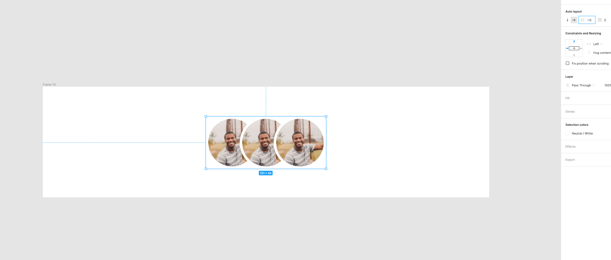
Launched: Negative values in Auto Layout

Sometimes elements overlap. And that’s ok. Please let us have negative values in auto layout. This includes negative values for padding and spacing between elements.

143 Likes

I think I saw Rogie do this in a demo, there’s an option in the auto layout that’s called “packed” or something like that. If you change it from the default you can get the effect you’re looking for.

Agreed that it’s not intuitive and could be easier for things you want to overlap. My most common use case is table rows with borders. I want them to overlap so the borders aren’t doubled up.

(I’m on my phone right now so can’t check exactly how it works.)

10 Likes

Yes, as @Richard_Doyle said, the option that you’re looking for is ‘Spaced between’, that will distribute all your avatar evenly. But if you shrink your group all the avatars will start to overlap.

5 Likes

Yeah, I’m aware of the hack. That’s how I’m doing it in my screenshot. It’s limited though and not very precise. If you were to build it with CSS you would totally have to guess on the negative value. Figma is probably blocking negative values so it doesn’t mess up the layer hierarchy which is already a mess.

8 Likes

ahhaha :heart_eyes: This is the exact post I wanted to post but forgot. I have mailed Figma support a couple times about this, they had negative padding when auto-layour v3 initially rolled out, I even had one or two components with independent negative padding values, at the time although you can’t type negative values directly but you can option drag, I am just regret I didn’t make hundreds of them from -1 to -999 so I can just copy paste them and use everywhere. Please have this feature back, if it was caused by a bug we need to have this bug :nerd_face:

6 Likes

It’s just my request, hope everyone also need this. Instead create multiple variant to move object inside the component frame, such as scrolling tab nav while last item (outside the frame) nav is active, i only need the auto layout padding accept the negative value so it could move object inside move outside the frame. just like the indentation but in opposite way :3

1 Like

I was just hoping for something like this when trying to deal with text objects arranged vertically. I don’t want to uniformly change the text style but I also don’t want the same spacing in this one auto-layout object. I’d need negative space between to achieve this.

1 Like

The struggle is real! If your problem is duplicated borders, for instance in a table, this is how I’m solving it now:

I create the atom component with 2 variants, one with “top border” only, and the other with both borders (which would be the last row of the table). I named the properties as “Both borders=Yes” and “Both borders=No”. This will show a toggle switch to enable the bottom border for the last row of the table.

Let me know if there’s a better hack :sweat_smile:

3 Likes

Need negative spacing for auto layout to make items overlapping!

9 Likes

+1 on this. The limitation of “Space between” is that auto layout has to be of fixed width. This means if you add a fourth item the space between each of those items will shrink to fit the new element. But you may actually want the space to stay constant and the total width to change.

Not actually sure why things like this are prevented! Is it just an attempt to simplify things by restricting valid inputs, or is there a technical reason attached?

7 Likes

+1

1 Like

I believe an optimal approach would be to allow Auto Layout items to let their children to have their own margins, either negative or positive. In that way the children will be able offset anything within their parent.

7 Likes

extremely needed!!!

2 Likes

+1 - really wanting this for table components. I’m working on a lot of tables and being able to have negative padding would make things so much easier. it’s rough to workaround.

4 Likes

This, indeed would be a great addition. Been running into this quite a few times now. E.g. when you have elements/components with a stroke, the stroke becomes double when you use auto-layout since it’s stacking bottom stroke to top stroke of the next elements while strokes on the side remain the same. Had to ditch the auto-layout and move all elements up one pixel to get a crisp single pixel stroke on all elements.

In addition, z-index would be great so elements with different stroke color can be on top of another element so stroke is the same color all around the object.

Other than this, lots of love for Figma, you guys are doing an awesome job.

5 Likes

I cannot replicate what is possible with code while using auto layout because it does not allow negative values.

Please allow negative values so I can stack elements on top of one another while they are part of the same group.

Just give it more weight here! Highly needed +1

3 Likes

We need negative values in autolayout pleeeeeeeease.
I need it to align the baselines of different fonts without losing the autolayout features on the widths of my components.

9 Likes

+1, don’t know how much technical effort it’s going to take, but Figma please consider implementing this feature for future updates, especailly now a majority number of designers should be grasping how auto-layout works so it totally makes sense to enable negative values for space between.

4 Likes

For folks looking to use this feature request to create tables (like me), I think the better solution is to allow for independent auto layout border values (like padding allows) so we can have no border (0) on a given side.

8 Likes