The awesome new auto layout! Thanks Figma <3
My topic: The wrap feature does always fill the available width, before adding a second row.
I’m looking for the setting how to fill the possible height first, before adding a new column.
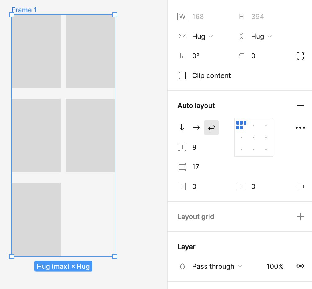
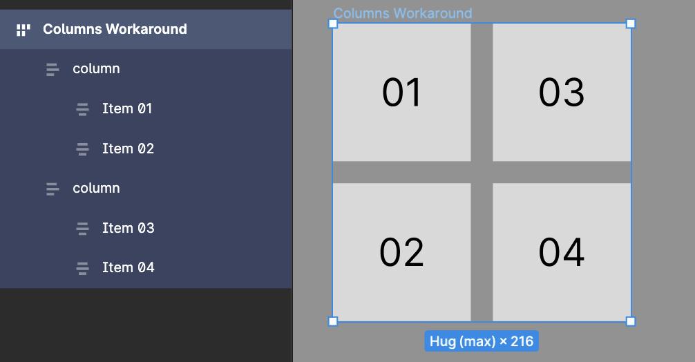
In the screenshot you can see the fifth item will always align top right instead of below-right.
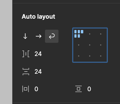
Is there a setting to choose “vertical first” instead of “horizontal first”?
Here’s an example. I’ve got the max width set to 168 which is the width of the 2 elements + spacing. Then as you add elements they wrap vertically instead of creating a 3rd column.
The preview though in the auto layout properties panel still shows it wrapping to a 3rd column. This is is just fixed icon to signify that wrapping is turned on.
Unfortunately setting a max-width doesn’t solve it.
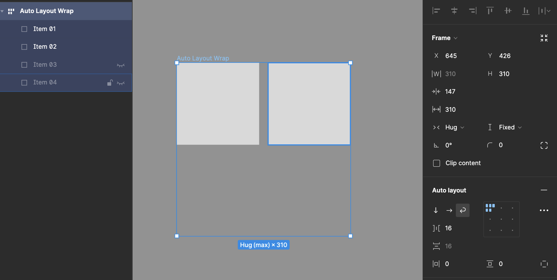
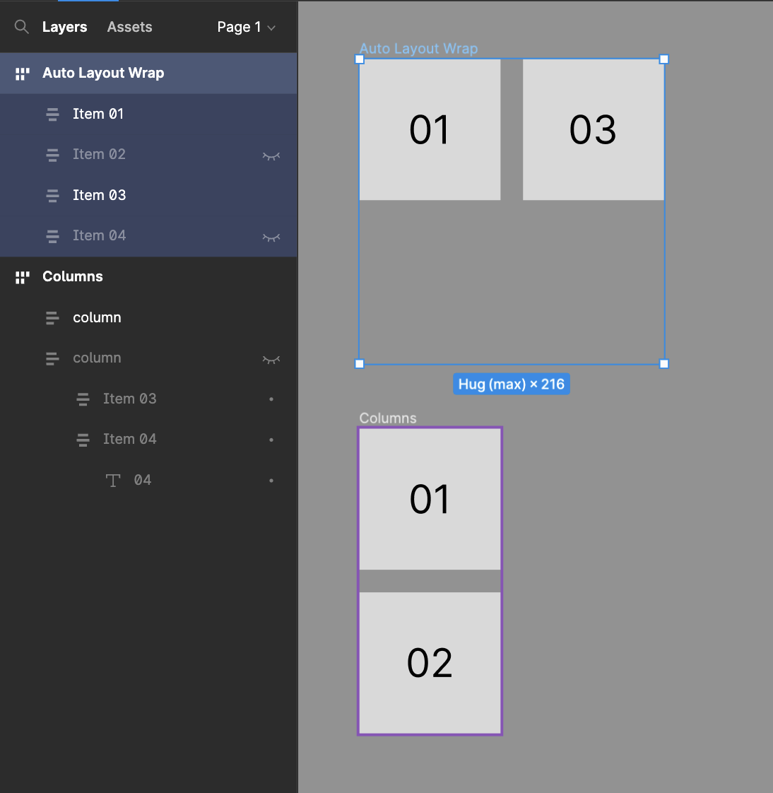
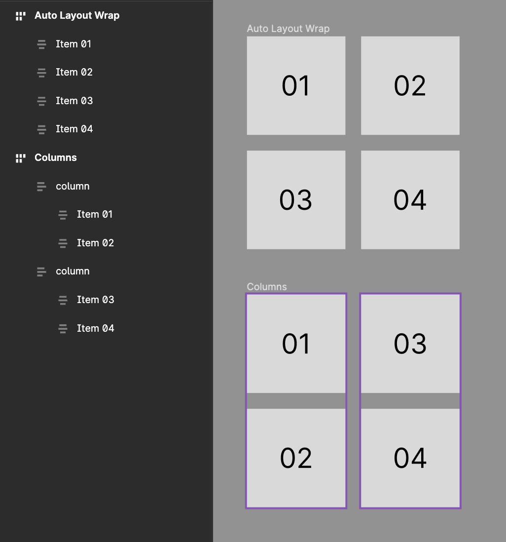
In my example I have max. 4 items. If I all 4 are visible, they arrange as a grid. If there’re 3 visible, the third aligns beneath; thats correct. The thing is: If there’re only 2 visible, they do align horizontally. But I want them to align vertically, filling the max available height.
I would not recommend to do this but it helped me when I encounter the same problem as you.
My solution was to tricks the system by rotating the auto-layout with a -90 angle and to reset the rotation parameter of the elements inside it, in order for the auto layout to fill by its height before its width
Hello Haroll. I am implementing your solution for a component in my design system. But the width and height values are now interchanged. And this is misleading for designers, devs and PMs using or inspecting my component.
I also still want to use the spacing:Auto feature so that the nested elements can arrange themselves to fill spacing horizontally within the container as it changes width.
Achieving these is challenging. Have you come across a similar scenario?