Is it possible to have padding follow a responsive grid rather than a set number?

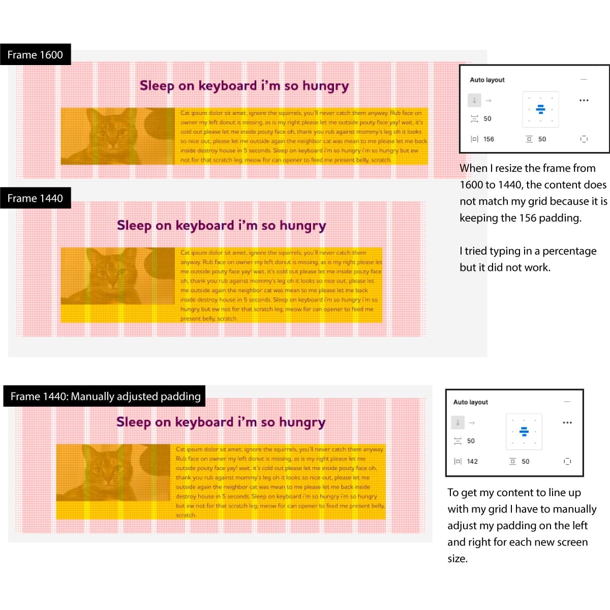
My Figma frame has a 12 column responsive grid and I want to show design mockups for various screen sizes ranging from 1600 to 320 px wide.

I drop a component I created into my frame, it does resize when I make the frame smaller or larger but I have to manually adjust my padding for each mockup so it lines up with my grid.

I included a screen shot below.

1 Like

To have padding follow a responsive grid rather than a set number, you can use percentage-based padding instead of fixed padding values. This allows the padding to adjust based on the width of the container and the number of columns in the grid.

For example, if you have a grid with 3 columns, you can set the padding of each column to 1% (or any other percentage that suits your design), which will result in equal spacing between the columns regardless of the container width. Similarly, if you have a grid with 4 columns, you can set the padding of each column to 0.75% to achieve the same effect.

Here’s an example CSS code for a 3-column grid with percentage-based padding:

css
Copy code
.grid {
display: grid;
grid-template-columns: repeat(3, 1fr);
grid-gap: 1%;
}

.grid-item {
padding: 1%;
}